Forms
Visual forms editor (VEF) is a tool for a supervisor (or admin) to create or maintain the forms in a visual way. The forms can be displayed either to the agent (at the end of the call) or to the customers (for example, as a link to the form, sent in a campaign email)
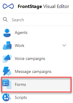
The editor can be found in the FrontStage administration, in specific in the list of editors, under .
Settings
Access to the VEF is controlled by the EditScenario role.
For proper operation, the FormAdminQueryId parameter must be set.
Data structure
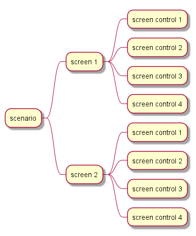
The form contains Screens (at least one), on which the individual form elements are laid out. The behavior of the element is then controlled by its specific settings and any parameters (additional settings at the bottom of the window).
Detail tab
Header settings for the selected form.
ID - a unique form identification, GUID
Display name - displayed in the list
Description - information for users
Group name - categorization/filtering
GDPR log level - default form logging options
Sql command on save - an SQL script that is executed every time the form is saved
Sql command on create - an SQL script that is executed when the form is launched
Tip
For the header parameters Sql command on save and Sql command on create, multiple SQL scripts can be specified at once; you should separate them with semicolons and line breaks. The return values of the scripts are ignored.
You can use variables in the scripts:
@ScenarioResultId- the ID of the form that was created/saved@AgentId- the ID of the agent who saved the form. It can beNULLif the form is saved by a system process (e.g. in the IVR)@Context- the place from where the script was calledForm - a form created/saved in ReactClient or WinClient
Rating - a rating created from ReactClient
IVR - a form created as part of the IVR processing
IVR - a form created as part of the IMR processing
Workflow - a form created as part of WF processing
Screens tab
For a newly created form, you must first create a screen. To do this, click Add screen (to delete a screen, click Delete screen). After adding a screen, you can click on it to open its details.
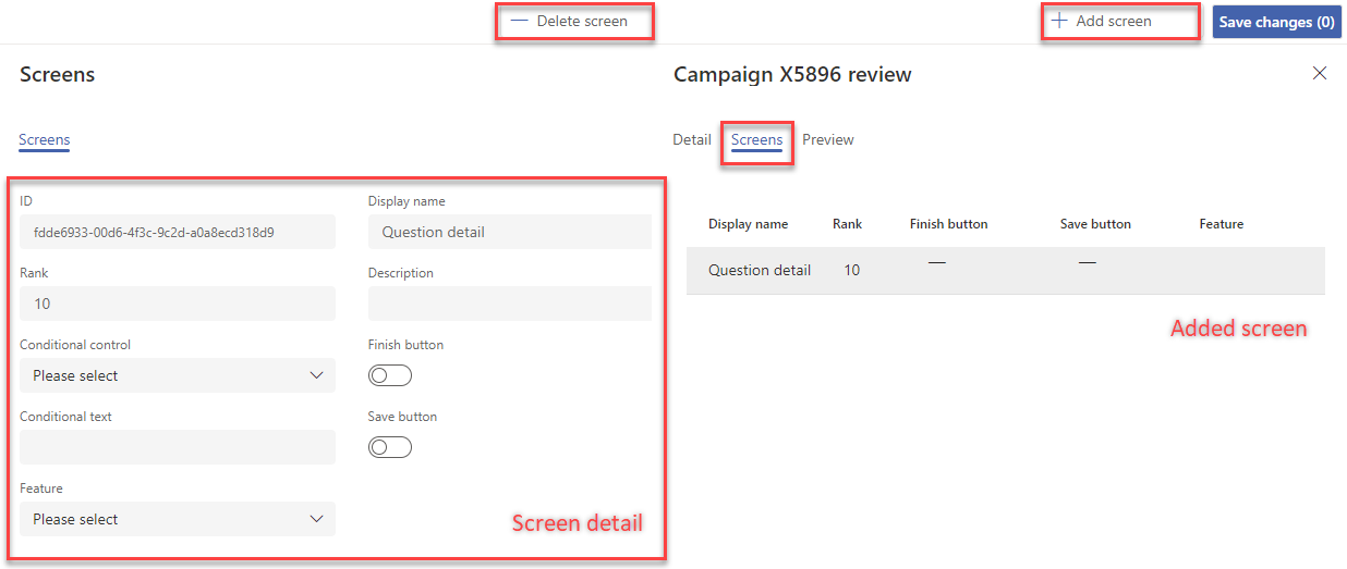
Screen parameters
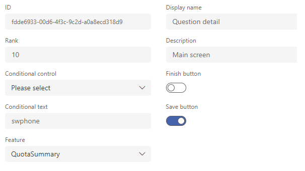
ID - a unique identification
Rank - a sequence in which individual screens are rendered
Display name - displayed in list
Description - information for users
Conditional control - element from the previous screen, which conditions the displaying of the current one (it can be
DropDopwn,RadioButton,CheckBox). Each screen can be conditioned by one value.Conditional text - refers to the previous item - the value given here is the condition of display (Conditional control displayed in the form; it must have this value filled in the previous step for the conditional screen to be displayed)
Finish button - whether to show the Save/Close button for the given screen
Save button - whether to display the Save button (without closing) for the given screen, related to the parameter Sql command on save
Feature - displayed in the transition between screens. Available feature
QuotaSummary- show quota attainment check and enumeration (for surveys)
Preview tab
The tab is WYSIWYG editor, where you add elements to defined screens and set them.
Working with the editor
In the open preview, where there are no elements entered yet, there is only the “+” button (Add) to insert the first element.
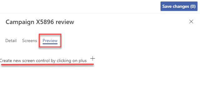
Press the button to open the window for adding an element and its settings.
After saving, the element is now displayed in the overview, and you can now see a set of additional buttons for working with elements.
Buttons included:
Add - another item on the same screen
Remove - remove this element
Edit - edit this item
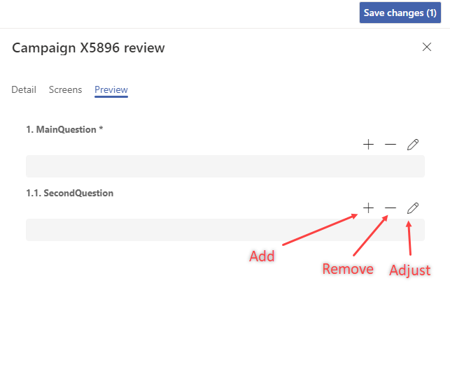
This style can be used to model an entire form with multiple elements.
Attention
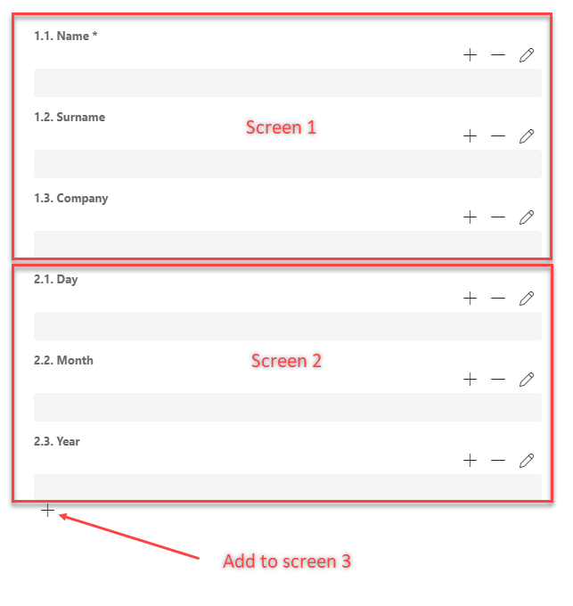
If the form contains multiple screens, then each screen has its own elements and a button to add a new element. The elements belonging to a particular screen can be identified by their numbering.
Setting form elements
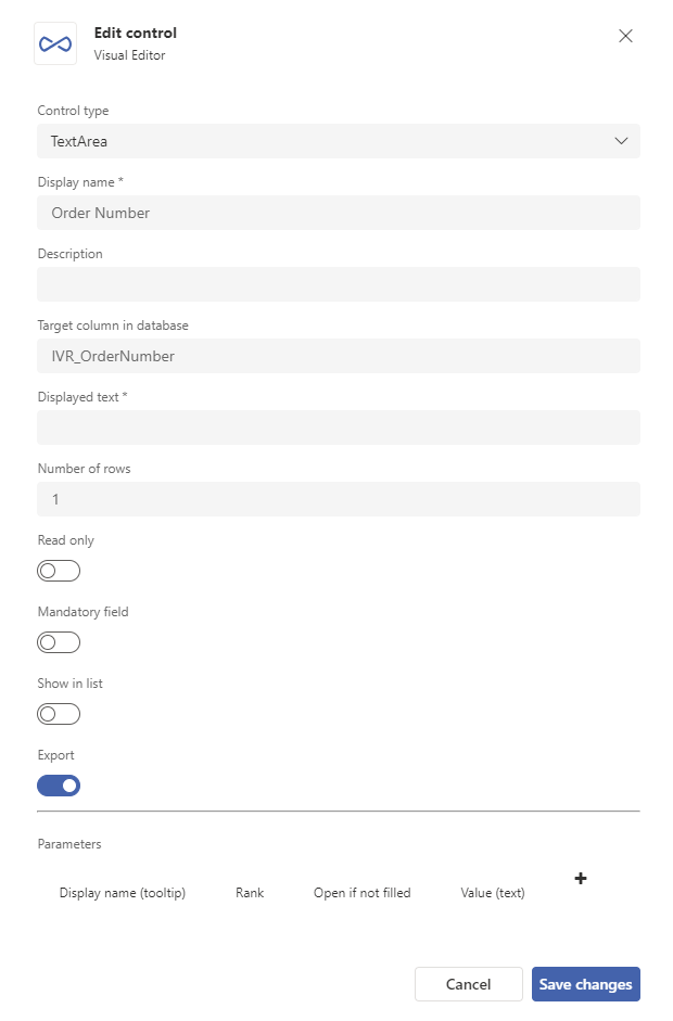
Values adjustable for one element:
Control type - the type specifies the style of rendering and controlling what values will be generated. Description of individual types
Display name - displayed in a list
Description - displayed when mouse cursor hovers over element name
Target column in database - value for integration (
TargetColumn); written with the value to the form when the form elements are createdDisplayed text - a function depending on Control type
Number of rows - a function depending on Control type
Read only - if enabled, the item cannot be edited even if the form is in an editable state
Mandatory field - if enabled, when saving the form, the user will be notified to fill in this field in the summary, the name will be displayed in red
Show in list - if enabled, the field is loaded into the reports (depends on the application processing)
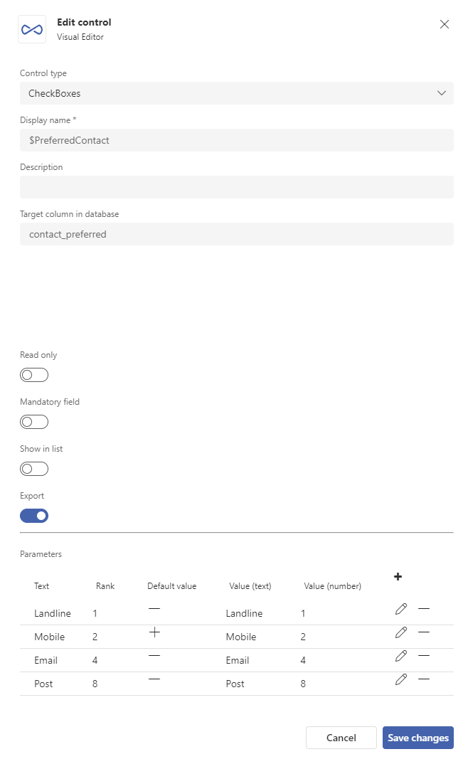
Export - if enabled and the form has been used for an outbound campaign, you will be able to export this element in the outbound campaign results
Note
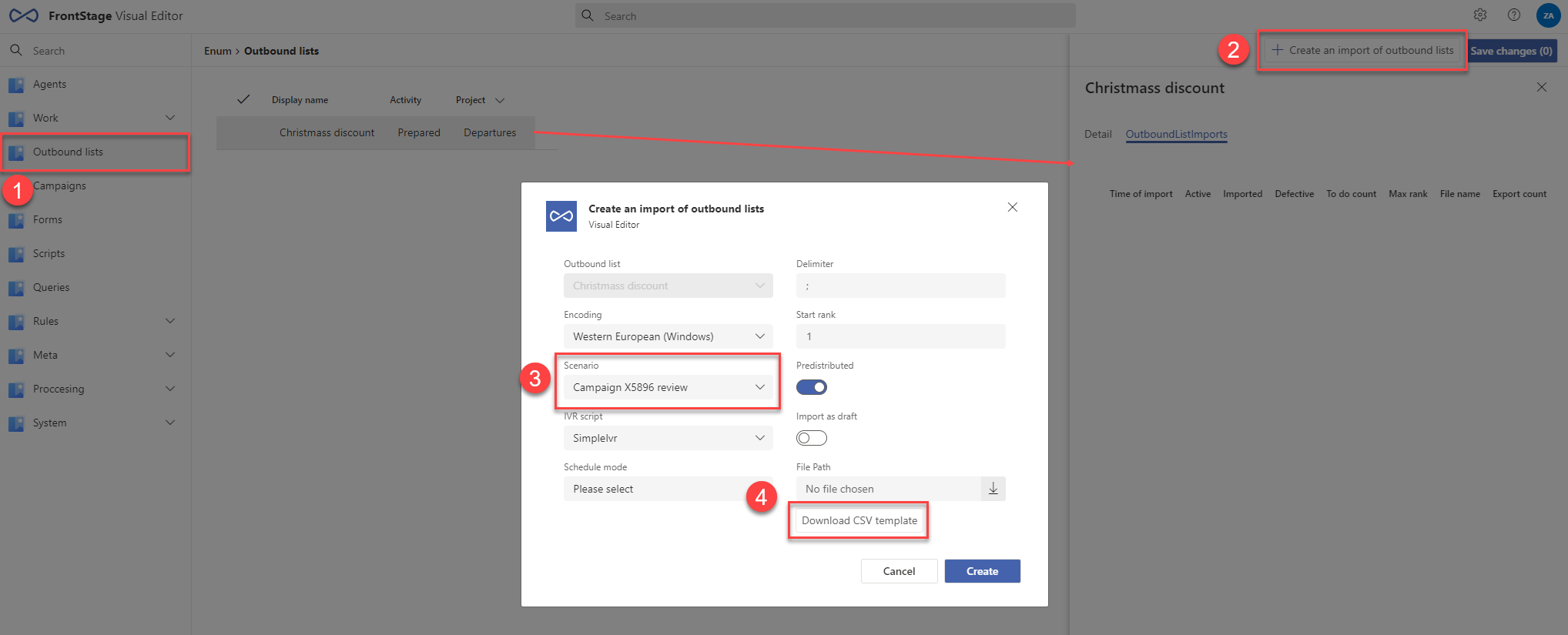
In the visual editor for outbound campaigns (1), you can perform the Create an import of outbound lists action for a campaign (2), where you also select Scenario, i.e. the form (3). After a successful import, other actions are available for the form, including a Download CSV template button (4), where only form elements that have this feature enabled will be available.
Sensitivity - related to the sensitive data handling in EU, see Sensitive data handling
Parameters - specific parameters; the form differs depending on the element type
Available form element types
TextArea
Used to insert text. Number of rows specifies the rows displayed in the form element.
You can also use the item for validation by a regular expression - it must have a parameter where Display name (tooltip) is with the value “Regex” and Value (text) contains the corresponding regular expression.
Integer
Used to enter an integer. You can set the Minimum and Maximum parameters, which limit the range of the entered number. The value is stored in the
ResultNumbertype field and also in theResultTexttext field. When loading,ResultNumbertakes precedence.
DropDown
It is used to select a specific item from the list; here the parameter is the list item.
The items that this element displays in the form are taken from the Text field (for parameters), displayed according to Rank. You can mark an item as Default value, and it will be pre-populated in the form (this label can have multiple items, then the specified Value (number) has priority). The default entry is applied when the form data is created.
The value of the
ResultTextfield is filled according to the Value (text) field,ResultNumberis filled according to Value (number). The fields refer to the selected item from the list.
DropDownTopic
All the properties are same as for DropDownCascade, only the control item for displayed item subset is the superior issue topic , which has the Rank value.
DropDownSubtopic
All the properties are same as for DropDownTopic, only the control item for displayed item subset is the superior issue sub-topic , which has the Rank value.
DropDownCascade
Appearance, settings and data storage identical to DropDown. The difference is that only certain subsets of items are offered, based on the control element, which is the closest DropDown, DropDownCascade, DropDownTopic or DropDownSubtopic element within the form.
The value Rank controls what subset of items will be offered when the element is used in the form. If this value is in the \(N\) control element, the dependent element will only display the subset where this value is in the range \(N*100\) to \(N*100+99\) when selected.
For example, if you select the item “Width” \((N=1)\) in the control element, then the dependent element will offer the subset “Meter” \((N=100)\), “Centimeter” \((N=101)\), “Decimetre” \((N=102)\)
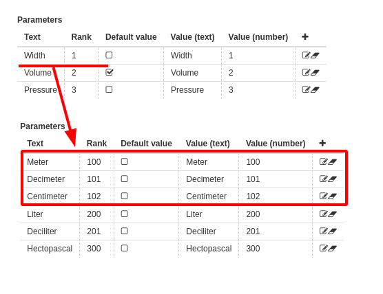
Elements can be chained at multiple levels; the offset for N is by \(N*100\) with each chaining. For example, under \(N=101\) falls \(N=10100\) and \(N=10101\) in the next element. This only works between elements on the same screen.
If no item is selected in the form control element, the dependent element will not display anything.
Each chaining level can have a default item. It is applied only when the form is displayed (not when the data is created).
If all items in the dependent element are outside the N range of the control element, nothing will be displayed.
Important
Forms are evaluated by control elements and have automatic data storage in the background. You need to take this into account when creating a script Sql command on save, written in the form header.
RadioButtons
These are used to select a specific item from the list.
Configuration and data storage identical to DropDown.
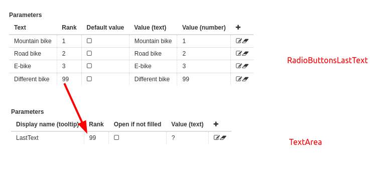
RadioButtonsLastText
It is used to select a specific item from the list, where the last item is a free text. For this to work, this item must be followed by a TextArea element with the “LastText” parameter set
For example, the RadioButtonsLastText and TextArea elements are defined consecutively on one screen. The RadioButtonsLastText element has the parameter “Other”, where the value of Rank is set to 99. The TextArea element then has a parameter named “LastText” (must be this name) and also has the Rank value set to 99. This ensures that this text field is used when selecting “Other”.
Configuration and data storage identical to RadioButtons.
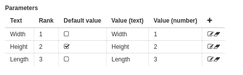
CheckBoxes
These are used to select multiple items from a defined list.
Storing data in the database: The
ScenarionResultValuecolumn contains an identifier for a specific element in the form, and theResultNumbercolumn contains the sum of Value (number) of each selected item.Example: If the element parameter definition is as shown in the picture below and you would select the items “January”, “March” and “April” in the form, 13 will be written in the
ResultNumbercolumn (i.e. \(1+4+8\))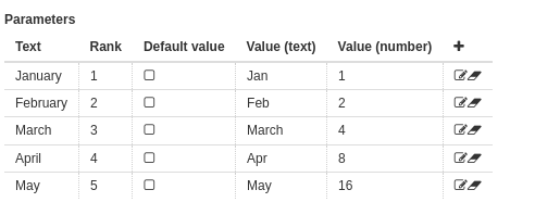
The
ResultTextcolumn contains the names of the selected items, separated by semicolons.
CheckBoxesLastText
Functions and data storage identical to CheckBoxes, except that the last selection item is a free text.
Configuration for the last item with free text is identical to element RadioButtonsLastText
LabelOnly
Used to display static text. The content is not stored in the database, but can be retrieved from it, using integration resources. Then the text
ResultTextis appended after the text of theControlTextelement. You can format the text using HTML, inserting its value in Displayed text
Time
It is used to enter the time. The value is stored in the
ResultTimetype field (the current date is used as the date) and also in theResultTexttext field (without time). When loading,ResultTimetakes precedence.
Date Time
It is used to enter the date and time. The value is stored in the
ResultTimetype field and also in theResultTexttext field (without seconds). When loading,ResultTimetakes precedence.
Date
It is used to enter the date and time. The value is stored in the
ResultTimetype field and also in theResultTexttext field (without seconds). When loading,ResultTimetakes precedence.
ActionButtons
It is used to display action buttons that can trigger an action.
Score
It is used to express the number of points. By default displayed as a drop-down list ending with the value written in Number of rows (step 10). It contains the First value and Step parameters, which change the default state.
The Step parameter cannot be negative or 0. The First value parameter should be less than Number of rows.
Grade
It is used to express a grade (integer value). By default displayed as a line of numbers ending with the value written in Number of rows (step 1). It contains the First value and Step parameters, which change the default state.
If Mandatory field is not active for the element, the N/A option is added to the row of numbers
The Step parameter cannot be negative or 0. The First value parameter should be less than Number of rows.