Data grids
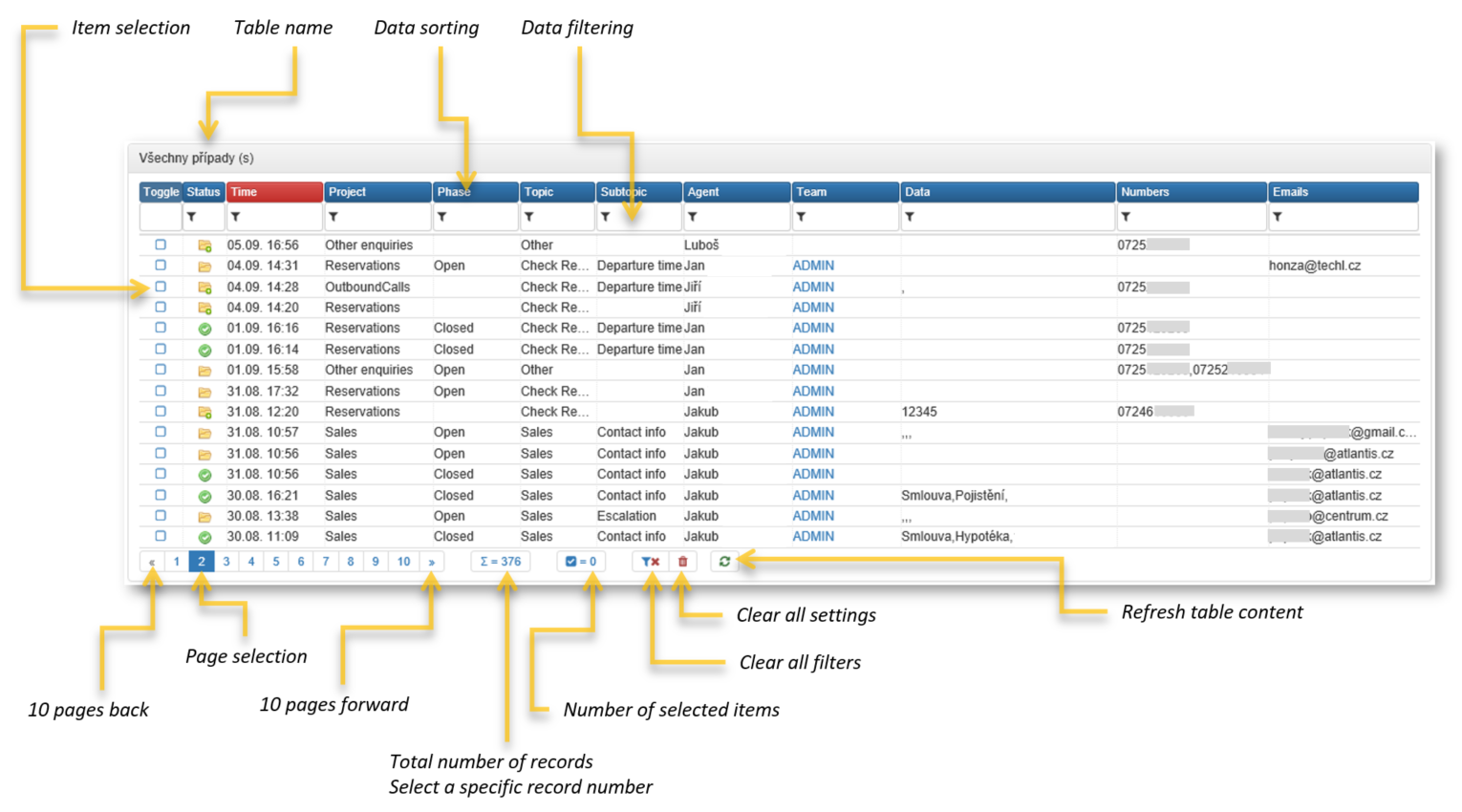
Data grids (or just grids) are the most common user interface elements in FrontStage. They represent data queries over a database prepared by the system vendor or consultant.
See also
In this article you will find data grid controls. Looking for data grid portlet settings?
Grid is a type of portlet and can be stored on any place or page within ReactClient. Available rows and colums depends on a background data querry and thus database content. However, the controls and options are the same for all the grids, which will be described in this section.
Note
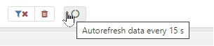
In case of a network outage, the graphs will refresh themselves after the reconnection.
Note
Grids are very adaptable; therefore, not all grids contain all of the options described in this document.
If you keep the cursor over an element for a short moment, a brief element description will appear.
Updating data
If you want to see changes to entries that may have happen since the grid was displayed, you can use the Reload data, which will immediately refresh the data. You can find the button in the grid footer.
Exporting data to CSV
Entries displayed in the grid can be exported to a CSV file. Click on the Export button in the grid footer to open or save the file.
Note
The underlying queries contain time data in UTC format, and the grid displays the local time depending on the logged agent and its time zone (UTC is converted to local time). When exporting: if the column is of type DateTimeLocal the time is converted to the server’s local time. Otherwise, it is converted to the local time of the agent’s browser that started the export.
Tip
If the button doesn’t work check the Exporting data from grid to csv article.
Sorting records
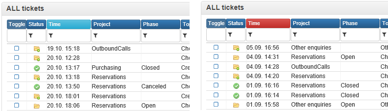
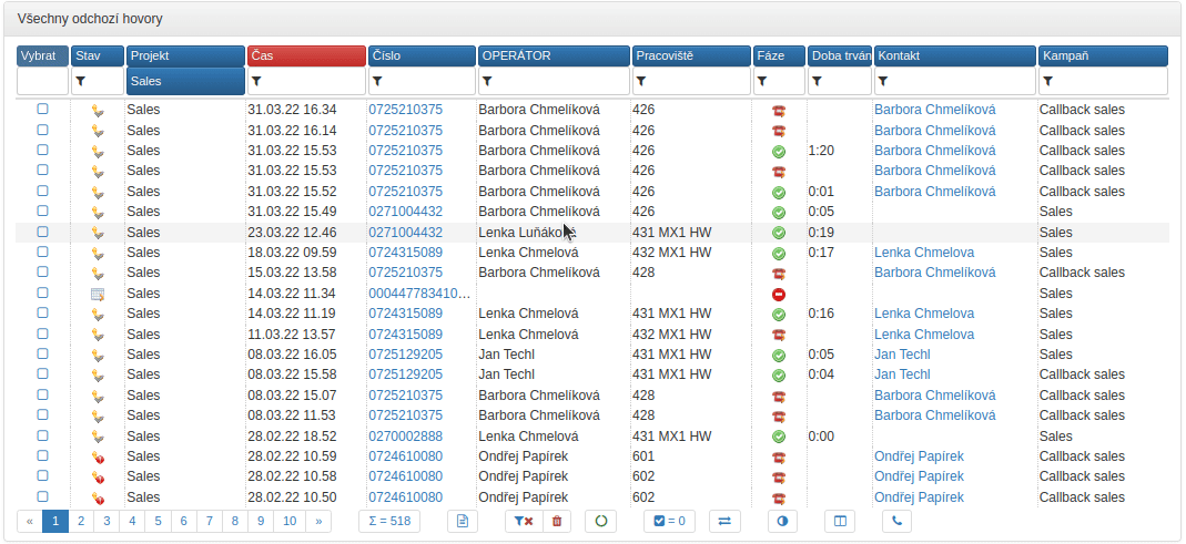
Records displayed in the data grid can be sorted by clicking on the column header.
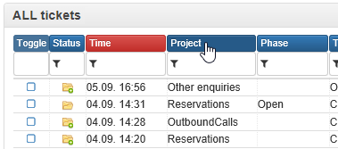
The column according to which the list is sorted has a different background color depending on the sorting type:
light blue background when sorted in an ascending order - from the lowest to the highest value (text sorted from A to Z, numbers from the lowest one, time from the oldest one)
red background color when sorted in a descending order - from the highest to the lowest value (text from Z to A, numbers from the highest one, time from the oldest one)
Pagination
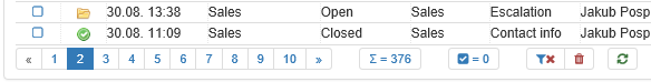
If a grid contains more records than can be displayed in defined grid height, you will find page numbers in the footer, through which you can navigate by clicking on the page number. The current page is highlighted with an inverse background color.
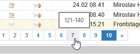
When you place the mouse cursor over the page number, you will see the numbers of the records shown there.
The maximum number of displayed pages is 10. If you need to display more pages, then you can use the arrows before and after the page numbers to move to the preceding/following ten of pages. If you have a grid with less than ten pages, then the arrows are inactive.
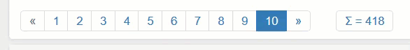
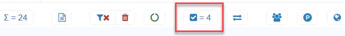
Grids can often contain even hundreds or thousands of records. The total number of records is shown next to the page numbers in a frame with the sum symbol.
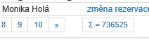
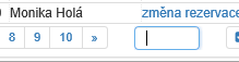
Apart from navigating by pages, you can jump to a particular record number. If you click on the sum symbol, the button will change to a text field. Enter the record number in the field and press Enter to go to the required record in the list.
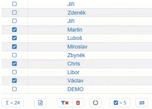
Batch selection
Some grids are formed in such a way that they allow you to mark (select) multiple entries, over which you can then perform a batch action (see batch actions below).
The first column of such grids usually contains a checkbox. You can select a continuous or discontinuous set of records.
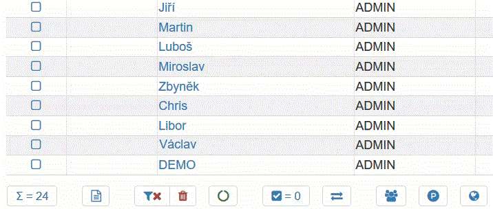
The number of checked records is continuously updated as you select them.
By clicking on the inverse selection, you can select the other records than those currently checked.
Tip
An inverse selection can be used to select all records. When none is selected, an inverse selection will then select all records.
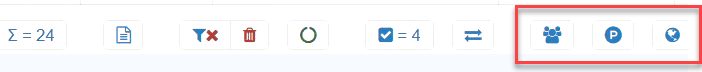
Bulk actions
Typically, grids allowing you to select records also offer one or more bulk actions, such as a set of buttons in the list footer. Bulk actions only work on selected records.
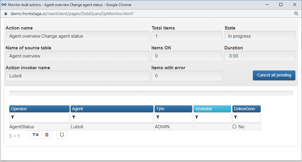
Once a particular batch actions has been selected, a dialogue will appear that is similar to the following picture. The most important thing is to determine:
which operation (the Command switch) to execute,
whether the selection should be canceled after executing the actions (the Cancel selection after executing the action checkbox)
depending on the batch action, which other options to choose such as the agent’s name
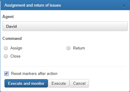
Click on Execute and monitor or Execute to start the execution. It is better to use the “Execute and monitor” button since you can then see the progress of and, if relevant, errors in processing in a newly opened window.
By clicking on the Cancel all pending button, you can cancel the action before the countdown period expires (or cancel the action on pending items).
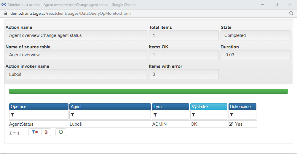
Once all request processing actions have been completed, the Status (upper right corner) will display Finished, and in the Finished column you will see an empty checkbox and the word True for the relevant table entries.
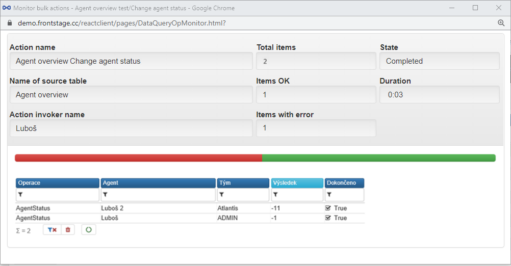
Once all requests have been successfully processed, in the Result column you will see the negative value of -1 for each of the items, and a green processing progress bar will appear above the table that lists the items processed.
Important
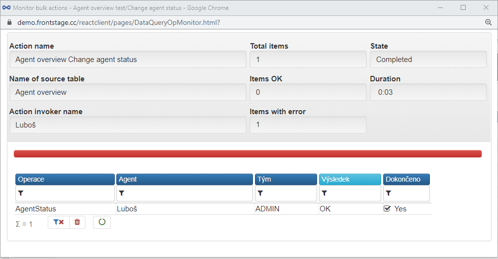
Any other value than -1 indicates a failure.
If any errors appear, the progress bar above the items will be partially red and partially green according to the processing success rate; if the processing of all items has been unsuccessful, the bar will be completely red.
Manual action
Some of the buttons in the footer of the data grid can be manual actions that trigger operations created specifically for the customer. They look just like the bulk action buttons and also work the same way.
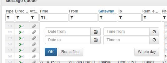
Filters
Most data grid columns offer you the option (in the header) to filter the entries displayed by hiding the values that you do not want to see.
Columns that do not support the filtering function lack the funnel icon in the header. If a filter has been applied, the column header will have a dark blue background color.
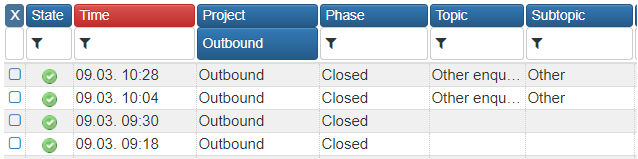
If you click on the filter row, you can enter the value to be searched. To apply the filter, use the Enter or the Tab key or simply click anywhere outside the filter row.
Mandatory filters
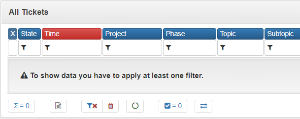
Some data grids may contain a high number of entries (hundreds of thousands or more). Due to performance reasons, grids are designed to display the content only when a filter has been applied.
Deleting filters or settings
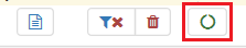
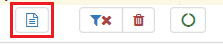
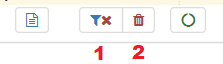
To cancel all filters, click on the [1] button.
The other button [2] will cancel all filters and, in addition, also the set Entry sorting and, if relevant, return the pagination to the first page of the list.
Filtering by values
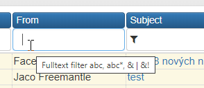
To find a specific value, enter the value. For example, John will find all entries with this value, but not Johny and the like. If you enter e.g. 777209291, only entries containing this number will be displayed.
To find “begins with”, enter the value with an asterisk at the end. For example, Gold* will find Goldsmith, Gold, Goldstein, etc. If you enter e.g. 291*, the system will find entries such as 291602189, 2914890, 2911, etc.
To find “ends with”, write the value with an asterisk at the beginning. For example, *smith will find Goldsmith, Smith, Rowland-Smith, etc. If you enter *291, the system will find entries such as 602192291, 123291, 3291, etc.
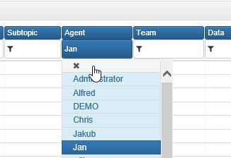
Selection from possible values
To display only columns that can contain just specified values, you can filter the entries by selecting a particular value from a drop-down list.
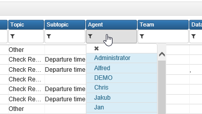
To cancel the filter, click on the value and then click on the X cross over the drop-down list.
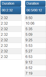
Duration
Columns containing a duration (of a call etc.) can be searched by entering a specific duration or from-to range.
To find an exact duration, write a value in the format of HH:MM:SS (hours:minutes:seconds). For example, 00:23:55 means an interval of 23 minutes and 55 seconds.
To find a duration from-to, enter a range in the format of HH:MM:SS/HH:MM (Important: There is a slash instead of a hyphen!). Example: 00:05:00/00:12:00 represents a range from 5 to 12 minutes.
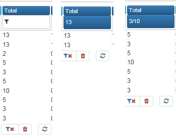
Numbers
You can filter numerical columns using a specific value or a from-to range.
To find an exact value, just enter the value. For example, enter 13 to find entries with the value of 13.
To search in the range from-to, enter the interval in the format of from/to (Important: There is a slash instead of a hyphen!). For example, 3/10 can be used to find entries with values ranging from 3 to 10 inclusive.
TimeUtc
In columns containing a time value (date and time, just a date or just a time), you can search using a specific value or a from-to range.
When you click the header, enter the range or exact value you want.
Drag & drop
Data grids can be operated with a help of drag & drop actions, which will help you to adjust the grid faster. You can adjust the column width, order of the columns and show/hide the columns. This functionality is supported both in potlet and bookmark visualisation.
Note
You must have permission to use, see. Drag & drop query columns
Data grid in a tab
Data grid can be displayed also as a standalone tab in various editors, see DataQuerryGrid tab in the editors.