DesktopClient
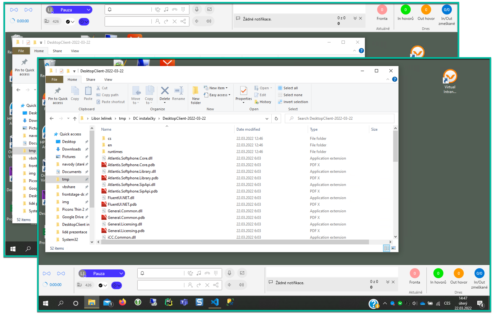
DesktopClient allows you to conviniently use the agent environtment, through native Windows application. It borrows some ReactClient functions, which displays on a single ribbon on your computer screen, plays sound alerts and displays notifications, which need your immediate attention.
DesktopClient (DC) also works with TeamsClient (TC). If you have TC running and you click on a button in DC that opens an external application (chat, message, etc.), this link is processed by the server and the corresponding object is opened directly in TC, on the Mainstage tab. In case of opening e.g. another chat from the DC, a new preview of the object is opened in the same TC instance, no new browser tab is opened. If the TC was not running, the object would be opened in the ReactClient application.
Note
The whole application is configurable and so not all of the items have to be displayed on your ribbon or may be configured in a different way. Always ask about the configuration at your admin/consultant. The settings is described more thoroughly in Visual designers section.
Start, login, closing
When DesktopClient is started, it shows the ribbon either on top or bottom of the screen, overlaying other running apps. Also tray icon is present and splashscreen is shown.
Attention
The behaviour after running the app is adjustable, it can vary depending on the instalation settings. See params StartMinimized, Wnd_Softphone_ShowInTaskbar, Wnd_Softphone_Topmost
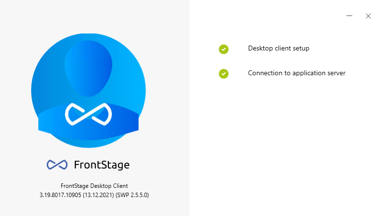
Splashscreen
The first thing that appears after launching DesktopClient is the splashscreen. Wait until all the steps on it are complete (they will have a green check mark).
If you are allowed to choose from more workplaces, which you can use from DesktopClient, splashscreen will present you these workplaces, so you can pick one.
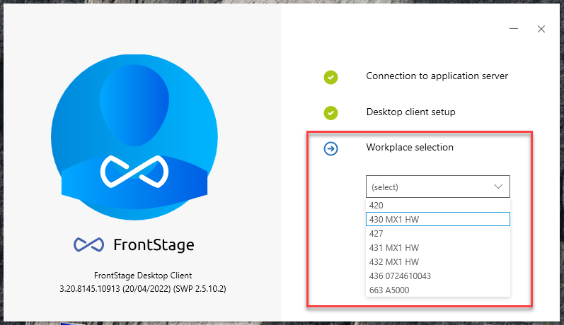
Caution
The step with choosing the workplace can be skipped, but you have to pick one on the DesktopClient ribbon anyway. The app can’t be used without a chosen workplace.
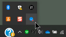
Tray
Running app displays a tray icon
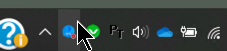
Tray icon doesn’t have to be immediatelly visible and can be found only after expanding the Tray section.
By clicking on this icon you can show/hide the app ribbon.
Hint
If you wish the tray icon to be visible permanently, you can adjust the Windows settings, see Windows documentation
Scale adjustment
The application will initially start with a default scale, see ApplicationScale. This might not fully correspond with your current computer settings, the app’s ribbon can be too big or small. Change the settings via DesktopClient’s context menu which can be opened by clicking on the app’s tray icon. The set value is saved.
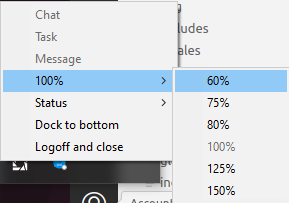
Docking at the top or at the bottom
The ribbon can be docked either to the top or bottom edge of the screen
Changing the loction:
In tray, right click on app icon
Depending on the ribbon loction, you will be able to see buttons Dock to top or Dock to bottom (if the ribbon is docked at the top, you will see Dock to bottom)
Closing the app
You can close the app and stay logged in on the workplace or log off before you close the app.
Do the right click on the tray icon and select Logoff and close
If you are not currently logged into any workplace, the options will be only Close application
In other case, you will be able to choose, whether you want to Logoff and close or Only close
Log in, log off
The app checks your identity within your organization, there’s no need to insert the credentials, access must be granted by admin
Logging in to the workplace
You will be prompted to log in immediatelly after the app starts, see splashscreen login
You can skip the workplace selection on the splashscreen and choose one later, from the app’s ribbon
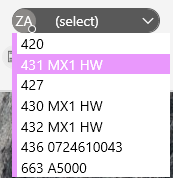
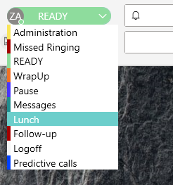
After the ribbon is displayed, look for Workplace dropdown or Workplace/Status dropdown item (visibility depends on your configuration) and click on it.
After clicking, there will be presented a list of workplaces, where you are allowed to log in with the app.
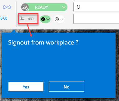
Logging off and workplace change
Logging of using the ribbon item Workplace dropdown:
Right click on this item, popup window will show with prompt, if you really want to log off
After accepting, the app is still running and you can use the same item to choose a new workplace.
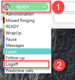
Logging off using the ribbon item Workplace/Status dropdown:
Right click on this item and select status Logged off
You are now logged of from current workplace.
After logging off, the app remains running and you can select new workplace the same way
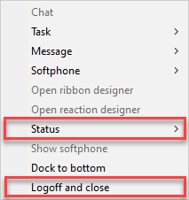
Context menu logging of
Find the app’s tray icon and right click on it
Context menu with two buttons will appear. These can be used for logging off (workplace change is not possible this way)
Logoff and close - when pressing, popup window will appear, where option of the same name is located, you will be logged off from the workplace, app will close
Status - when pressing, list of all available statuses will appear, one of them will be Logged off, app is still running
Change of agent status
You can change the agent status either throuht the context menu or app’s ribbon. The presumption is, that you are already logged in to the workplace and thus you already have some status assigned
Change through the ribbon item Workplace/Status dropdown
Agent status is being displayed
When pressing, list of available statuses will appear, choose status New
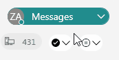
Change through the ribbon item Quick status
Item has two functions - it can switch you to the certain status (depending on the app settings) or cycles between two certain statuses (function and statuses depends on the app settings)
Both functions look the same from the UI perspective, your admin should inform you about the current functionality
Switching to a status:
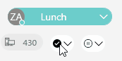
Cycling the statuses:
Change throuht the context menu
Function already described for logging out, in case of change, you just select a different status.
Making phone calls and interaction
Ribbon items for making calls
You can make the call with ribbon item Basic Call Bar, for project transfer/consultation there’s Transfer bar. These two together have the similar functionality as portlet Call bar within ReactClient app.
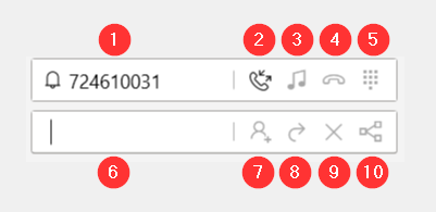
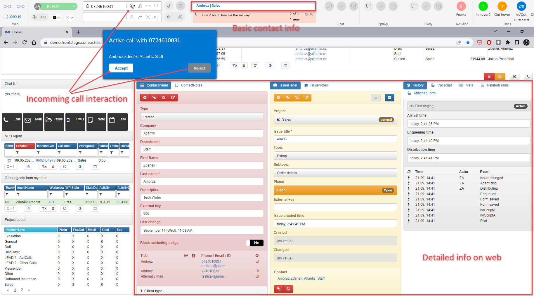
For incoming call, phone number is being displayed or you can insert the phone number yourself in case of the outcoming call.
Start the phone call or accept the phone call
Call hold
Call end
Dial pad
Option to insert a phone number for consultation or transer
Dial the second call and start the consultation
Transfer the phone call to the inserted number
End the consultation and go back to the previous phone call
Change metadata for transfer purpose - cases when the client dialled a wrong number
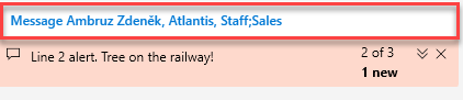
Item Interaction context info shows you the contact info during the incoming call or call in progress (presuming some are already present in the system). Also info from other channels can be displayed, like chat or tasks.
Tip
Template for item Interaction context info can be changed in settings, via Voice Display Template
Inbound call
Note
You can be informed about inbound call by ringing, popup window, etc. It depends on your instalation settings. Behaviour presented here is just an example. Database always contains default reaction set, provided by your consultant. For more info, see Reaction designer
Item Basic Call Bar shows calling number (1) during the inbound call, you can accept the call by pressing Accept button (2), alternatively you can use popup window, which also contains options to work with the call.
If you have also currently open the ReactClient and you are also logged in there, automatic detail window will appear, with all the information about the call (contact info, campaign, etc.). Basic contact info is provided by item Interaction context info on the ribbon.
Sound alert can be played, based on the set up reactions.
Active call
During the active call, all of the described ribbon functions are available. You can process the call in a standard way (additionally ReactClient data is being displayed)
If the customer needs to be transferred into another project (wrong number, different language, etc.) press the “Change metadata” (10) button and change the values in newly opened popup window.
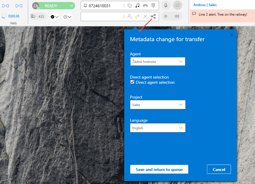
When pressing Save and return to queue button, customer will hear a signature tune and will be handed over to another agent. The call ends by this action for you.
Terminating a call
The call can be terminated by hanging up, transferring the call, handing it to another agent etc. (already described above)
After the call is terminated, your status will automatically go to something like “Wrap up”, “Filling”, etc. for like 40 sec (can be set differently for various projects). During this status, you can see detailed info within ReactClient and adjust/change the detailed call result.
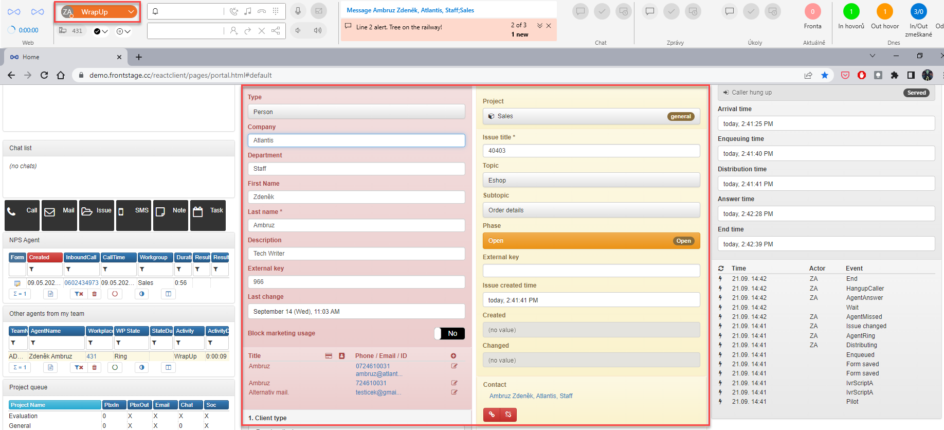
Previous status will be automatically triggered after the set up interval and you can process new calls.
Softphone
Softphone is also part of the app, which can be triggered by using Softphone toggle item
Note
The triggered window can have more appearances, see available softphone types.
Another options can be found after opening contextual menu from app’s tray icon (right click on the tray icon), the options are:
Always on top - if checked, Softphone window will remain on top of other currently running apps
Show in taskbar - if checked, running Softphone will have it’s own tray icon
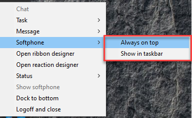
Note
Settings described above can be also preset from config file, see Wnd_Softphone_Topmost, Wnd_Softphone_ShowInTaskbar. Can be changed afterwards.
Notifications
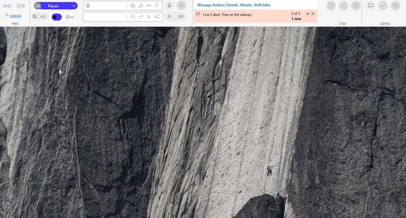
Supervisor can use the notice board to let you know about some cruacial information/notifications, which will be presented on the ribbon with usage of Client alert board item. There can be more than one notification, they are then being displayed according to the set up rules. Notification can be only informative or it can request confirmation of reading (supervisor can check, if you confirmed or not). It can be displayed in ribbon item, stripe through the screen, popup, etc.
Note
Pictures and grids are not supported notifications. Only text is allowed.
Informative notification:

More than one notification, different colour suggest needed user action:
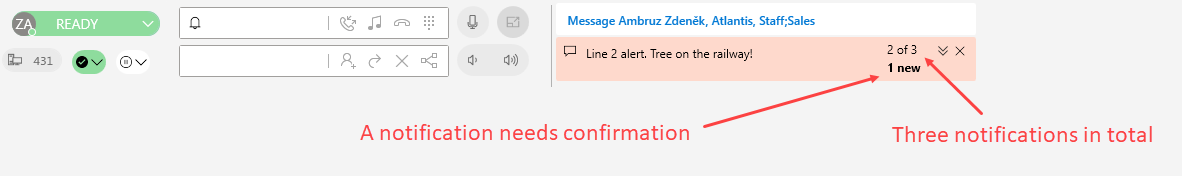
Popup notification window with confirmation:
Importatnt notifications usually have to be confirmed, after that it remains visible on the noticeboard or it will disappear (based on the notification settings)
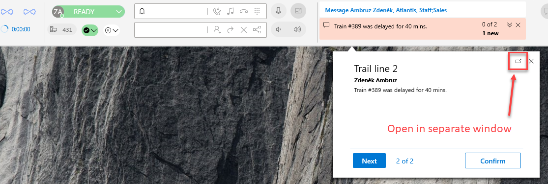
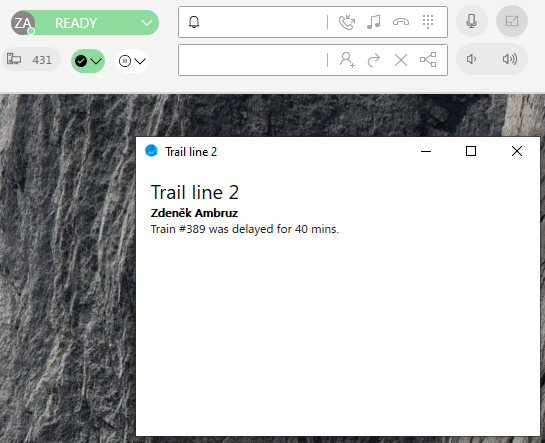
Notification in a separate window:
If you wish, every notification can be displayed in a separate window (see button on the picture above). Until you close this separate notification, it will remain like that (will also disappear, when the app is closed)
Tip
Separate window can be moved for instance onto the next screen and importatnt notification is always visible.
Sound
Next items can be used to control sound input/output
Microphone mute - by clicking on it, you will turn off the microphone (actual recording device), the button will change the colour, with another click you will turn it on again

Volume - controls the volume of sound output device, by clicking the right side of the item volume is increased, on the left side it’s decreased

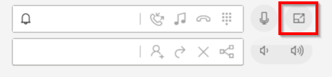
Browser link
Another item on the ribbon can be a button, which will open a predefined website (ReactClient page, your web, etc.). The item is called Open in browser
The only interaction here is just b clicking on the button, which will open the predefined website in your default browser.
User stats
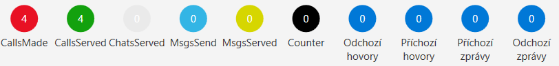
Ribbon can also consist of items, which give you stats about what happened during your shift. Typically it can be a call counter, divided into processed/missed calls or inbound/outbound calls etc. This item is highly configurable, so you will see just some examples of many. Displayed info has only informative character, no interaction needed.
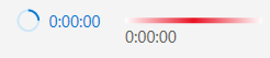
Information about actual call lenght (two looks)
Detailed comunication stats

Detailed stats - another look
Chat, messages and tasks
As an agent, you can also take care of incoming mails and chat, also your tasks are displayed on the ribbon. App will let you know, that there’s some communication that needs to be proccessed by sound alert or popup window (depends on reaction settings))
Attention
Correct function of these items is conditioned by installing windows add-in Microsoft Edge WebView
Chat
For proccessing the chat can be used the Basic chat bar item. Functions:
Display chat list (1) - the choice of the chat which you want to proccess
Display chat list (1) - the choice of the chat which you want to close
Postpone active chat (3)
All of the buttons described above open list of your chats, when clicked, so you can always choose, which one are you working with.
Note
Button icons for Display chat list item do change it’s colour, based on the chat state. It has the same meaning as for Chat list
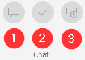
Incoming chat
Aplication can alert you visually on three different places, that new chat needs to be taken care of. Sound alert can also be used.
You can accept it within a popup window with help of Accept chat or within ribbon item Display chat list (colored icon)
When certain chat is choosen, it will be opened in a separate window
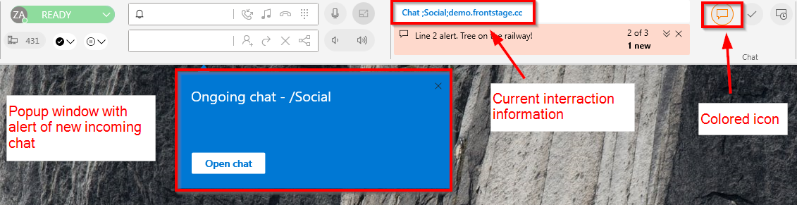
Accepted chat:
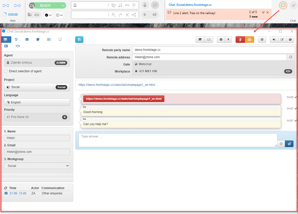
Chatting is the same as you are used to from the web (a separate ReactClient window opened)
During the chat, application will alert you about new incommig questions by playing the sound alert and changing the color of the icon.
To end the chat from the ribbon, choose Finish active chat and then pick certain chat, which is then ended. It’s not pressented in the queue anymore. From customer’s perspective, it’s also closed.
For delaying active chat, choose Postpone active chat and pick certain chat.
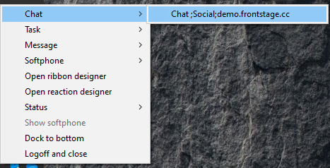
Opening the chat from windows tray:
Right-click on the context menu and choose the Chat option
if some chats are available, a list will appear when pointing there with a cursor - chat window will appear after clicking on a particular value
if none chat is available, the button will be greyed out
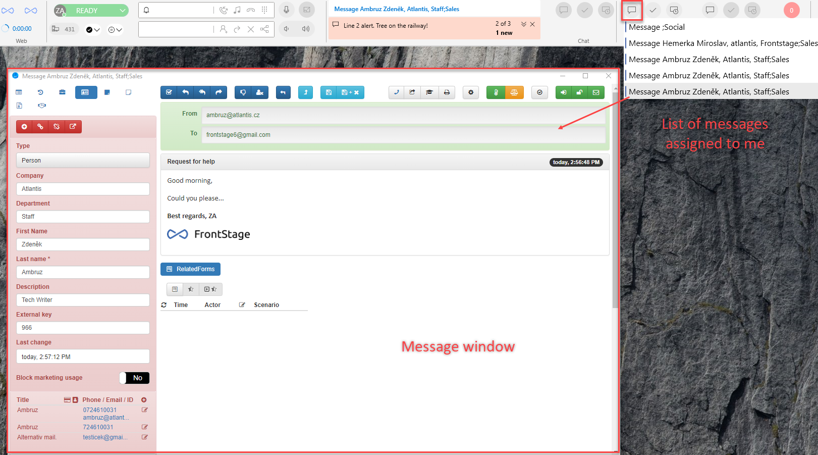
Messages and tasks
Item Basic message bar will alert you about assigned messages, Basic task bar then about tasks.
The function and control of these items is basically the same, as it was described for chat item above. Notifications are just based on a different channel.