Portlets
Portlets are individual elements of the user interface that you place on portals. This section provides a complete list of the available portlet types, which can be used by agents to make calls etc., gain insight, as well as create new user interfaces.
For easier orientation, we can divide the available portlets into three areas:
For end users (especially agents) |
Informative and for getting insight |
For creating user interfaces |
|---|---|---|
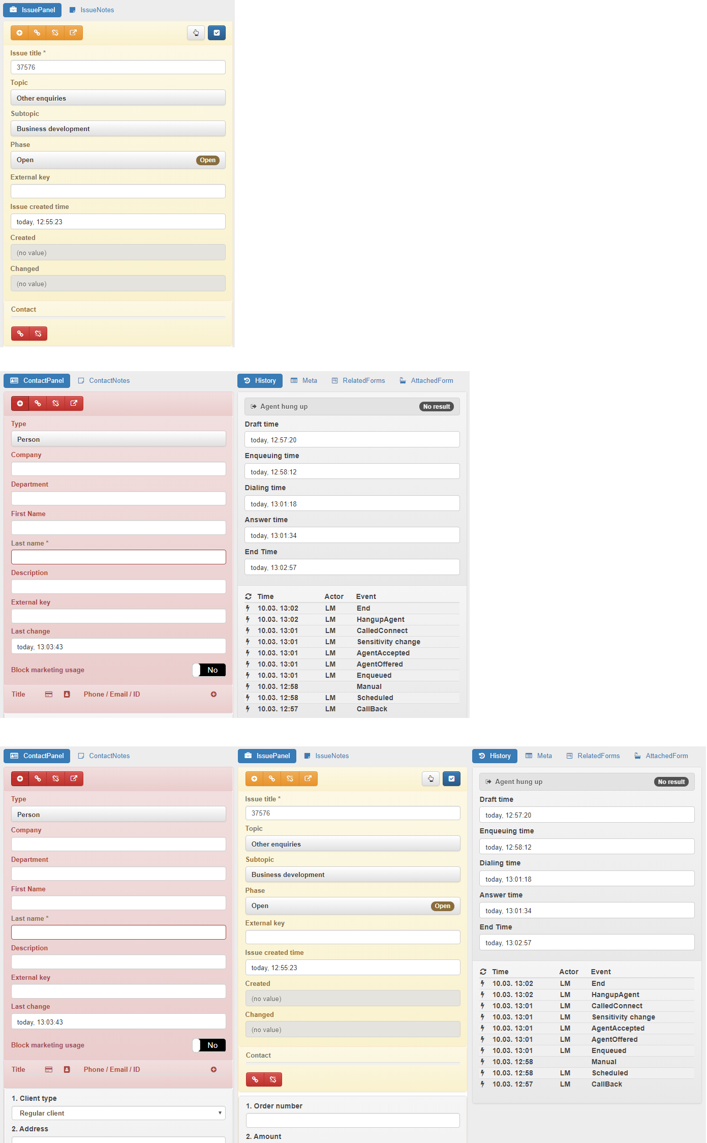
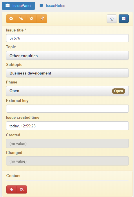
Container
The container in which you can insert additional portlets is the basic portlet when creating portals.
Usage
It is invisible to the user.
Settings
Settings |
Description |
|---|---|
Fixed top position height of container |
If you enter a value, a container will be pinned to remain visible even when you scroll through the page (CSS 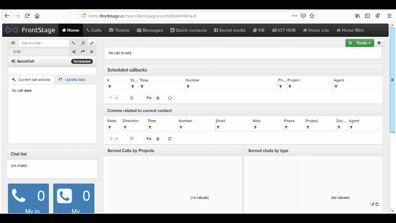
|
Usage example
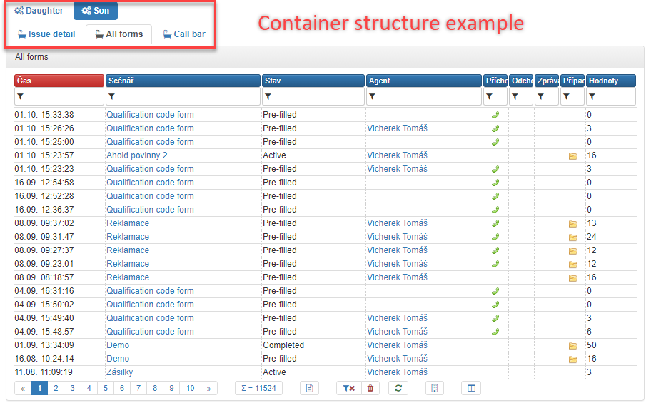
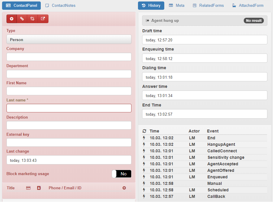
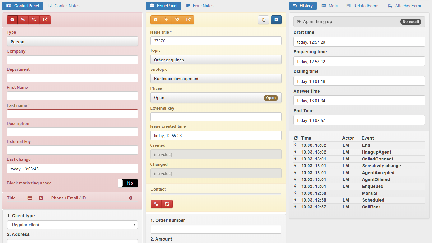
The container allows you to insert other containers into its body that contain sub-portlets. This allows you to achieve a complex view structure at one place. Internally, we refer to such a layout as “ears”.
These can be created using three containers, where one is the main (“parent”) one and the other two sub-containers (“children”) are nested within it.
Tip
For all containers in this structure, it is worth setting Portlet glyph to make the breakdown clearer. For more information, see Glyphs.
For the “parent”, ou should set Tabs (tabs are not displayed by default) and set Minimal container height , including the unit (px, em). Portlet style should be set to the maximum value
For the “children”, you should set Tabs and leave Minimal container height empty. Set Portlet style to the desired look
Equip the “children” with the required potlets
The structure holds its shape thanks to the “parent” height setting; it will not change after each tab switch.
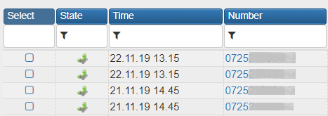
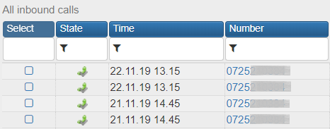
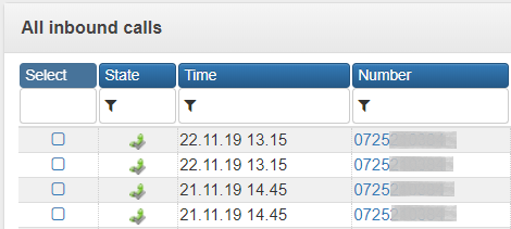
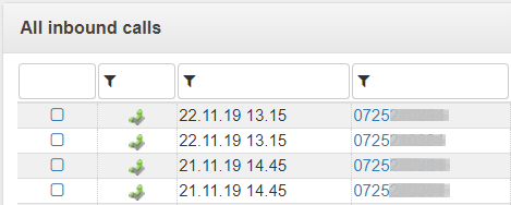
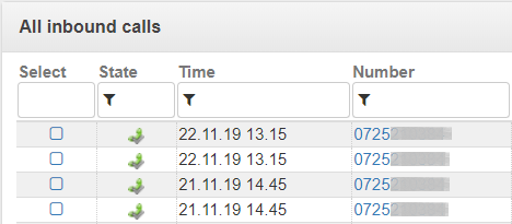
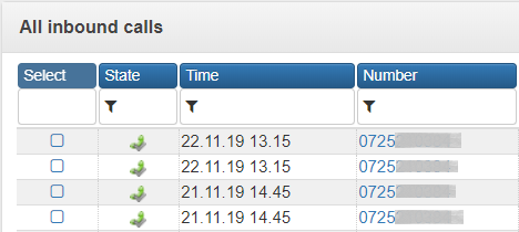
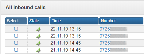
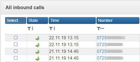
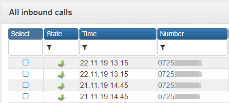
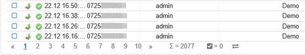
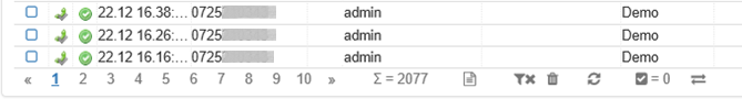
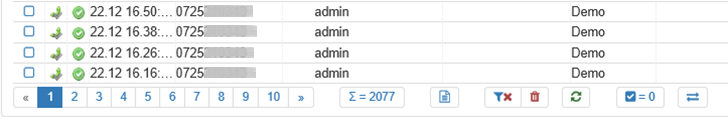
Data table
Usage
The controls are described in detail in a separate article Data grids
Settings
Settings |
Description |
|---|---|
Data query |
Dropdown to select source data query. |
Row per page in grid |
Maximal rows per data grid page. |
Fixed height grid |
|
Show only filtered data |
|
Vertically oriented columns in the header |
|
Height of vertical columns in the header |
|
Automatic refresh period [s] |
If set, data will be automatically refreshed every N seconds. |
Pop-up window parameters |
The parameter for the pop-up window is a string passed onto the If not set, it follows the value from the |
Refresh data on event |
Checkboxes for options
|
Show grid title |
Radio button among values
|
Show column names |
Radio button among values
|
Show column filters |
Radio button among values
|
Show footer, pager and buttons |
Radio button among values
|
Column width unit |
Radio button between values Pixels and Percents. |
Bulk action on marked items |
A section for setting up bulk actions to be performed for all checked items. The data grid must be enabled for checking. In order for any button to appear, you need to specify a glyph. The bulk action buttons appear last in the footer. 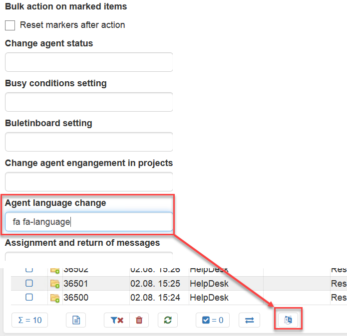
|
Reset markers after action |
Once executed, the items above which the bulk action took place are unchecked. |
Manual actions |
A section for setting up to ten buttons that call an action triggers or workflow. Like bulk actions, they appear in the footer as buttons with a glyph set. The manual action buttons appear before the bulk action buttons (if any). You must specify a glyph for the button to display. 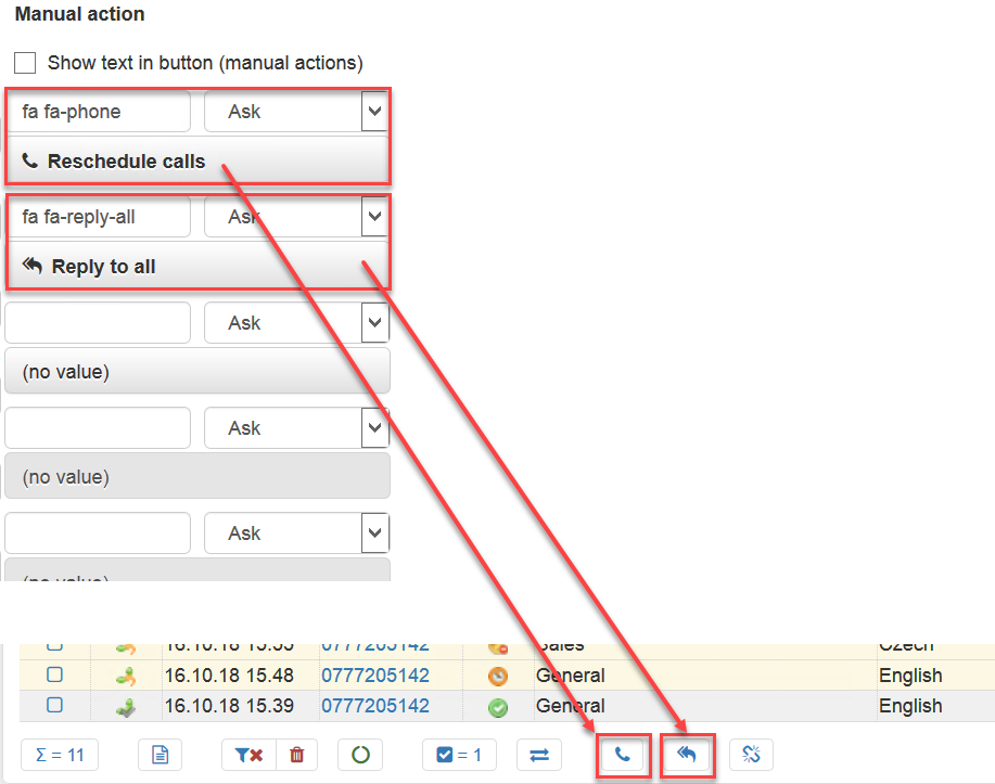
Select the target trigger from the drop-down list. If the workflows have a group set, the items are grouped accordingly. Only those triggers are displayed that have the 
|
Show text in buttons (manual actions) |
If checked, the name of the corresponding trigger or workflow will be displayed on the manual action buttons. 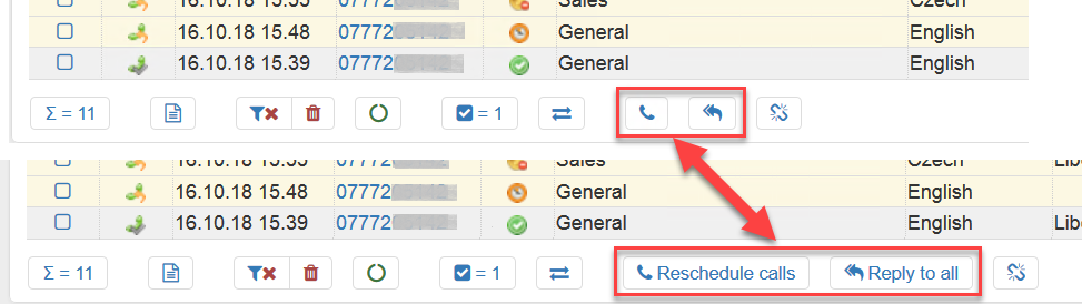
|
 icon, with the
  workflow.
Simple chart
Note
In case of a network outage, the graphs will refresh themselves after the reconnection. Applies to all types of graphs.
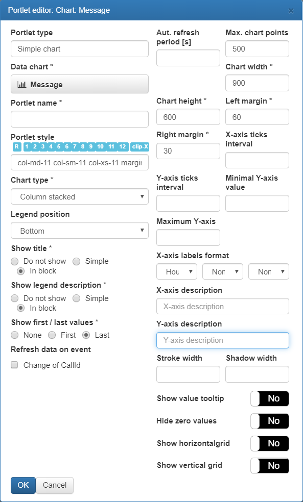
Page element in the Edit mode
An editor used to set element properties.
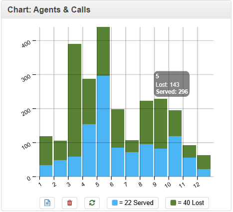
Element appearance in the browser.

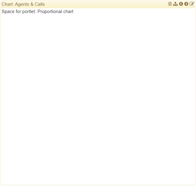
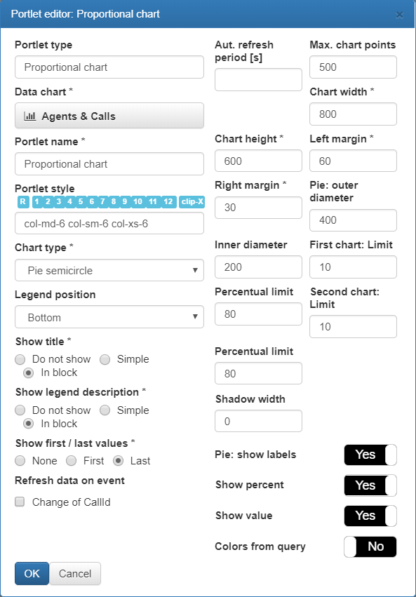
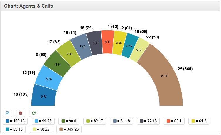
Proportional chart
Page element in the Edit mode
An editor used to set element properties.
Element appearance in the browser.
Note
In the data query used to fill the chart with data, you can use the @RecordId parameter whose value is automatically replaced with the corresponding parameter of @InboundCallId or, as the case may be, @OutboundCallId. It applies to both simple chart and ratio chart.
Navigation
The Navigation portlet creates a menu with buttons or tabs to navigate to other portals of the same navigation group.
Usage
It is very easy to operate it. A tab represents a link to the given portal.
Settings
Settings |
Description |
|---|---|
Orientation |
Horizontal or vertical, and style.
|
Show labels |
Indicates whether portal names should be displayed. 

|
Black panel |
Indicates whether it should be displayed on a black background.

|


Agent log-in
The agent login portlet is a drop-down list that allows users to log in to a workplace and select their status.
Usage
The first time you open a portal page, you will be logged out.
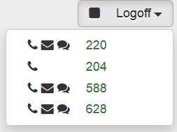
You have to choose a workplace for your further work. The portlet displays workplaces that are currently free and available to you. The available workplaces have been set by the supervisor or consultant by means of seating.
In front of the name (usually the number of the assigned telephone extension), there are icons indicating the workplace options: whether it is possible to make calls from the workplace, handle messages, handle chats. The workplaces that you have recently used are listed first.
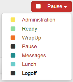
When you sign in to your workplace, you will be in the default status. It is usually called Pause and it disables you from immediately receiving calls, messages, etc. Only when you select a status such as Ready or the like will you actually start to be “at work”, and FrontStage can distribute requests to you.
Note
Colors and status names are customizable and may therefore differ from the images shown here.
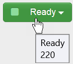
When you hover your mouse cursor over the portlet, it will show you to which workplace you are currently logged in and your status.
Important
At the end of the work, it is essential that you log out to free the workplace and associated extension. If you forget or for any other reason, you may be subject to a forced logout by the supervisor (or your status can be set to any other status).
Settings
The agent login screen has only one setting - whether to align left or right.
Settings |
Description |
|---|---|
Portlet alignment |
Aligns left or right. |
Personal settings
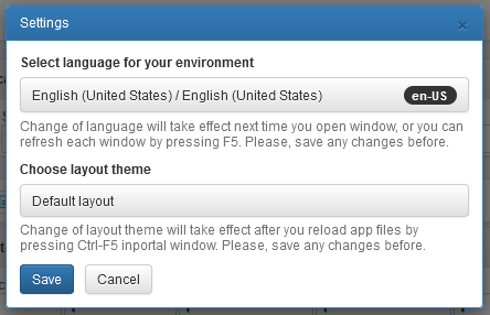
The Personal Settings portlet is a button that opens a dialog with your personal settings. The most important option here is the environment language.
Usage
After clicking the button, dialog with personal settings is open. Likely the most important setting is user interface language.
Settings
Settings |
Description |
|---|---|
Portlet alignment |
Align left or right. |
Show labels |
Indicates whether only the icon or also the caption should be displayed on the Personal Settings button.
|
 or
or 
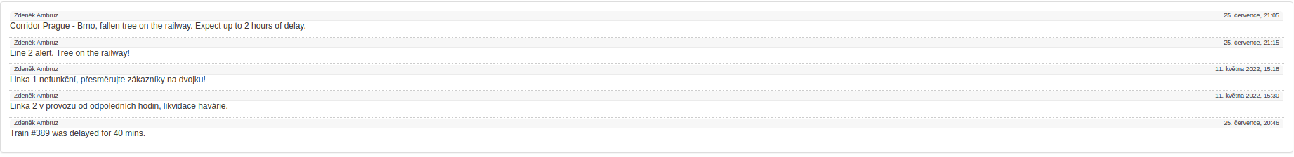
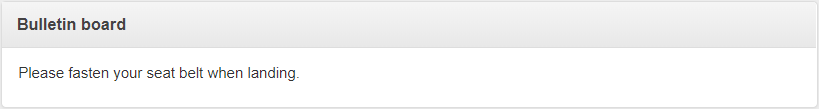
Notice Board
Portlet is used to display to agents important short alerts defined by their supervisors.
Note
In case of a network outage, the notice board will refresh itself after the reconnection.
Usage
Portlet is used for showing the notifications, after clicking the particular one, you will be able to see its detail in standalone window (pop-up window)
Settings
Settings |
Description |
|---|---|
Panel name |
Unique name for given notice board gives you the option to pick a particular board for your message (if your instance has more notice boards). The name condition applies to Agent notice board 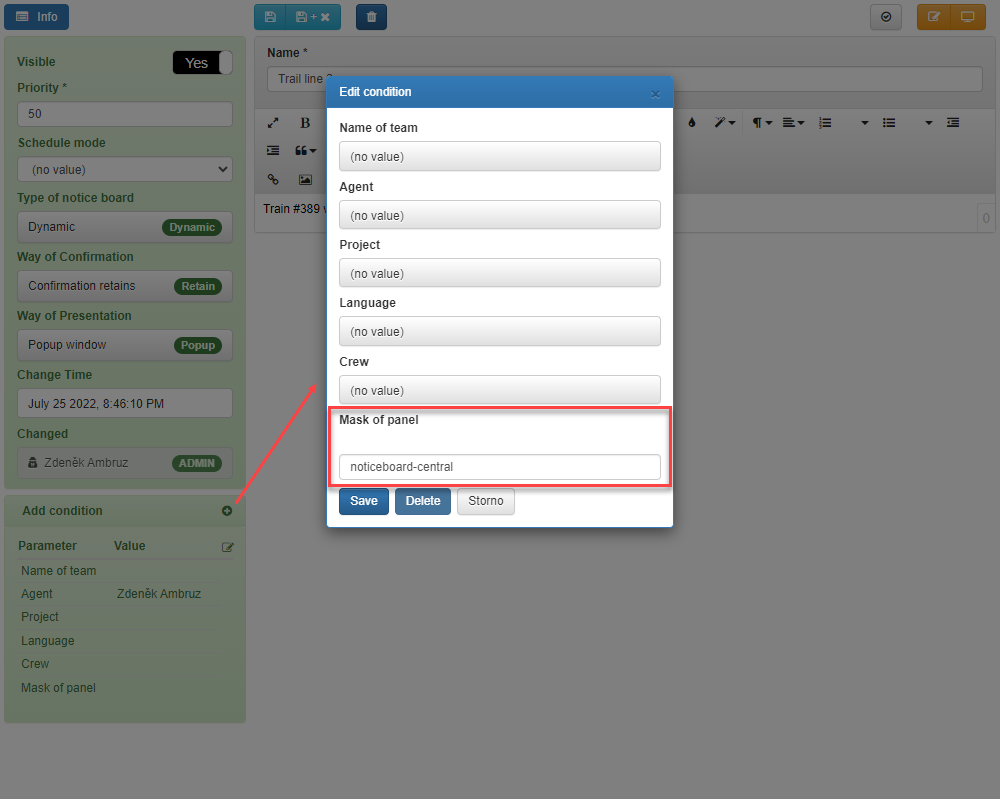
|
Framing |
Framing portlet. Radio button among values
|
Automatic refresh period [s] |
If set, alerts will be refreshed every X seconds. |
Show actor and time of last change |
Yes/No switch. If the value is Yes, the header of each notification shows the name of the author and a date (time of the last change) |
Element styling |
See Styling |
Portlet type |
inserted portlet type, read-only text, visible when editing the portal |
Portlet name |
User picked name, choose unique names for better orientation when editing the a portal |


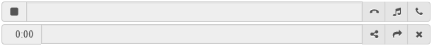
Call bar
The call bar is used for receiving, dialing and controlling calls. The agent uses the call bar instead of working with a telephone.
Important
Unlike the rest of portlets, this portlet cannot be placed to portal more than once.
Usage
Note
In this section, you can find a refference to portlet controls. Practical usage for accepting, making and controling the calls can be found in Inbound Calls and Outbound Calls.
The call bar consists of two bars – the specific call bar ([1] to [5]) for call handling and the bar ([6] to [10]) for transferring to an external number. Depending on the layout you have set, both bars can appear side by side or under each other.
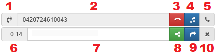
Meaning of each of the parts:
[1] indication of inbound call ringing, outbound call dialing or ongoing call
[2] displays the phone number for an inbound call ** or allows **a phone number for an outbound call to be entered
[3] hang up
[4] put on hold to wait (with music)
[5] dial/answer a call
[6] call duration
[7] enter a number for consultation or transfer
[8] dial a second call and start a consultation
[9] transfer call to another number – either directly without consultation or as a next consultation step
[10] end the second call (consultation) and return to the original call
[11] Turn On/Off Call Recording
Settings
Settings |
Description |
|---|---|
Layout |
Radio button setting call bar layout.
|

Current call information
Portlet is used to set current call’s metadata.
Important
Unlike the rest of portlets, this portlet cannot be placed to portal more than once.
Usage
Note
In this section, you can find a refference to portlet controls. Practical usage for accepting, making and controling the calls can be found in Inbound Calls and Outbound Calls.
If there is no current call, portlets is empty with disabled buttons.
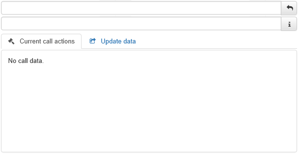
In case of current call, you can set call result, change project or other metadata.
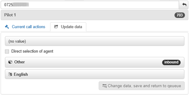
Settings
Portlet contains the Update data tab, where you can choose the project for the ongoing call. The drop down menu is filled by data querry, whose ID is set up in DropDownProjectsInCallInfoDataQueryId config parameter.
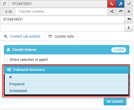
Attention
Previously, all dropdown lists with projects were handled by the query set in DropDownProjectsInCallDataQueryId; now this parameter handles only calls. A custom one has been created for the portlet. Please pay attention to this when updating FrontStage.
Current call editor
Porlets is used to set contact and/or issue related to current call.
Important
Unlike the rest of portlets, this portlet cannot be placed to portal more than once.
Usage
Note
In this section, you can find a refference to portlet controls. Practical usage for accepting, making and controling the calls can be found in Inbound Calls and Outbound Calls.
The portlet on the page has three different forms depending on whether or not a call is in progress or has just ended.
If there is no current call, portlet is empty.

During a call, the portlet displays one, two or three vertical zones, which are used to view the history and edit the contact or, if relevant, issue.
After the call ends, the portlet offers an option to open the previous call in a new window.

Settings
Settings |
Description |
|---|---|
Layout |
Radio button sets portlet layout.
|
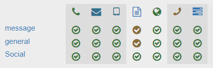
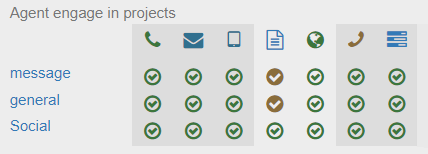
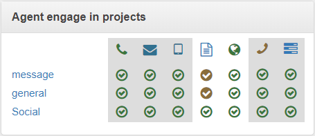
Agent engage in projects
Portlet is used to change project engagement by agent themselves.
Usage
Settings
Settings |
Description |
|---|---|
Show title |
Whether and how to display portlet title. Radio button among values
|
Project group name space width in px |
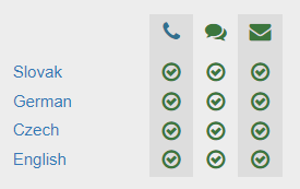
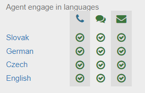
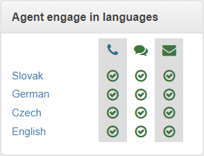
Agent engage in languages
Portlet is used to change language engagement by agent themselves.
Usage
Settings
Settings |
Description |
|---|---|
Show title |
Whether and how to display portlet title. Radio button among values
|
Language name space width in px |
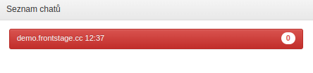
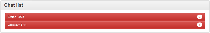
Chat list
A portlet showing a list of chats that have been assigned to you as an agent.
Usage
Status |
Preview |
|---|---|
No chat |
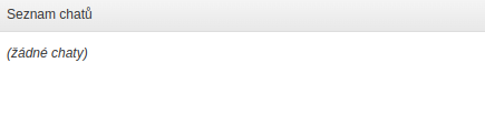
|
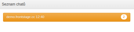
You have been assigned a chat but have not yet accepted it (clicked on it) |
|
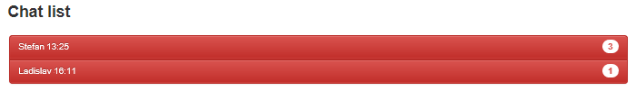
Chat ongoing; there are messages in the chat that you have not replied to |
|
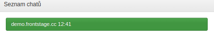
Chat ongoing; all messages have been replied to |
|
Note
The number displayed for each chat in the list indicates how many messages from the customer you have not yet replied to.
Settings
Settings |
Description |
|---|---|
Portlet type |
Pre-filled when inserting; it can be modified by the user |
Portlet name |
Pre-filled when inserting; it can be modified by the user |
Portlet style |
See Styling |
Portlet glyph |
See Glyphs |
Chat list height |
Chat list height in pixels |
Show title |
Radio button among values
|
Display small buttons |
The Yes/No switch adjusts the line height in the chat list. 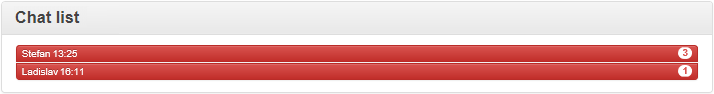
|
Show gateway |
If enabled, the chat list indicates through which gateway the communication came. For example, “Facebook”, “WhatsApp”, etc. See more at Social platforms (ServiceLink). |
Show project |
If enabled, the chat list indicates to which project (queue) the communication is assigned. This information can help with faster orientation in the chat list. |

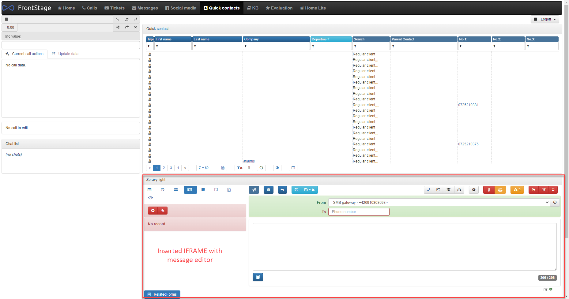
Embedded IFRAME
Portlet, which allows you to display another, built-in, web page on a single portal. It can be another portal within FrontStage or any web page.
Usage
Portlet will display exactly the set up web page, no specific controls needed.
Settings
Settings |
Description |
|---|---|
Portlet type |
read-only text - “Embedded IFRAME” |
Portlet name |
user definable name - for admin purposes |
Element styling |
See Styling |
Portlet glyph |
not used in this case |
Height |
Portlet height in px (insert a value without a unit), range 20 - 1000 |
URL |
URL address, which will presented within the portlet. It has to be used with the https protocol (http address won’t load correctly) |
Show title |
Do not show/Simple/In block (behaviour same for all the previous portlets) |
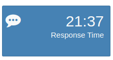
Tiles
It’s a portlet, which is designer to present the data in quick and clear form. Typically summarization data, like time spent during active calls, length of actual agent status, number of currently active chats, etc.
Background data for this portlet are delivered by data-querry, which you can create in administration, section. The data-querry is then paired with this portlet through it’s editor in ReactClient. Data-querry can fully influence the behaviour of this portlet
Note
In case of a network outage, the tile will refresh itself after the reconnection.
Background data-querry example:
SELECT 1 as [Rank]
,'Response Time' as Text
      ,(select  CONVERT(varchar(5), DATEADD(minute, (AVG(DATEDIFF(SECOND,AnswerTime,DistributionTime))),0), 114)  from icc.dbo.chat
where AgentId=@MeAgentId and AnswerTime is not null) AS Number
      ,'#4682B4' as BackColor
      ,'#F7f9f9' as FrontColor
      ,'fa fa-commenting' as Glyph
      ,'' as Url
Settings
Settings |
Description |
|---|---|
Data query |
Data-querry selection, which will provide the background data |
Portlet name |
User definable name, choose a unique one for better orientation in case of more tiles |
Element styling |
See Styling |
Portlet glyph |
See Glyphs. It’s possible to define the glyph right inside the data-querry. Example - |
Show title |
In case of tile, title is ussually defined right in the data-querry. Example- |
Automatic refresh period [s] |
value in seconds; represents the time, after which the data-querry is called and thus the presented data are updated |
Height |
units - px, rem, %, … |
Minimal width |
units - px, rem, %, … |
Maximal width |
units - px, rem, %, … |
Tile style |
See Styling |
Tile left margin |
units - px, rem, %, … |
Tile top margin |
units - px, rem, %, … |
Font size - number |
units - px, rem, %, … |
Font size - text |
units - px, rem, %, … |
Text and number right margin |
units - px, rem, %, … |
Font size - glyph |
units - px, rem, %, … |
Glyph left margin |
units - px, rem, %, … |
Pop-up window parameters |
The parameter for the pop-up window is a string passed onto the If not set, it follows the value from the |
Responsive |
Yes/No switch. Decides, if the tile has firm dimensions or acts responsively, when the window dimensions change. |
Note
Tile colours can be defined only throuht the background data-querry, using the BackColor and FrontColor params.
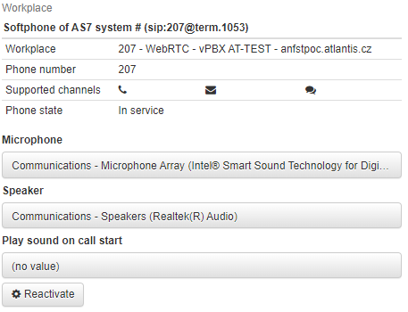
Workplace
A portlet that displays information about the workplace where the agent is currently logged in.
You can set up workplaces in Administration –> Agents –> Workplaces, where the information displayed here is taken from.
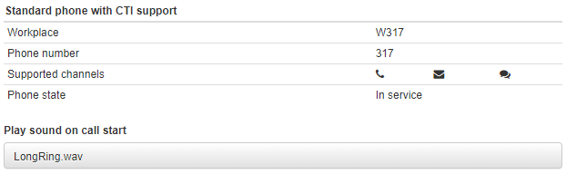
The agent can set the notification sound for inbound communication in the displayed portlet.
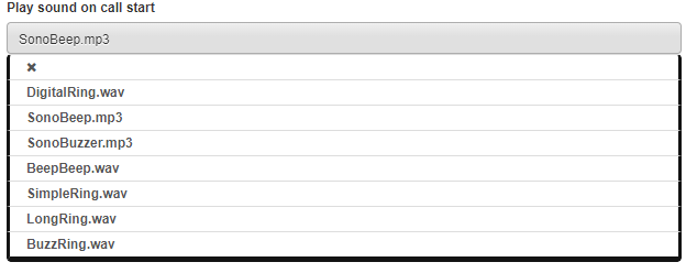
If it is a workplace with “WebRTC” for the AS7 PBX, you can set which audio devices are used for audio playback and recording.
For this type of workplace there is also the Reactivate button available. This is useful in cases where two terminals are connected to the workplace, e.g. a physical SIP phone and a WebRTC phone within FrontStage.
For example, if you last answered a call on a physical phone and now choose to work only in FronStage, use the Reactivate button to ensure that calls are answered correctly within the system.
Note
The reactivation function is available for terminals with the PhoneType parameter set to AS7anCTIups or AS7anCTIupd in the configuration.
Call listening
For information and control of listening in, use the Call listening portlet, which you should add to a convenient place in the supervisor’s portal.
Listening-in status |
Portlet options and appearance |
|---|---|
Listening-in in progress |
View the name of the extension that is currently being listened into, pause or resume listening 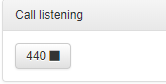

|
Listening-in ended |
Display the reason for termination for 30 seconds (the call was ended by both parties, the call was interrupted due to an error, etc.) 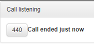
|
Listening-in not in progress |
The portlet is empty 
|