Teams Client
Teams client is a web application using graphical styling based on Microsoft Teams. The new concept offers a redesigned look and a modern control style. The application can be run from the web environment or can be integrated, as a plug-in, directly into the thick MS Teams application on your computer. These versions are not fundamentally different from each other, only the plug-in version has a differently oriented main panel. The layout of the elements of this application is fixed and therefore absolute customization is not possible, as you are used to with the React client.
Note
TeamsClient (TC) also works with DesktopClient (DC). If you have TC running and click on a button in DC that opens an external application (chat, message, etc.), this link is processed by the server and the corresponding object is opened directly in TC, on the Mainstage tab. In case of opening e.g. another chat from the DC, a new preview of the object is opened in the same TC instance, no new browser tab is opened. The behavior applies to both the web and plug-in versions of TC.
Login
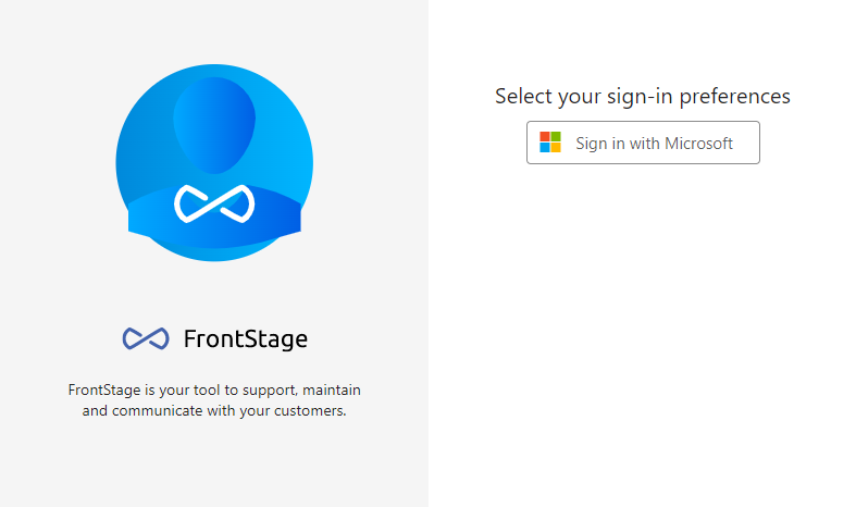
Logging into the app has been redesigned to make it as fast and straightforward as possible. You can login to the app with account created by your organization. So in most cases, just click the button that directs you to the appropriate authentication method and don’t enter your login, as you probably already have it stored in your browser.
Workplace selection
After a successful login, a menu will appear with a selection of workplaces. Only those where you can log in using this application will be visible. These can be selected from the Recommended dropdown. Another option that speeds up logging in is to select Most recetnly used (the workplace you worked at before you last logged out).
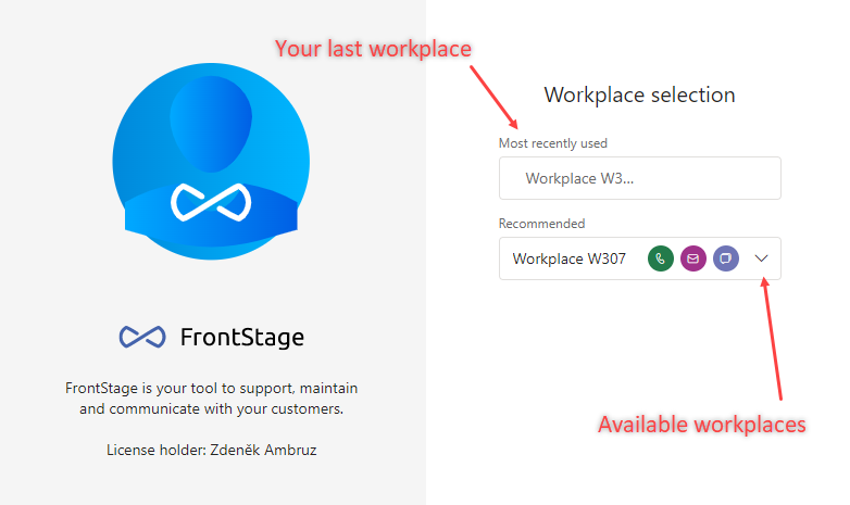
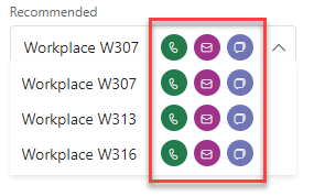
Selection with the help of the Recommended drop-down menu contains additional information about the workplace. It is a graphical representation of the allowed channels that you can operate from that workstation.
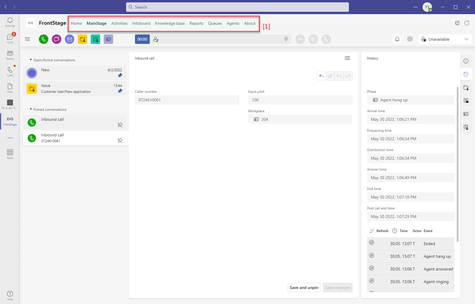
Element layout
Once you have successfully selected a workplace, the Teams Client application itself opens and you can now operate it.
It is divided into several sections:
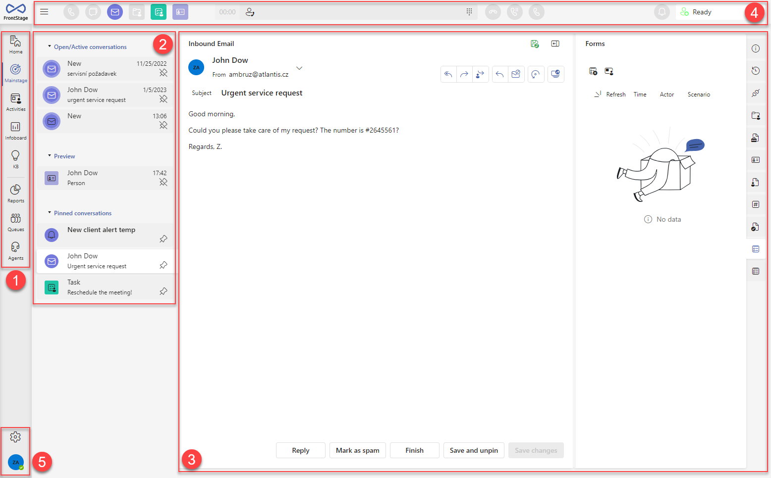
[1] -The main toolbar, used to navigate between the tabs of the application
[2] - The contents of the tab you selected in section [1] This can be a list of conversations or other signposts. For some tabs, this section is not available.
[3] - Conversation form, including subtabs - the form depends on the selected conversation in section [2]. For some tabs this section is not available.
[4] - The top bar of the application, which is populated with several different functional elements - setting up a new communication, quick actions/notifications, calling component, agent state. We will discuss in more detail below.
Individual application tabs
The main toolbar contains several tabs, each of which has its own specific function.
Mainstage
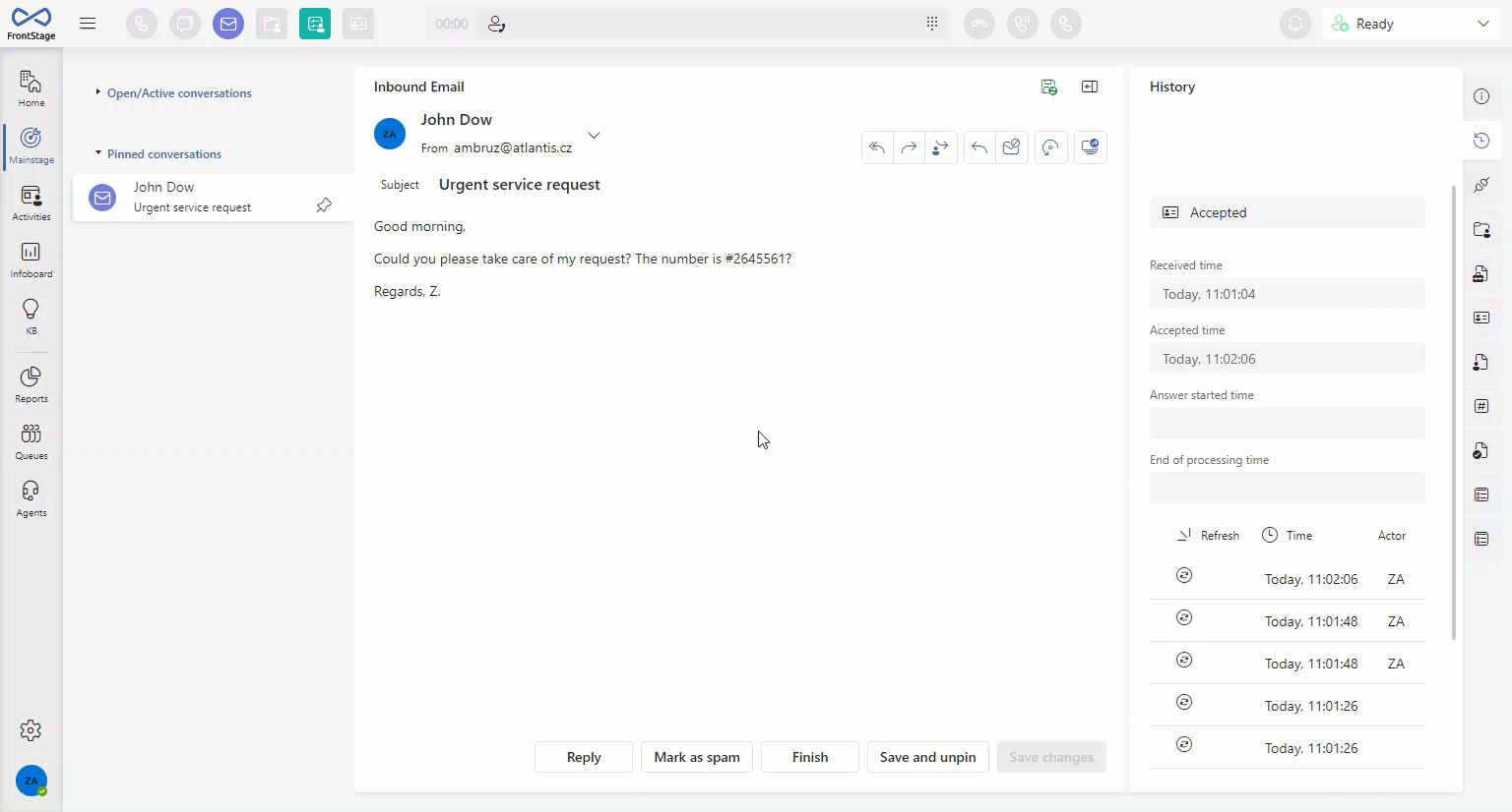
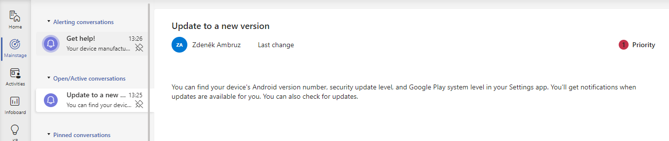
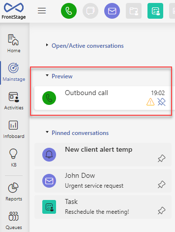
The tab serves as a hub for all the communication you handle within TeamsClient. In one panel you can clearly see all the active conversations you need to work with, and underneath you can see a clear history of the important items you have created. In addition, it serves as an editor for all existing objects, e.g. calls, cases, messages, contacts, etc. The individual records of the grid are also opened in the form of this tab when selected. From Mainstage, you will therefore edit and browse all the entries you need for your daily routine.
After opening it, you can see the content section ( [2] - see picture above) and the form of the current message/object ( [3] - see picture above).
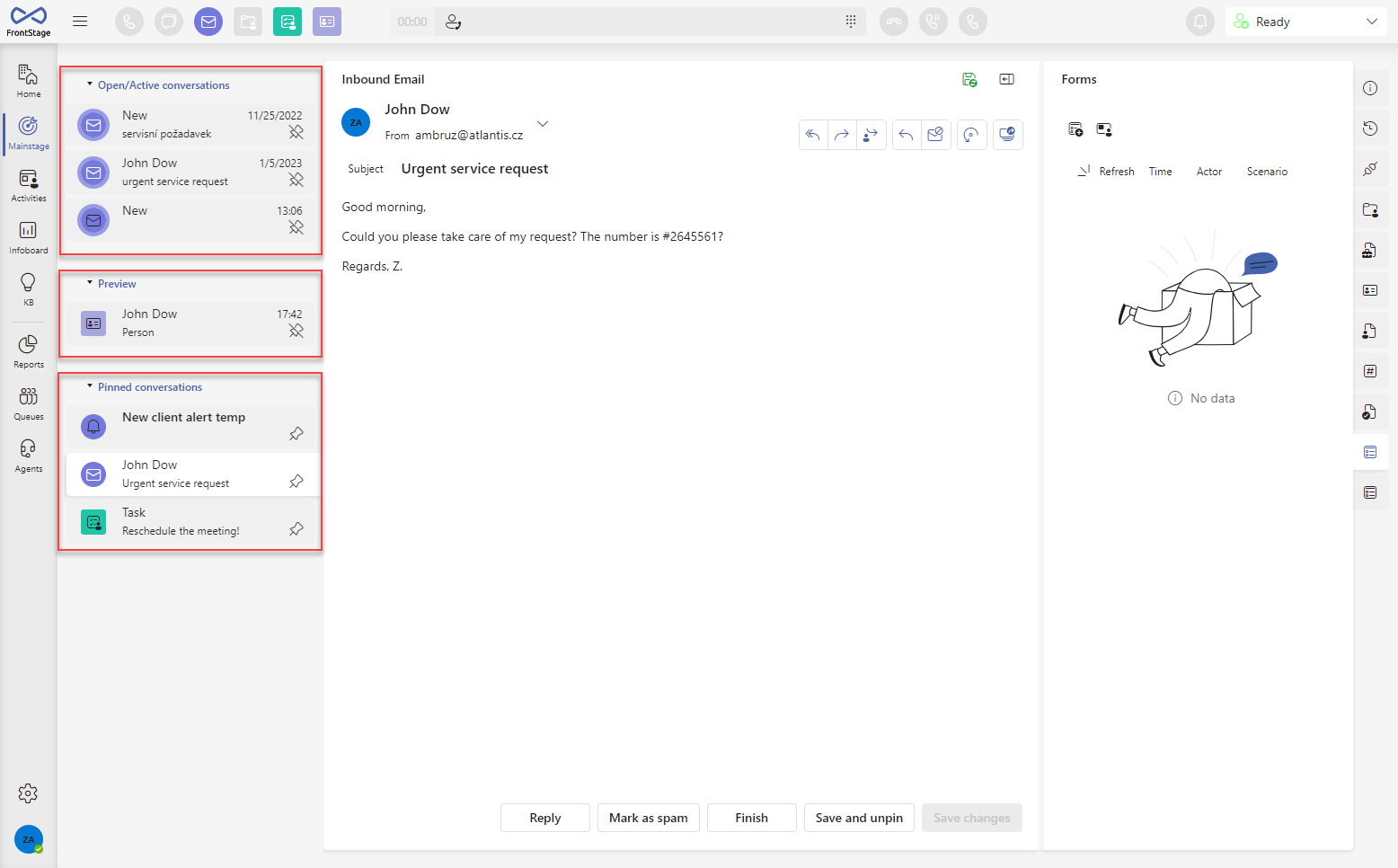
The content is divided into three groups:
Open/Active Conversations - brings together conversations you are currently working on that are not yet resolved/completed
Preview - records opened from the grid
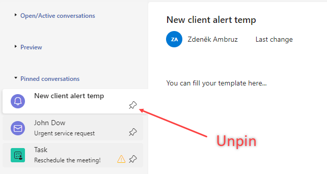
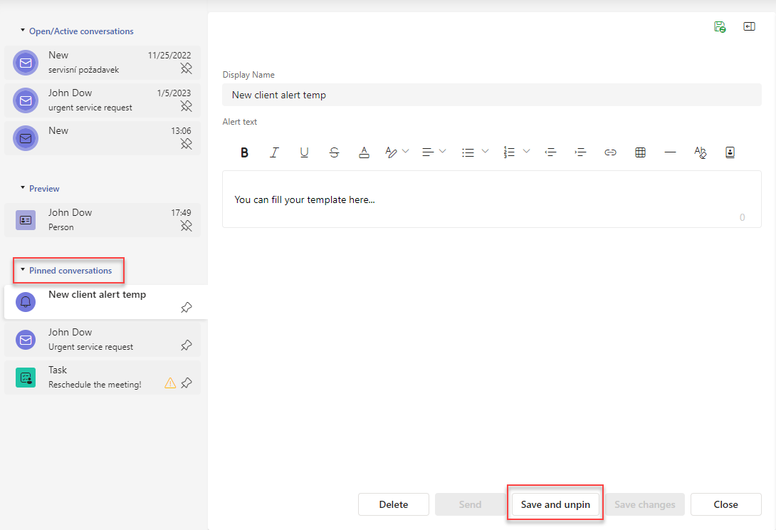
Pinned Conversations - all pinned conversations/objects, this is a custom list created by the agent
Tip
You can hide and show individual groups by clicking on their name.
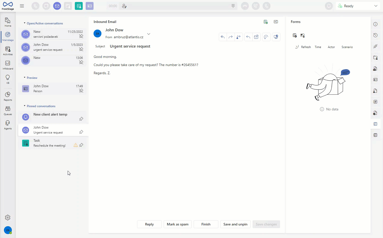
The groups mentioned above can contain either standard objects or alerting objects, whose icon flashes, which means they should be taken care of with priority.
Objects which can be alerting:

By clicking on a specific report/object, you can open the form that relates to it. So each object has a specific form form.
The form also contains subtabs that group information about the object, its links to other objects, history of changes, etc. The number and content varies depending on the open object.
General bookmark functions
The tab gives you a lot of options for working with specific objects. Many of these options are linked to specific objects and appear dynamically, depending on the content. Here we’ll go over the general ones that are available everywhere.
Pin/Unpin
You can pin any object so that it is always visible in the Pinned conversations group.
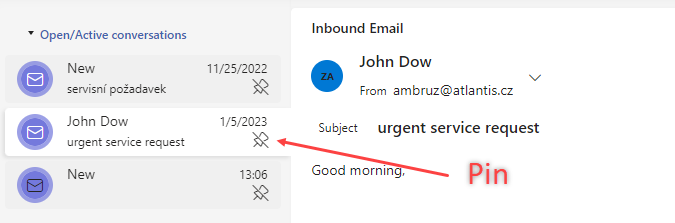
Unpinning is then done analogically, i.e. by clicking the button again. If the object has already been pinned, the icon is slightly different.
A special option for unpinning an object is the Save and unpin button, which appears only for an object that is already pinned and is opened from that section.
Form width change
The width of the form is fixed and cannot be changed at will, in order to maintain a clear layout in relation to other elements of the application. If you would still like to adjust the width, you can use a special button that will resize the form to a compact size, giving more space to the sub-tabs. If the form contains more than four buttons, they will shrink into one button represented as 
Saving the data
The data you edit in the form is not automatically saved, you have to confirm the saving manually. You can do this in several ways.
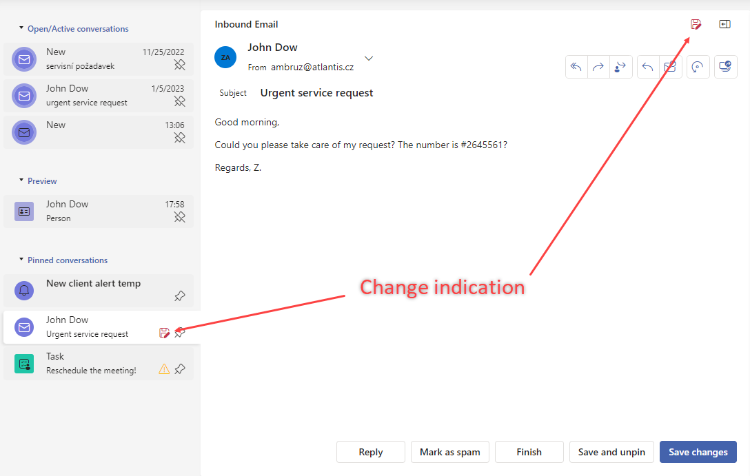
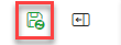
In the form and the list of content, an underlined “floppy” icon appears next to the modified object, indicating that the object has been modified in some way and it is not saved. In this state, edits are only visible under your login and other agents will see the older version of the object. The icon itself also serves as a button, so click it (both in the content and the form) to confirm the save. Once saved, the icon will disappear.
Another option is the Save changes button, which is activated in the form.
Unsaved changes will remain under your profile and will be indicated when you move to any other objects. They will not be lost even if you log out.
If the modification was not intended and you want to undo it, use the Discard Changes button to return the object to its original form.
The green diskette icon on the form means there has been no change, and everything is saved.
Form errors
There are three types of notifications that can occur in the form. The first one is when you need to fill in some mandatory data that the application expects for its correct functionality. The second type is more of a warning, about important data from our point of view, which would be good to have filled in, but you have not done so yet. The third type is an error alert when some data do not comply with the logical conditions.
If one of these occurs, an information icon will appear in both the form and the list of content to indicate which object requires your attention.
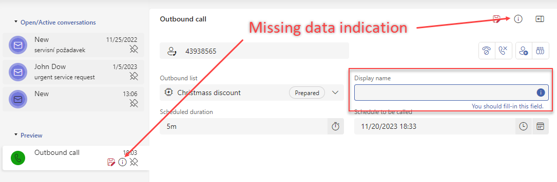
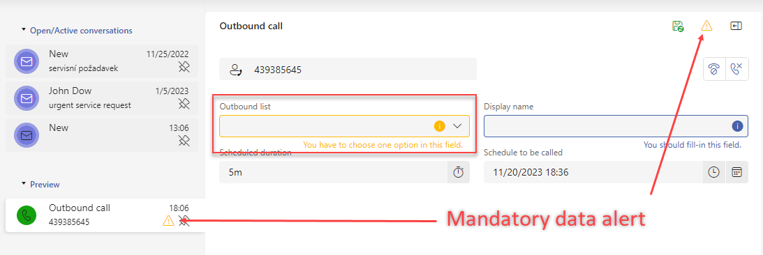
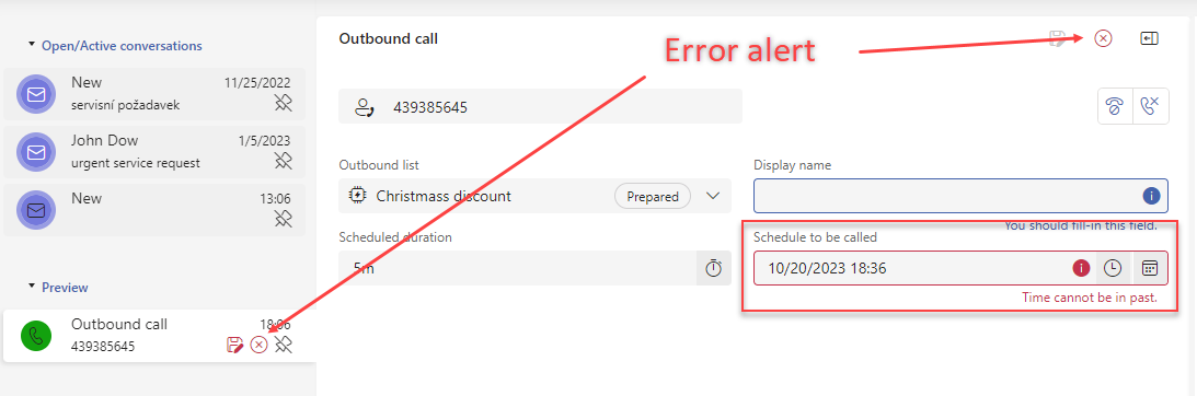
The open form of such an object will then tell you which data needs to be added, as you can see from the pictures above.
Another option is to click on the icon in the form and the Form Error Summary window will appear, displaying all warnings as a list. All types of warnings can be in this window at the same time.
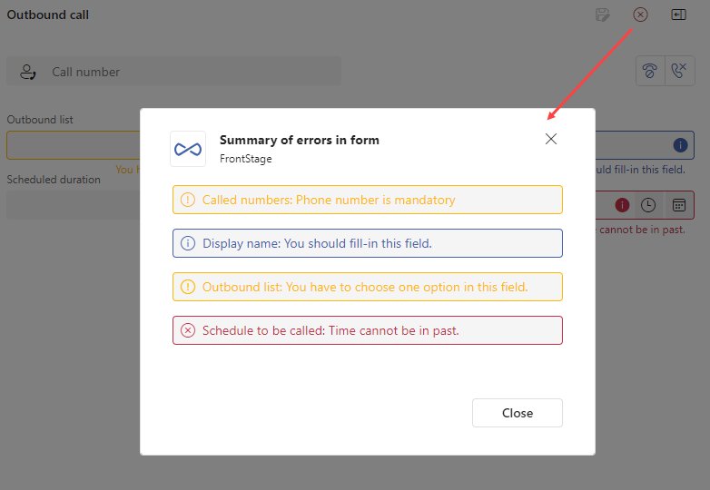
After filling in the missing data, the warning disappears immediately.
Activities
The tab is used to group grids (data tables) that are important to you.
When you open this tab, you will see a name list in section [2] that you can use to switch between the different grids. The content of a particular grid is always displayed in section [3].
Note
Grids can also be divided into groups, so section [2] can have a tree structure in this case.
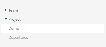
Grids can be added as needed, this will be provided by your supervisor/admin.
Note
In case of a network outage, the graphs will refresh themselves after the reconnection.
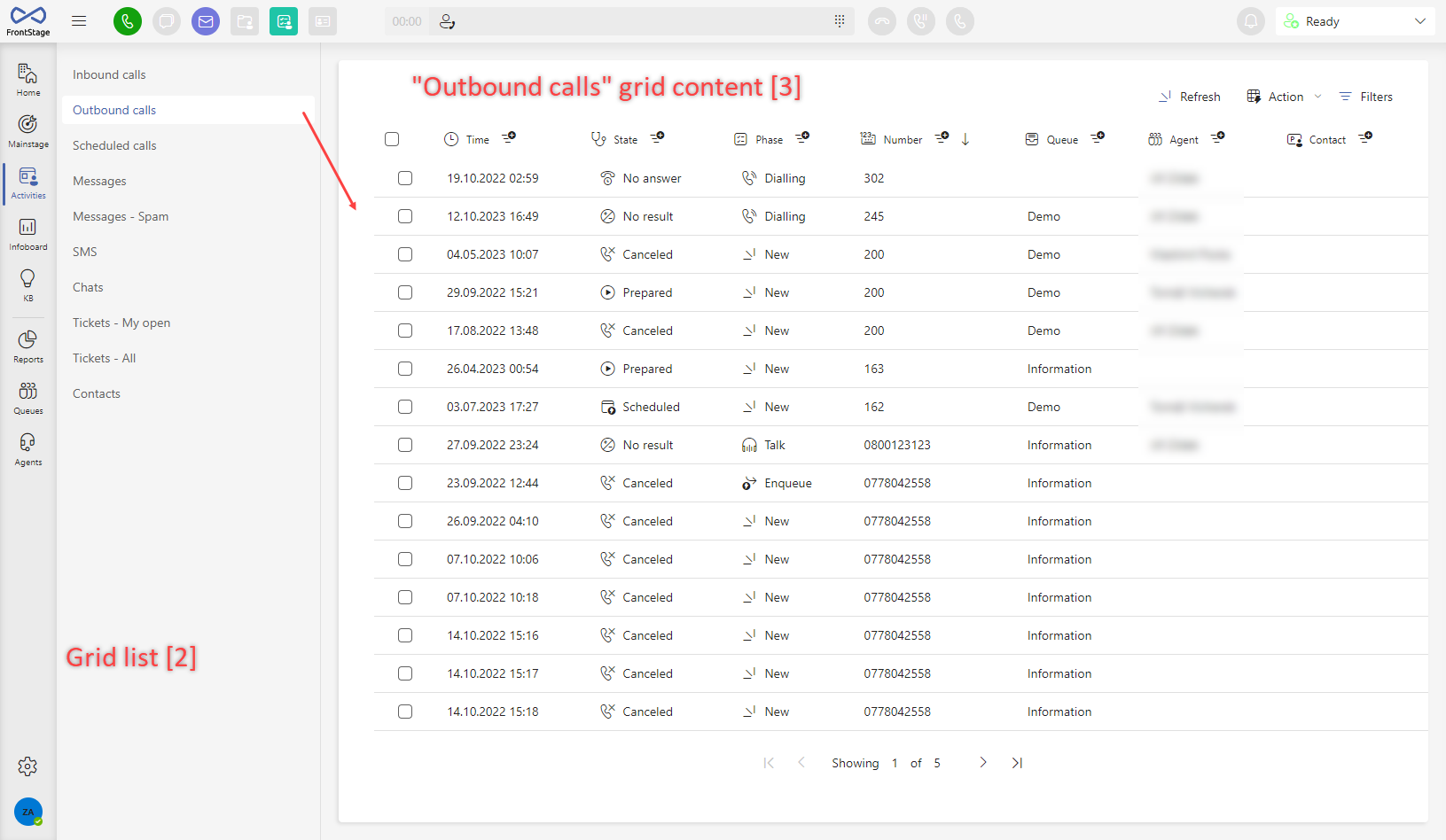
Grid controls
The content section of the grid can be divided into 3 parts:
[1] - Functions - operations you can perform on the data
[2] - Header - column names with icon and quick filter button
[3] - Data - individual rows of the grid
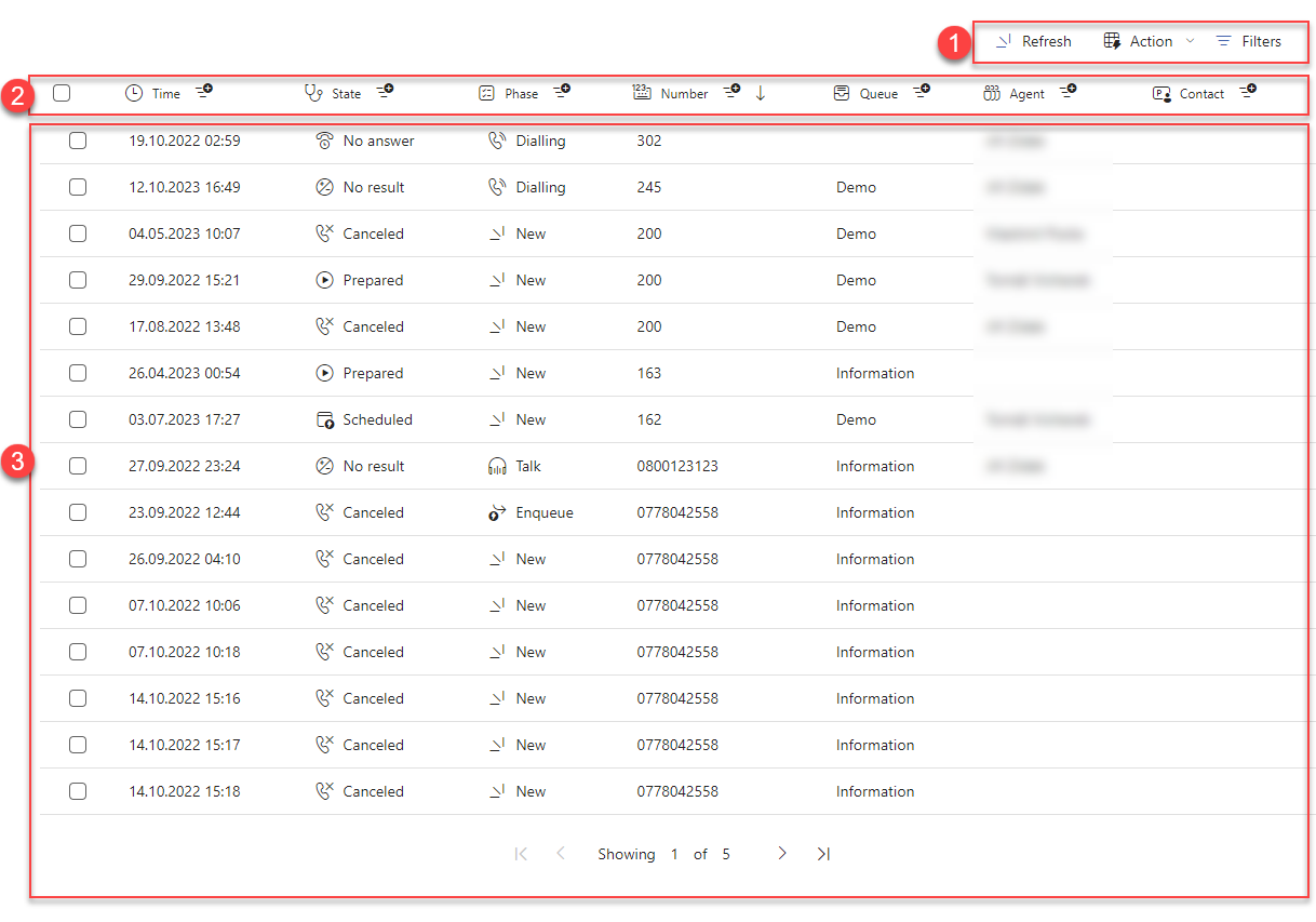
Functions [1]
Description of operations you can perform on the data in the grid.
Refresh
After pressing it, the data is reloaded from the database, so you can see the current state.
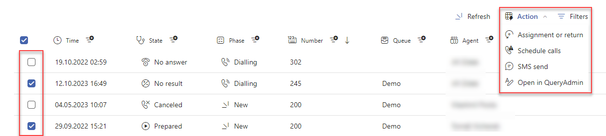
Action
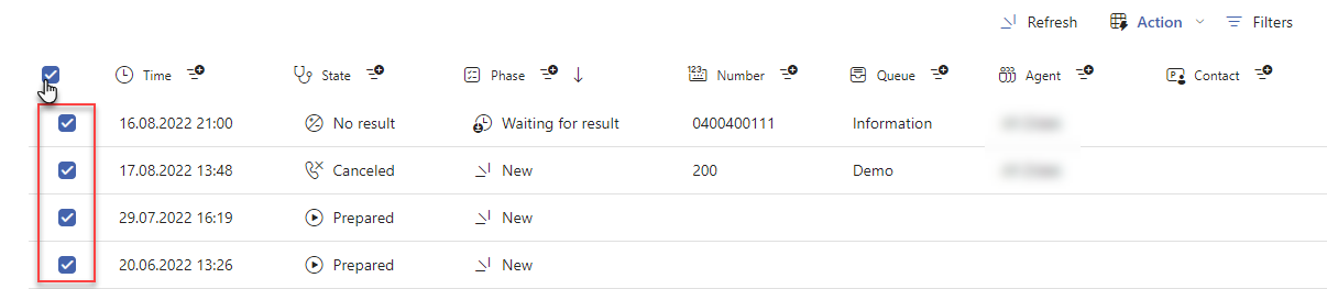
Actions that you perform on multiple records from the grid at the same time. To enable, you must select at least one record using the checkbox that is always at the beginning of the row. The action will be performed only on the marked records. The records remain checked until you uncheck this option (even after moving to other parts of the application!)
Note
You can adjust the access to particular actions, see Activities tab bulk actions.
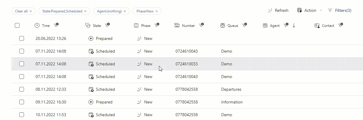
Filters
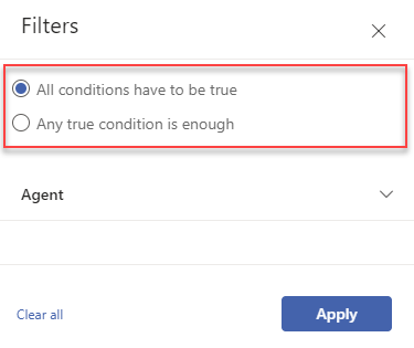
You can filter the records in the grid by the values in each column. You can apply any number of filters to the entire grid, confirm the resulting filtering by pressing the Apply button. Choose from two types of filter evaluation, when multiple of them are used.
All conditions have to be true - records which comply with all of the active filters
Any true condition is enough - records which comply with at least one of the active filters
Basically there are 2 types of filters:
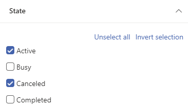
Selection from predefined values - for some columns there is a predefined list of values from which you can then select for filtering. Use Select all and Invert selection buttons to speed up your value selection.
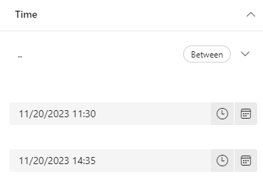
Enter any value - some columns can take any value (usually numeric data), so you have to enter the filtered value manually. Along with the value you can also choose the condition that the filtered records must meet in relation to the entered value, e.g. in the case of a time filter you can say whether to filter records that have a time greater/smaller/in range/etc. in relation to the specified time in the filter.
After each column name, there’s a filtration icon  . Click on it to open a filtration side bar, where selected column filter will be accesible and choose/insert the value.
You can tell if a filter is active by the number (shows the number of active filters) next to the filter button and also the individual filters are listed in the upper left corner, above the grid itself.
The best way to edit the active filter is to click on its filtered value above the grid, which will open the filtering menu with the already active values.
You can cancel filtering either in bulk, using the Clear all filters button, or by cancelling individual active filters.
Search
Search among the grid records with the help of the written text. This can make your work much more faster, when you encounter a lot of records. The search uses a “full-text” algorithm, so you don’t have to insert a completely accurate text, just a piece of it will do. The text will be compared to available database data and every corresponding record will be displayed.
Active search will be indicated as a visible text within a search field and as a filter badge (left corner above the grid) at the same time. Canceling the search can be done by deleting the inserted text from the search field or by clicking on the filter badge, like you are disabling the filter.

Important
The search doesn’t work on all of the grid columns, ask your supervisor about the current settings.
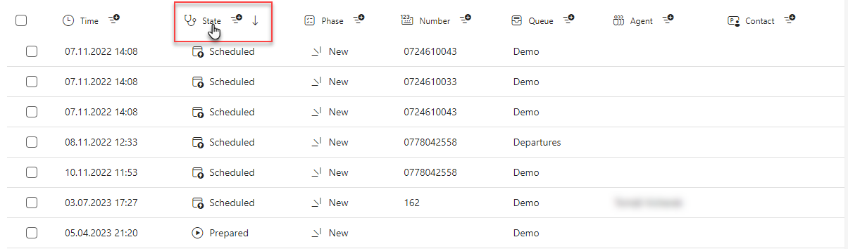
Header [2]
This section contains the names of the individual columns, including the glyph they contain. Clicking on a column name activates sorting by that column, after the first click the records are sorted in ascending order, after the second click in descending order. You can tell that records are sorted by a column by the arrow that appears next to that column (the direction of the arrow indicates the sorting style).
Tip
If you want to mark all visible records at once, use the checkbox at the beginning of the header.
Data [3]
This part contains particular records from the database, which are then displayed in the grid.
If all the records do not fit on one page, you can scroll through them using the buttons at the bottom of the window.
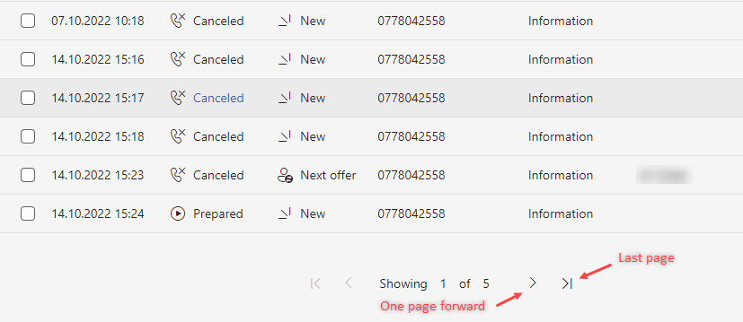
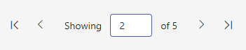
Click the text between the buttons to activate a mode, when you can insert a particular page number and show the page by pressing Enter.
Note
Number of rows per page can be configured per grid.
To open a specific record, double-click anywhere on its line. The detail is not displayed in the grid itself, but will open in the Mainstage tab (in the Preview group), which is designed for this purpose. You can go back to the previous grid by clicking on the Activities tab, which will display the one you were last working with (the page displayed is also remembered)
Infoboard
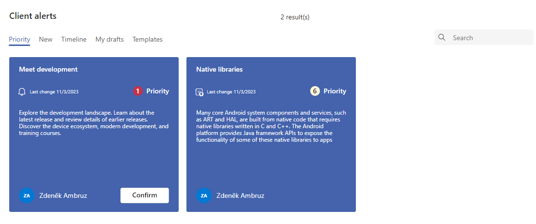
The tab acts as a bulletin board that shows you important messages entered into the system by the supervisor. It is divided into several subtabs that you can switch between. Each one shows you the posts in a different form for better clarity.
Priority - preview of posts (including priority) that you have already opened. Contains already confirmed posts (except posts with “Dismiss” type confirmation)
New - preview of posts which you have never opened (event “Shown” doesn’t exists for the user, see History subtab)
You are notified of new client alerts by the “bell”, located in the application header, which will switch you to the New subtab when pressed. The shown number represents the amount of new alerts (if no number is present, pressing the “bell” will switch you to the Priority subtab).

Note
Subtabs Priority and New show only posts that can comply with the schedule mode (means they can be visible the given date/time to the agents) and display condition.
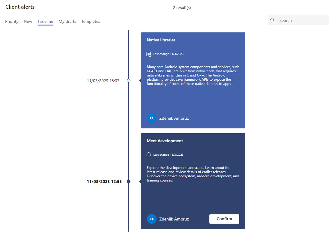
Timeline - previews of posts sorted by creation date
Note
The subtabs My drafts and Templates are only available to users who have authority to post and template, i.e. in most cases to supervisors.
In the top right corner, there is a box that you can use to search between messages. Simply enter a fragment of text and press the search button (magnifying glass icon).
Clicking on a post from any subtab will open a full view of it at Mainstage.
If you have sufficient permissions, you can edit the post from here.
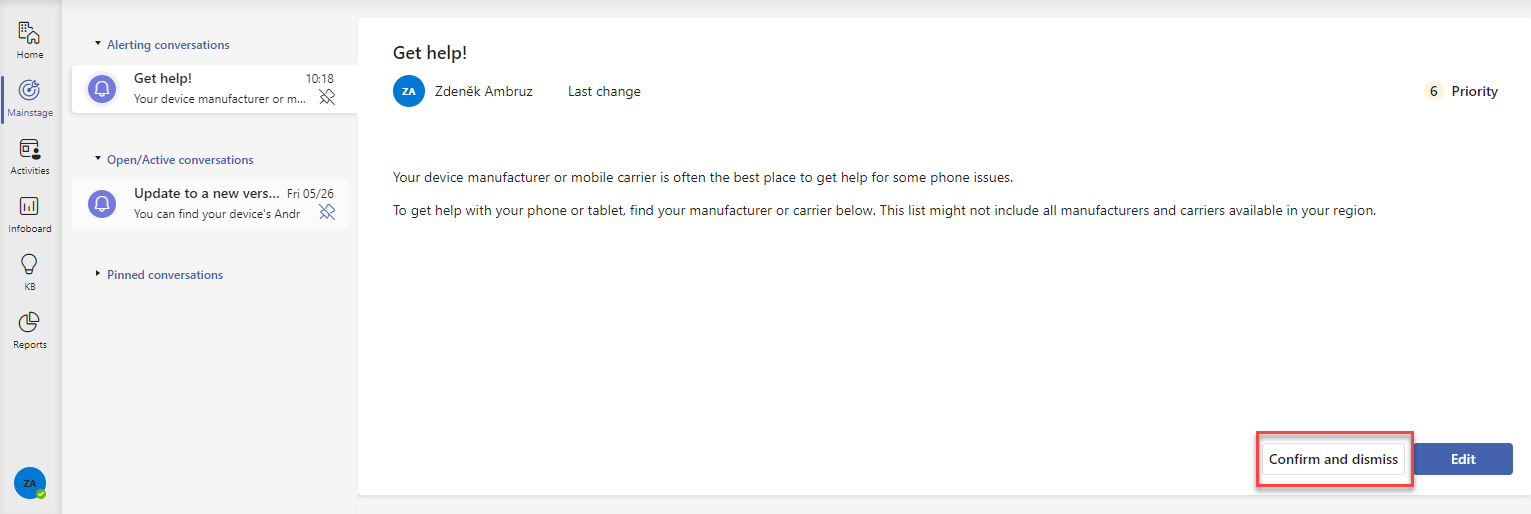
The post may require your confirmation. This serves as proofreading information for the supervisor. It will alert you of the need to acknowledge by having a flashing icon on the Mainstage tab, in the Alerting conversations group, and having a Confirm and dismiss button. The confirm button is also located on the bulletin board’s Priority and Timeline sub tabs.
The behavior after confirmation can be twofold, depending on the settings of the post by the submitter:
After confirmation, it will disappear from Infoboard and Mainstage and will not appear again
After confirmation, it is still displayed on Infoboard
KB (Knowledge base)
The tab serves for displaying the “knowledge articles”, which should represent any workflow or manual, how to behave in certain situations, for example: how to handle spam, how to set up your routine, to what data fill when and so on.
You can find the tab under the KB name (which is abbreviation for Knowledge base)
After opening the tab, you can see the New search [1] label in its list, which associates all of the KB articles, available at the moment
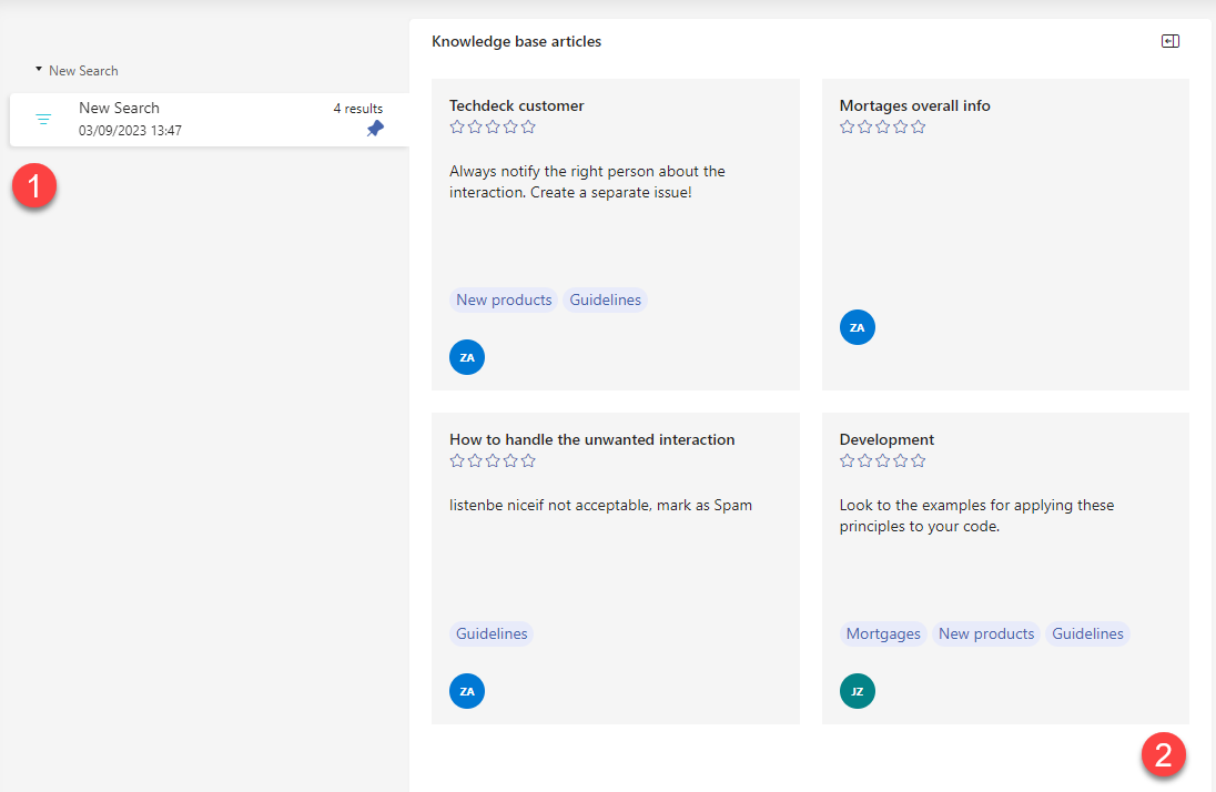
You can do the following with the articles: open/edit, rate the value, filter/create filter groups.
Open the article
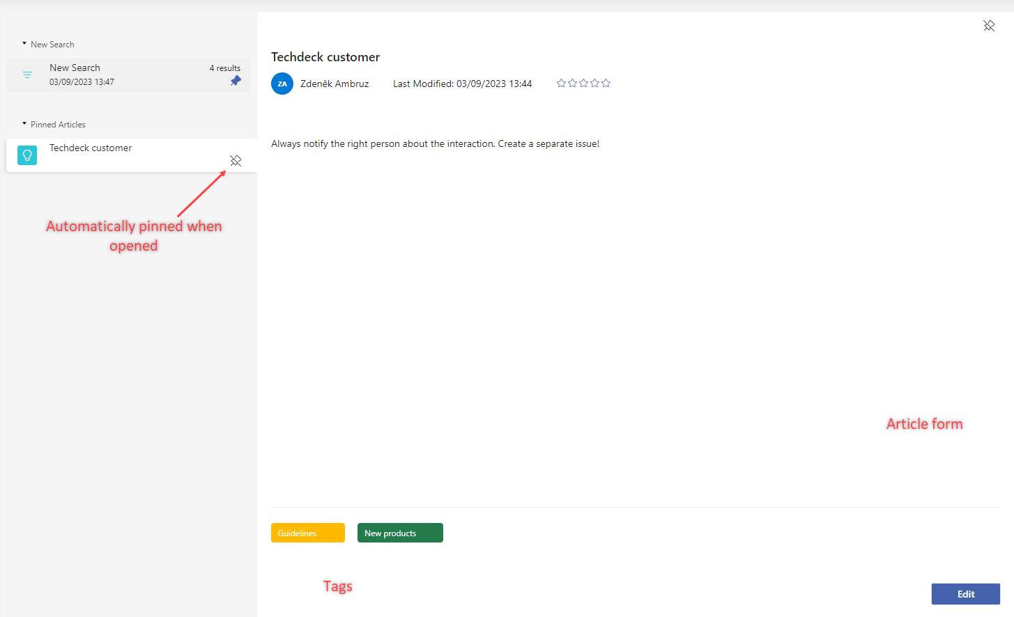
By clicking the article tile in the list, its form will be opened, where you can see the article’s text, including the formatting and tags.
Important
By opening any of the articles, you will pin it to your personal list. Until you manually unpin it, it will remain pinned, even when you close the KB.
Note
If you have sufficient rights, there’s an Edit button in the lower right corner. After clicking on it, the form will switch to an editor.
Article rating
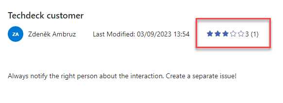
After reading the article, you can rate it, if you would like to. The rating can be entered within the article’s form, where in its header is located the “stars” item, dedicated to this purpose.
You can see the average rating and the amount of votes, at the end of the chart (the same info can be seen within the tile preview in the list)
Filtration and grouping
The list of the tiles can be filtered according to the available filter values and then the filtration outcome can be saved, so you can access it again, without filling in the filters.
The filters are located at the right side of the window, they work as usual, as a selection from possible values.
After filtering the required articles, you can save this list, by clicking the “Pin” button, on the New search item, which groups the currently filtered articles. This will trigger the pop-up window, where you can enter the title for the filtered group and save it.
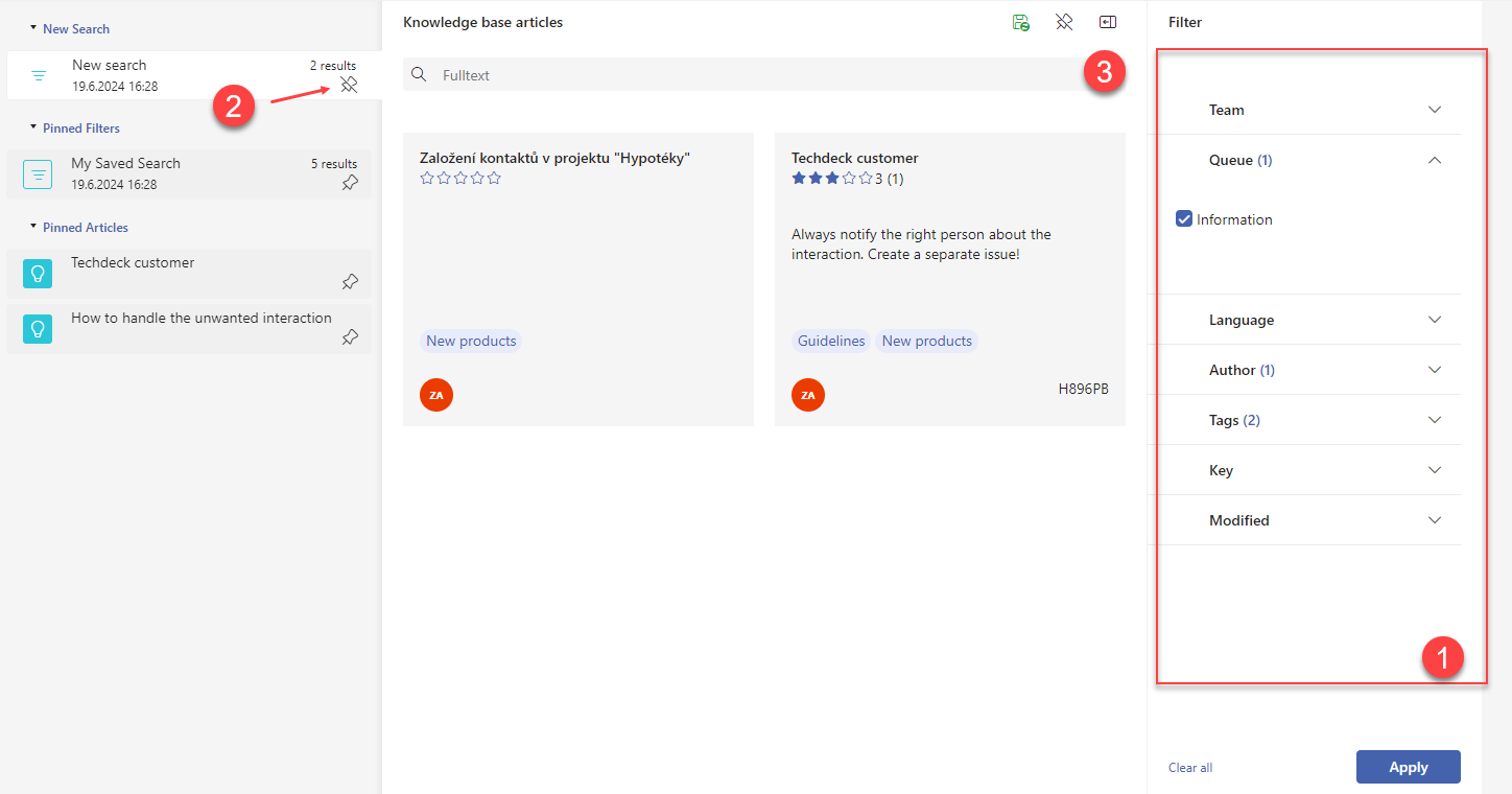
The filtered group then appears in Pinned filters, from where it can be used again anytime.
Note
The saved filter combination for any filtered group can be changed anytime. All you have to do is to open this group, set up new filters and use them, which will set new filter combination for the group.
Start a new conversation and add information
The top panel of the application contains the “hamburger menu”, under which you can create new conversations and enter additional information into the system.
Includes options like New call, New email, New case, New contact, etc (depending on your permissions)
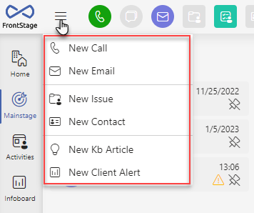
After clicking on any of the options, a window will appear where you can select additional information necessary for the correct function of the application and after confirming it, the form of the inserted object will open.
Individual objects are opened on Mainstage, in the Preview group.
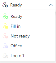
Change of agent status
You can change the status by using the status drop-down box from which you can select the currently desired status. The drop-down is located in the upper right corner of the window. Typically, you will find states for most call center agent activities - those when you are unavailable to handle calls (“Lunch”, “Pause”, “Training”, etc.) and also ready states (the basic one usually named “Ready”). The specific state name for ready may vary in your application. In addition, there can be more than one ready state - e.g. “Ready” can be for calls, with the “Email” state you are not receiving calls and are working on emails. For these reasons, we will use the term ready state to include all “working” states.

Defined statuses example:
Opening the most urgent conversation
To make sure you don’t forget to deal with any conversation or issue, there is a quick access bar in the header that allows you to view the most urgent conversations of that type.

The buttons represent conversations/objects in the following order: Call, Chat, Email, Issue, Task, Contact.
When you press the specific button, the Mainstage tab will open the form of the conversation/object that is considered most urgent. If no such conversation currently exists the button won’t be active (grayed-out) and hovering the cursor over it will change the cursor in order to alert you about the fact.
The principle of selecting the most urgent conversation
Conversations of a given type are grouped according to their possible states (if the object supports states). The groups are then searched and the oldest record in the group is presented to be worked on. If there was no record in the first group, the next group is searched.
For example: the issue has possible states Open, New, Hold, Wait, Closed. Nothing was found in the “Open” state group, so we go to “New”. Here are the issues with the dates “12.6.2022” and “13.6.2022”. The most urgent issue, which will be displayed is the one in “New” state, with the date “12.6.2022”.
For calls, the most urgent one is the call which is right now in process. If there’s no call in process, another one is selected, for example a newly created one or the opened one from the grid (Preview section). For contacts, the oldest one is selected.
States priority
The states are evaluated in the exact sequence specified here.
Chat and Task: Pilot, ICR, Waiting, Alerting, Active, ReActive, Answered, Closed, Lost, Served, ReLost. The date for the chat is evaluated according to the last incoming chat message.
Email: Alerting, Active, Held, Waiting, Answering, Answered, Closed
Issue: Open, New, Hold, Wait, Closed
Inbound Calls
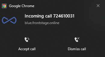
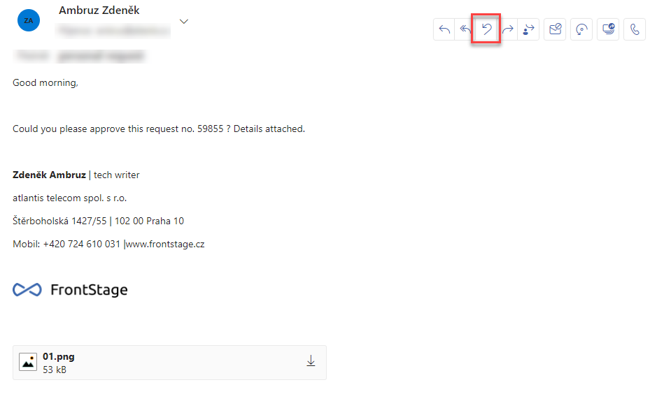
Incoming calls are handled by the component located in the middle of the header. It includes a call length counter and buttons for answer, hang up and hold.

When a call comes in, the caller’s number is indicated (if stored with the contact, the name is displayed) and you can answer the call using the green answer button.

Note
Your browser can also alert you about the inbound call, but it depends on the particular website notifications settings.
When a call is in progress, you have access to the hang-up (red) and hold (yellow) buttons. You can also see the ongoing call form, where you can fill in the details continuously.
When you press the call hold button, the caller is put on hold and will hear a waiting sound. A call that is on hold is indicated by a highlighted icon.
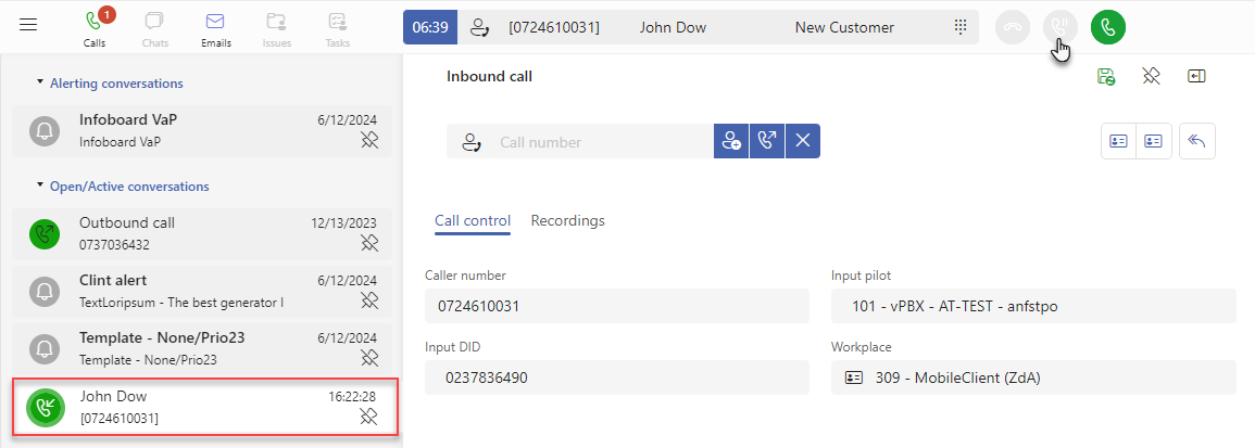
To resume the call, press the green answer button again.
Note
When the call is on hold, you can navigate between the different forms and search for information. You can quickly return to the call on hold form by pressing the special button in the header.

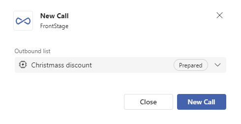
Outbound Calls
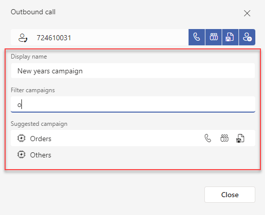
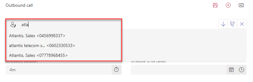
By clicking in the calling component area, you can open a pop-up window to enter the phone number and parameters of the outgoing call.
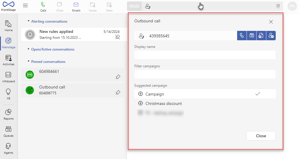
Enter the phone number you want to call in the field provided. Next to it are the call options:
Prepare on me - an outgoing call is established with you as agent, the call is being dialled
Prepare - an outgoing call to the specified number is created, waiting in the queue
Save draft
Private - a call is initiated to the specified number, the call is not stored in the application in any way
For each of these calls, you can define a Display Name and a campaign that you select from the provided list (for faster selection, there is a Filter Campaigns field to narrow down the suggested selection). Both pieces of information are then visible in the call form.
Important
To make an outgoing call you must be in the “Ready” state !
When you have an outbound call in progress, you have the option in the form for this call to work with it further and involve other agents. Just enter the phone number or extension number in the form field and you have the following options available:
Dial another call and start transfer
Transfer call to another party
Hangup split call and return to original caller
Form types
Each object in the application has its own unique form that contains only its relevant information. Forms are opened in the Mainstage tab.
Important
The forms support definition of additional buttons, which are not included in the default configuration. So the amount of buttons, you will see here, might not always be the same as for your instalation. More at Additional form buttons
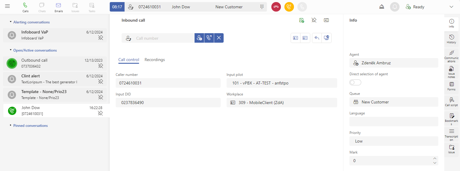
Inbound call
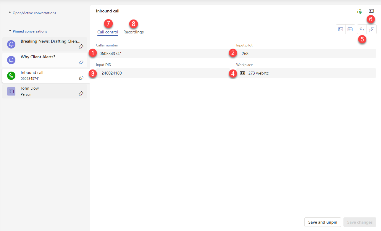
Caller number - the number from which the call was made, after hovering the cursor a button appears for quick copying to the clipboard
Input pilot - IVR pilot
Input DID - number called
Workplace - workplace where the agent handling the call was logged in
Call back - makes an outgoing call to the number from which the call was made
Related outgoing call, callback - switches you to the related call (a call usually created by pressing the Call back button)
If the call has dependencies on other calls, additional buttons will appear to cycle through these calls.

Incoming call chained after this call - it will switch you to the call, which was created later in addition to this call, available only if such a call exists
Incoming call chained before this call - it will switch you to the call, which was created earlier with a tie to this call, available only if such a call exists
Tied calls can originate in more ways:
by rescheduling the original call to another time
by transferring the call to another agent
by a predictive call
Note
The calls are internally connected by their IDs this way.
Call recording
If your system has the call recording feature activated, a specific form will open in a panel after the call has ended and its recording has been processed. It usually takes couple of seconds.
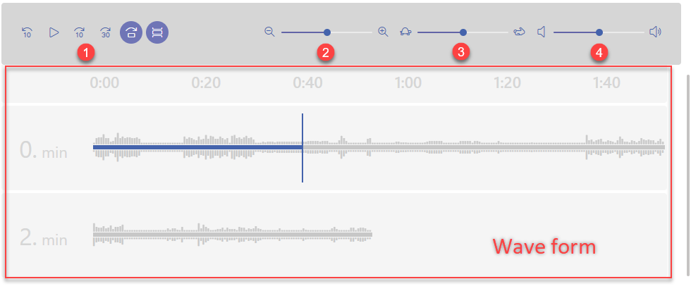
Playback controls
Timeline detail in the “Wave form”
Playback speed
Volume
Subtabs:
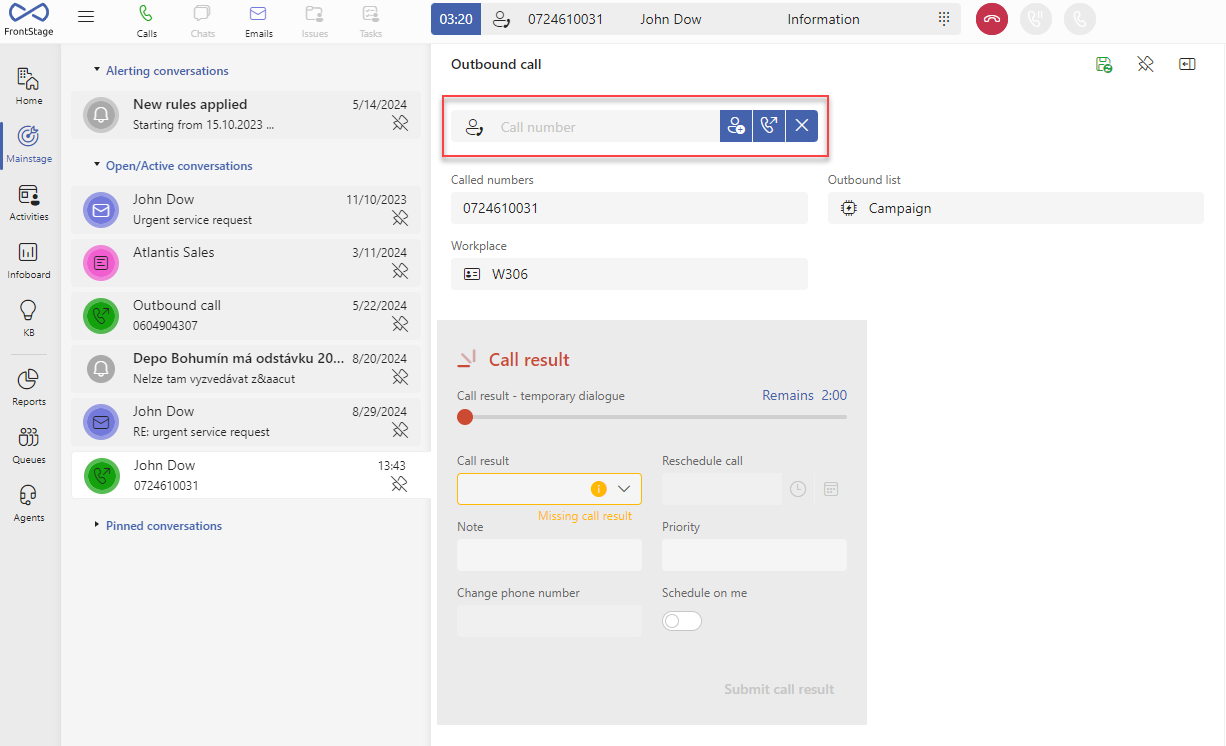
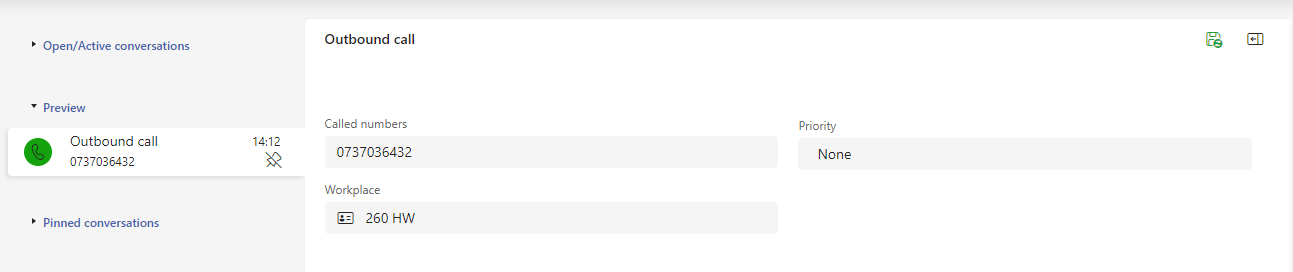
Outbound Call
Campaign call waiting to be scheduled
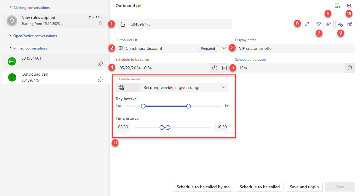
Called number - phone number of the opposite side
Outbound campaign - campaign assigned to this call
Call name - can be pre-filled or to be entered
Scheduled duration - presumed call length
Schedule to be called - date and time, when to offer the call to the agent
Related incoming call - switches you to the related call from which you created the outgoing call
Cancel call - the Scheduled duration and Schedule to call fields disappear, the call will not be distributed
Cancel call - deletes the call
Schedule to be called by me - schedules the call to be called according to Schedule to call and the attendant agent will be you (if another one was specified, the value will be overwritten)
Schedule to be called - schedules the call to be called according to Schedule to Call and the attendant agent will be the one listed in the Info subtab.
When buttons [9] or [10] are used, the call is already scheduled, and you can’t adjust the data anymore. If you need to change them anyway, a new button Pause call, so that it can be edited is shown, returning the call to the non-scheduled state, and data editing will be available again.
Inbound email
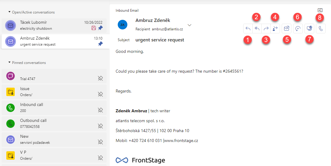
Reply - creates an outgoing email to the sender
Reply to All - creates an outgoing email to all addresses included in the message
Forward - forward the email to a new address
Forward to myself
Mark as spam - email marked as spam and closed, action can be reverted in the email form by clicking on Not spam
Return to queue - the assigned agent is removed and the email is again waiting to be received by another agent
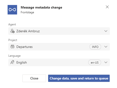
Change metadata - brings up the metadata change window
New call - if the email has a contact assigned to it, an outgoing call will be made to that contact (the contact’s phone number must be entered)
Subtabs:
Outbound email
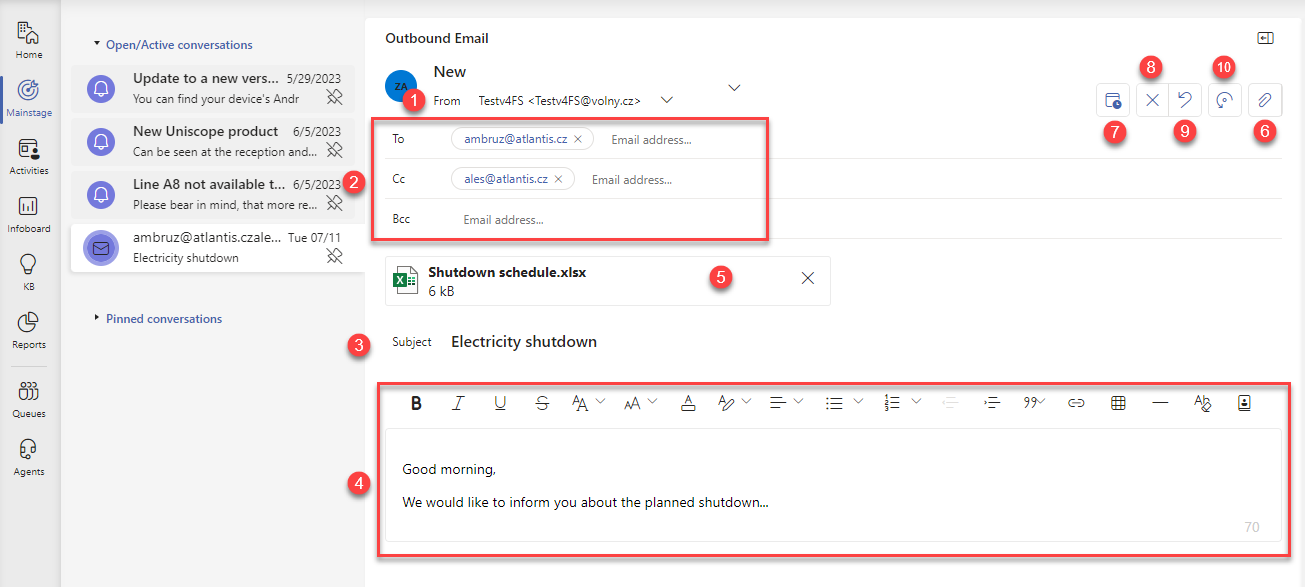
The email address to which the message will be sent. If defined, you can select from multiple addresses
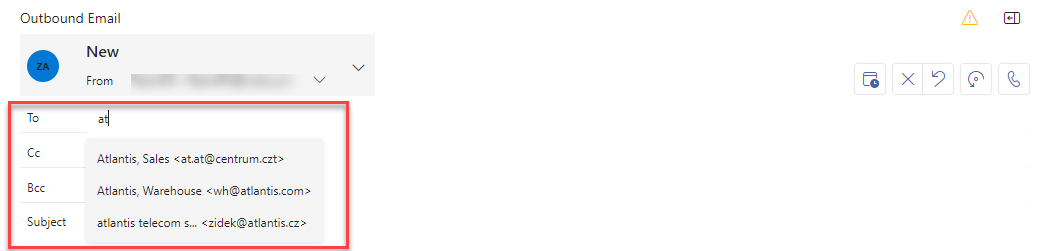
Recipients - the usual To, CC and BCC. If an email has a Contact assigned to it, which has an email address, this address will be offered by the whisperer when you click To (or even when assigning a contact).
Subject - the subject of the email being sent
Message body with formatting options
Message attachment
Add atachement - to attach a file from you computer (you can also use drag & drop onto the form’s space)
Do not send before - when clicked, the option to enter the date and time will appear
Cancel - deletes the email
Cancel and go back to the original - if the current email is a reply to an already received one, the current one is deleted and you return to the received one
Return to anybody else - the assigned agent is deleted on the Info subtab, an email will disappear from your Mainstage, can be found again through Activities
In case the email is not assigned to any agent, the Return to anybody else button will be replaced by Accept button. By using it, you will assign yourself as the agent on the Info subtab.
Important
To be able to use Return to anybody else and Accept you have to have AcceptMessage role assigned.
Subtabs:
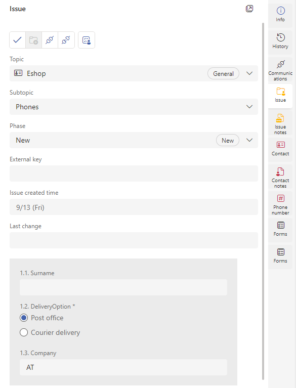
Issue
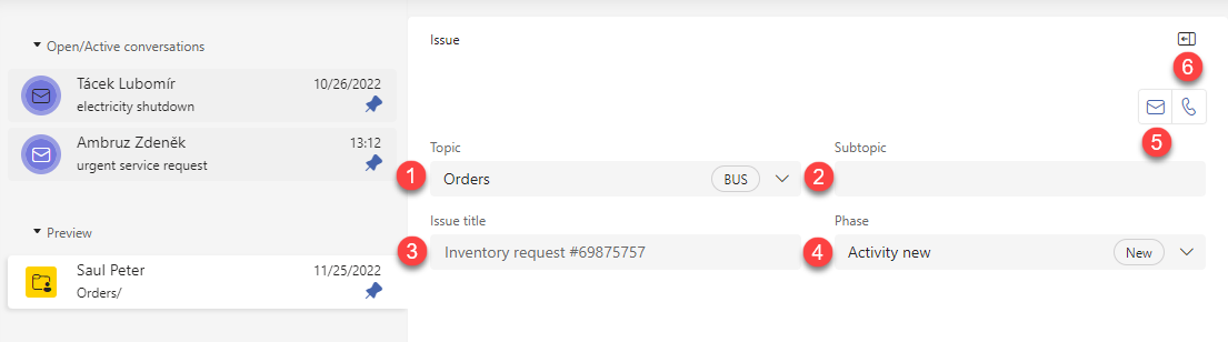
Topic
Subtopic
Issue title
Phase
New email - if the issue has a contact assigned to it, an outgoing email is created to that contact (the contact’s email must be entered)
New call - if the issue has a contact assigned, an outgoing call is made to this contact (the contact’s phone number must be entered)
Subtabs:
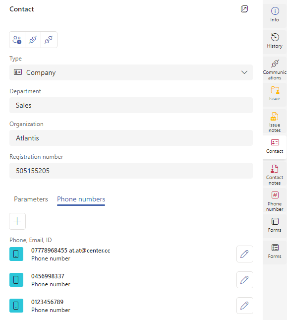
Contact
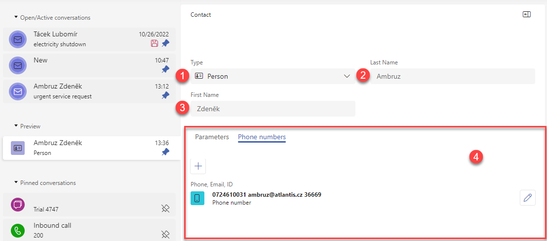
Type - selection from defined contact models, it influences how other form items look like, see Contact model
Last Name
First Name
Section of internal form tabs where you display either Parameters, Phone numbers, or Forms of the contact.
Note
Based on the selected contact type, additional form items may be visible, see Contact model.
Parameters
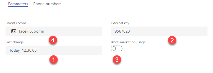
Last change - date and time of the last change
External key - ID for linking with external system
Block marketing usage - switch On/Off
Phone numbers
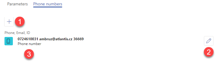
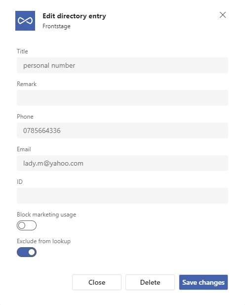
Create directory entry - opens a window for entering data
Edit directory entry - always refers to an existing entry that you want to edit
Existing directory entry - data entered
When you press the Create Directory Entry button, a popup window appears where you enter contact values such as phone number, email, name, etc. Settings options are also included:
Block marketing usage - switch On/Off
Exclude from lookup - if ON, the call whisperer won’t offer you this number / the email whisperer won’t offer you this email
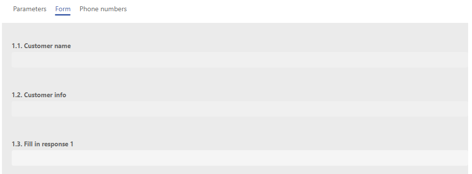
Form
You can see here a form that is set for the selected contact type, see. Contact model, Scenario item.
Subtabs:
Webchat
Ongoing chat window
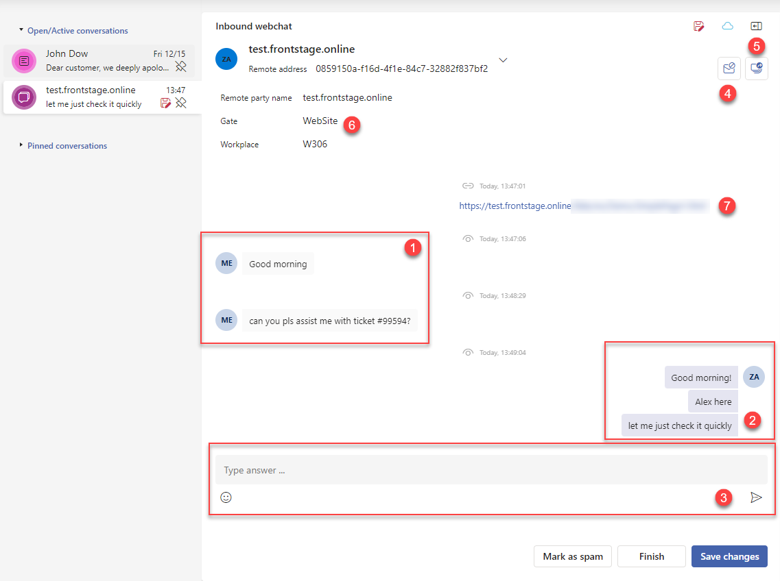
On the left side there is a text from the customer
On the right side is a text from the agent
Agent reply field, only visible if chat is still active
Mark as spam - chat will be ended, marked as Spam
Change metadata - brings up the metadata change window
Internal chat data, available after expanding the menu
Full URL of the site where the customer triggered the chat (optional, can be set for a particular gateway).
You can see the information of delivering  or reading
  above every text group in the chat window.
In a situation where the webchat has not yet started, two extra buttons are visible:
Accept chat that rings unsuccessfully at another agent - chat switches to the new agent, cannot write for now, waiting for button 2 to be pressed
Start chat - agent can start typing
Chat activity
As an agent, you have the possibility of checking whether the customer is still active and when was the last time he was active.
You can see the sun/cloud icon in the upper right corner of the window:
 - Customer active
 - Customer inactive
If the customer is inactive, you can see his last active time by hovering the cursor over the icon.
Note
To learn more, check the Counterparty status article.
Subtabs:
Communication
Task
Creator point of view (draft)
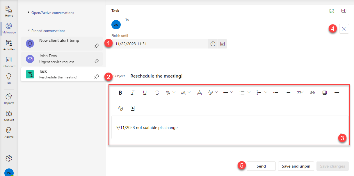
Expected finish date/time
Task subject, headline
Message body with formatting options
Delete task
Publish the task to the queue, where it can be accepted by other agents to work on
Before accepting
The form looks the same as above, there are two new buttons. You can’t edit the text at this moment.
Accept - you accept to solve the task, and your name is filled in Agent item on Info subtab, the task state is updated to “Open”.
Return to draft state - returns the task to draft state, see picture 1
Solver point of view
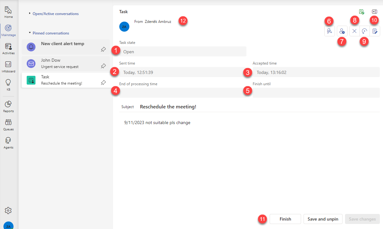
State, work progress information
Time of publishing the task into the queue
Time of accepting the task by assigned agent
Time of finishing the task (button [11] pressed)
Expected finish date/time
Switches the task into the “Waiting” state, new button to resume the work will appear
Switches the task into the “Hold” state
Delete task
You are no longer the solver, value for item Agent on the Info subtab is emptied
Returns the task to the “draft” state (see picture 1)
Closes the task as finished, switches the state to “Closed”, no buttons available at this moment
Agent who created and published the task into the queue.
Subtabs:
Communication
Outbound SMS
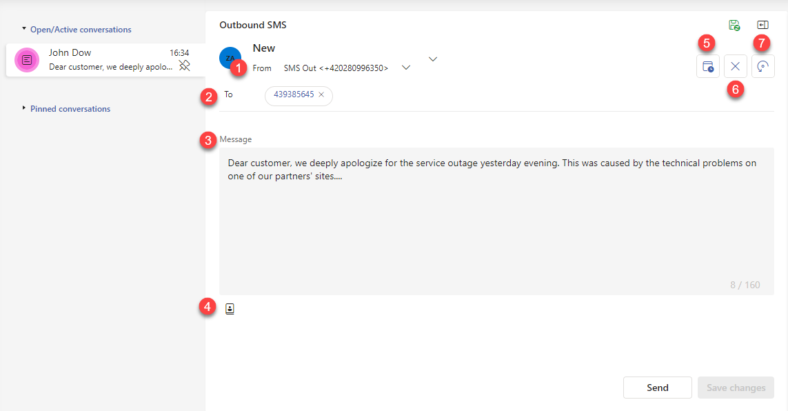
Outbound gateway selection, which is tied with the sender number (if only one gateway is available it will be selected by default)
Receiver’s number. You can manually type the number and confirm by pressing the Tab key or start typing the contact’s name and select from the displayed results.
Message text that will be sent.
Template selection. It will populate field no. [3]
Schedule for sending later.
Cancel - Deletes the message.
Let somebody else to finish - Displayed only in case of assigned agent to this message (Info subtab). By pressing, you will remove assigned agent, and someone else can accept it. Without any agent, the Accept button is displayed. -

Subtab types
Forms always contain subtabs that group various information relevant to the object and provide links to other objects in the system. For the location of subtabs, see. right side of section [3]. The appearance of individual subtabs may vary slightly across forms because not all fields are relevant to particular objects.
Warning
Displaying a particular subtab depends on the ChannelUsage parameter. If a channel is unused, its related subtab will not be visible anywhere.
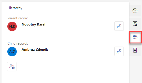
Issue
Assign an existing issue to an object or create a new one directly. Then display information about the issue.
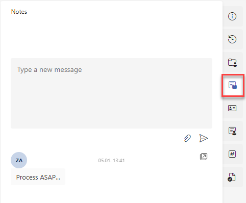
Issue notes
Notes that are saved to the linked issue (also visible via the issue form). Without a linked issue, you cannot add anything.
Contact
Assign an existing contact to an object or create a new one directly. The contact information is then displayed.
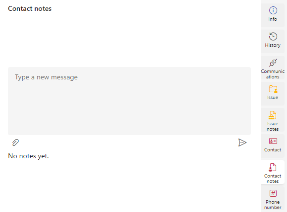
Contact notes
Notes that are saved to the linked contact (also visible via the contact form). Without a linked contact, you cannot add anything.
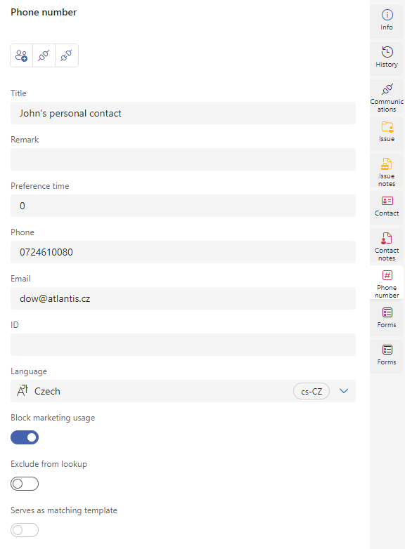
Phone number
Assign an existing phone number to an object or create a new one directly. The information about the phone number is then displayed.
GDPR
Categorisation in the context of the sensitive data protection.
Phonebooks
Available for contact only. Option to add it to the phone book.
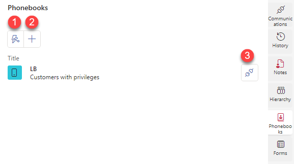
Refresh displayed data
Add to existing phonebook
Remove from particular phonebook
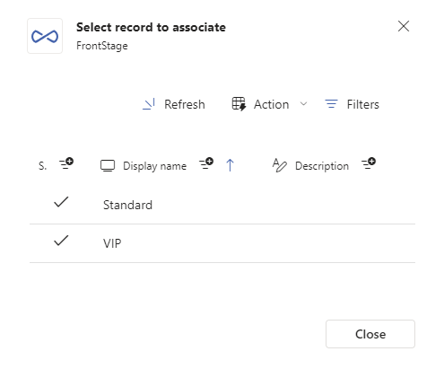
By pressing [2] you will open a window for assigning a phonebook. Only not already assigned phonebooks are displayed.
Tip
You can create a new phonebook using Phone books visual editor.
Forms
Forms available for particular object.
Panel
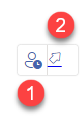
During the ongoing chat between the agent and the client, the agent can observe what information the client enters into the running form and assist if needed.
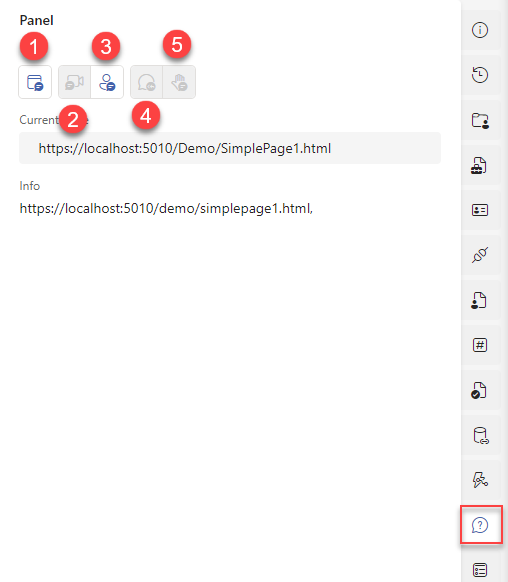
If a customer fills out a form, the agent can open a preview of the same and see the customer’s completed data in real-time
Resumes the transfer of form data from the customer to the agent that was paused by button #3
Suspends the data transfer to the agent, who can now edit the data in its form version. Use when you want to help the customer with fulfillment.
Displays the customer’s current URL on the Panel subfolder
Sends data from the agent’s version of the form directly to the customer. Should follow button #3.
Warning
For buttons #2 and #4 to work correctly, the CORS setting is required.
User settings and agents options
In the bottom left corner of the app, you will find an icon that you can use to change the TeamsClient settings for your agents account.
In this section there is also a button in the form of the agent’s initials, which also indicates your status. If a profile picture is defined, it will be displayed inside the button. After clicking on it, it is possible to log out.
Note
Ask your supervisor for the profile picture change.
General settings:
Select the language of your environment - Select the application language for your account.
Choose layout theme - App’s White or Black theme, for preview see Visual editors.
Condensed grid rows - On/Off toggle. When enabled, all grids become more compact, the graphical separation of individual rows disappears. Grids are displayed mostly on the Activities tab.
Emails settings
Search contacts of models - whisperer settings for outbound emails. When entering the email address, you don’t have to insert the whole address out of the memory, but writing the recipient’s first name or last name, company or department will be enough. Data are taken from stored contacts. Whisperer can display the data according to these contact information:
First Name
Last Name
Company
Department
Description
Only start of fields - if OFF, text inserted into the whisperer will be looked up also in the middle of text info (like firstname, surnmame etc. - see setting choices above). If ON, text info will be always compared from the beginning.
Turned OFF example:
Search contacts of models - the second part of the whisperer settings, where you choose contact models from which to whisper. You can understand the “contact model” as a specific type of contact, i.e. whether a private person, a company, etc.
Max number of suggestions - maximal amount of whispered records
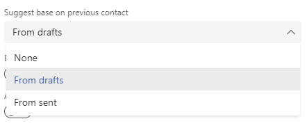
Suggest base on previous contact - if ON, contacts from previous communication are taken into account. For every possible option here, time span is set to 7 days. For example: if you had saved some draft mail 5 days ago with particular email address and that address is also saved as a contact and you have enabled drafts in this settings and you will use the whisperer at this time, the particular email address will be whispered with priority. This settings can also be deactivated.
Browser spell checker language set according to language of message - dynamic spell checker during the email writing, language automatically detected
Allow “Reply to all with attachments” - if ON, inbound email form will display Reply to all with attachments extra button. It will be present only if inbound email has some attachments in it. When clicked, new outbound email will be created (all email adresses included) with originally attached file included.
Calls settings
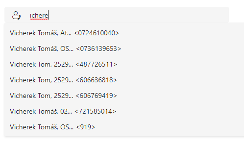
Search contacts of models - whisperer settings for outbound calls. When entering the phone number, you don’t have to insert the whole number out of the memory, but writing the recipient’s first name or last name, company or department will be enough. Data are taken from stored contacts. Whisperer can display the data according to these contact information:
First Name
Last Name
Company
Department
Description
Only start of fields - if OFF, text inserted into the whisperer will be looked up also in the middle of text info (like firstname, surnmame etc. - see setting choices above). If ON, text info will be always compared from the beginning.
Turned OFF example:
-
Search contacts of models - the second part of the whisperer settings, where you choose contact models from which to whisper. You can understand the “contact model” as a specific type of contact, i.e. whether a private person, a company, etc.
Max number of suggestions - maximal amount of whispered records
Suggest base on previous contact - if ON, contacts from previous communication are taken into account. For every possible option here, time span is set to 7 days. For example: if you had saved some draft mail 5 days ago with particular email address and that address is also saved as a contact and you have enabled drafts in this settings and you will use the whisperer at this time, the particular email address will be whispered with priority. This settings can also be deactivated.
Supervisor settings
Warning
If your account doesn’t have the “supervisor” flag, this section is hidden.
This tab is described in detail in the supervisor section.
TeamsClient application integrated in the Microsoft Teams desktop application
TeamsClient can be integrated into the thick Teams application as a plug-in. You add the application to Teams in the same way as other Office plug-ins. Its icon is then displayed in the vertical bar on the left side.
The functionality is no different from the web version described above. The only difference is the position of the main signpost, which is placed vertically above the application [1].