Visual designers
Enabling and running designers
To launch designers, you need to:
Run DesktopClient from the command line with the
--allow_designerparameterLog on to the workplace
In Windows, open the “Show hidden icons” area (next to the notification area) where there is also an icon for DesktopClient
Call up the context menu above it (right click) and you will see the following options:
Open ribbon designer
Open reaction designer
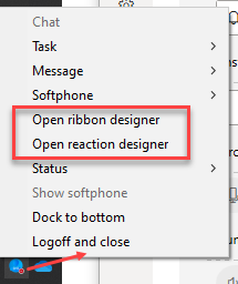
After selecting one of the options, the window of the selected designer will open.
Designer bars
Note
DesktopClient tries to retrieve the json bar definition from several places:
If it is not found there, the default definition is stored in the
LL0.jsonfile in theDC_Defaults_RibbonDefinitionparameterIf it is not found there either, the default definition in the application code will be used
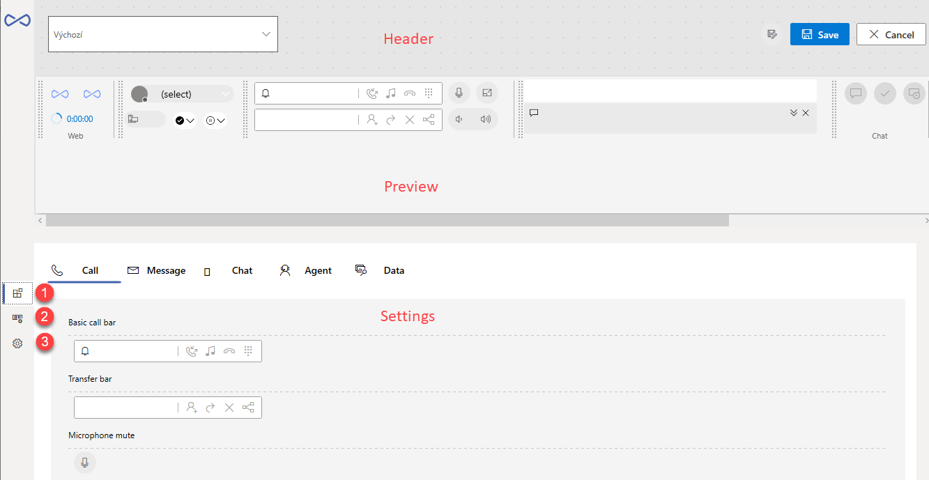
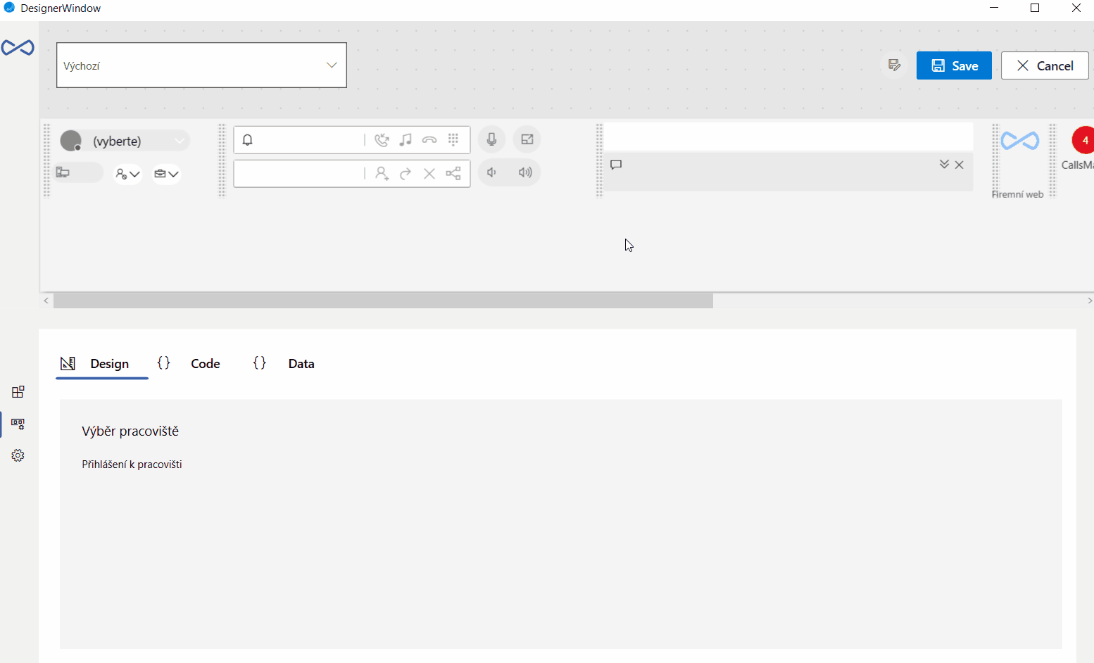
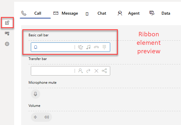
The toolbar designer window is divided into three sections:
Header - you can choose from the “Default” template (and edit it) or create your own. It contains save buttons.
Preview - The current form of the template as selected in the header. This is what the DesktopClient window will look like. It is divided into component groups and supports drag & drop between groups (you can change the order in a row and also change the column where the group is displayed). By clicking with the mouse on individual groups/elements, you can display the setting options for the given group/element in the third section.
Settings - Contains three vertical tabs:
Available items (1) - A graphical overview of available items, categorized by channels and focus
Item settings (2) - Refers to the specific selected item that you marked in the preview
Application settings (3) - Local settings for DesktopClient
Toolbar templates
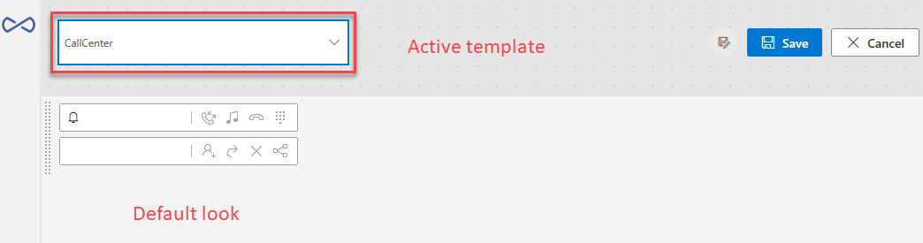
When first opened, the “Default” template - the basic layout of the bar - is available in the header. Its configuration is stored in the LL0.json file in the DC_Defaults_RibbonDefinition parameter.
To add a new template, press the button as shown in the picture:

A separate window will open where you can add any number of templates.
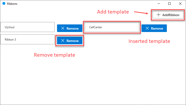
Once added, the template will be available in the header dropdown list.
Adding an element to the bar
In the settings section, open the vertical tab for available elements (1) to select one available. Grab it with your mouse and drag & drop it to the preview section. You have the option to insert the element into an existing group or insert it separately into a new one.
Inserting into an existing group - While dragging, move the cursor over the group; it will become framed in green, and after releasing the mouse button, the element will be inserted into this group
Inserting separately (new group) - When dragging, move the cursor over the preview section (preferably its bottom edge); it will become framed in purple, and after releasing the mouse button, a new group will be created that contains the inserted element
Edit control
Click on the element in the preview; a tab with the element settings will appear in the settings section. It is further divided into three tabs:
Design - Displays a short description of the element and its quick settings (if available for the element)
Code - A detailed listing of the element attributes, structured in .json; by editing the attributes you can change the element settings
Data - ??
Editing a group of elements
To set up a group of elements, click on the “bold divider” at the beginning of it; the available parameters will appear in the settings section:
Display text - a group name. If filled, it will be displayed at the bottom of the group; if not filled, nothing will be displayed.
Typical height - The group height in pixels; the typical value is 45px
Width (px) - The group width in px
Changing the element group position
Groups can be moved using drag & drop; at the beginning of each group you can see a “bold divider” that you can grab with the mouse cursor and move the group. You can change both the column and the row.
You can no longer move elements after placing them in a group. If you placed an element somewhere else than needed, it must be deleted and placed again.
Tip
To delete an element/group, press the CTRL key and click on the object that you want to delete.
Default elements for designer bars
In the settings section, you can see a graphic preview of the available elements that you can place on the DesktopClient bar. Elements are categorized by channel and focus.
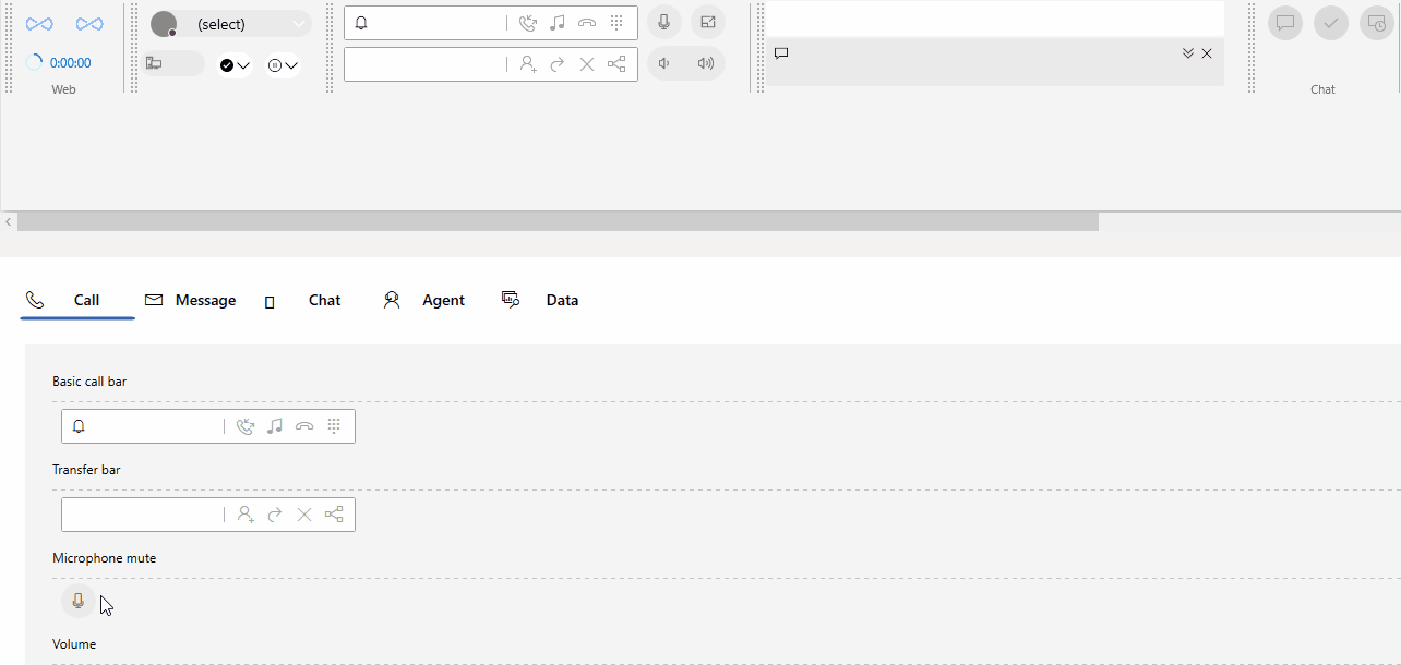
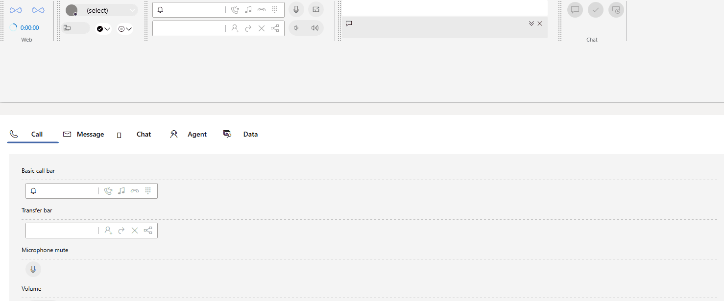
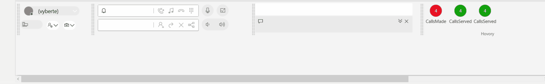
Call tab
Basic Call Bar
Description: Basic voice communication operations.
Quick settings: Width (px)
Transfer bar
Description: Supports operations consult, transfer, metadata change.
Quick settings: Width (px)
The elements mentioned above form the main component for calling
Microphone mute
Description: Button enables/disabled microphone used by softphone.
Volume
Description: Controls volume of device used by softphone.
Actual Interaction
Description: Show information about current communication transformed with templates configured through global ribbon options.
For the following channels: Calls, Chat, Messages, and Tasks
For the display format, see DesktopClient settings
Softphone toggle
Description: Show/hide softphone - see Built-in softphone
Message tab
Basic message bar
Description: Basic message communication operations.
You need to set a URL for the message editor in the application settings to ensure a proper functioning
Basic task bar
Description: Basic task communication operations.
You need to set a URL for the task editor in the application settings to ensure a proper functioning
Chat tab
Basic chat bar
Description: Basic chat communication operations.
You need to set a URL for the chat editor in the application settings to ensure a proper functioning
Agent tab
Workplace dropdown
Description: Worplace login component. A list of workplaces at which the agent is allowed to log on.
Workplace/Status dropdown
Description: Component combination with the option to select the workplace and the agent’s state.
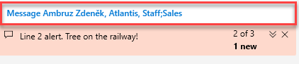
Client alert board
Description: Shows notifications dispatched to agents.
The source is a notice board; notifications are either informative or require a read confirmation by the user
You can check read confirmations via ReactClient
To ensure proper displaying on the bar, you must set the corresponding Scope
Status dropdown
Description: Status dropdown enables you to select from allowed statuses and send change request to server. Te change request is limited by configurable time interval.
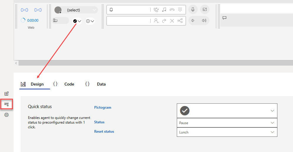
Quick status
Description: It enables you to change the agent’s status with one click. It operates in two modes: 1) configured state activation 2) “reset” state activation, when clicked the second time.
Quick settings:
Pictogram - a toolbar element icon
Status - An agent status to switch to when the element is clicked
Reset status - If this status and the previous one are filled in, clicking on the element cycles the agent between these statuses
Open in browser
Description: Component allows to open URL address in browser.
Quick settings:
Display text - It will be displayed inside the element
Background color - Color in hex format #F0F / #FF00FF. Bootstrap color can be used: danger, warning, …
Resource - upload/delete icon
Url - Valid absolute url is required, for example: https://www.atlantis.cz/
Data tab
Elements displaying statistics for a given user. These elements work with the database query that is set for the agent as the data source.
Call duration
Description: Shows length of current call.
Editing subparts of a statistical element
Elements displaying statistics have predefined multiple items that you can place on the bar. You can set specific displayed values using Data query cell, which will be displayed when you click on a specific part of the element.
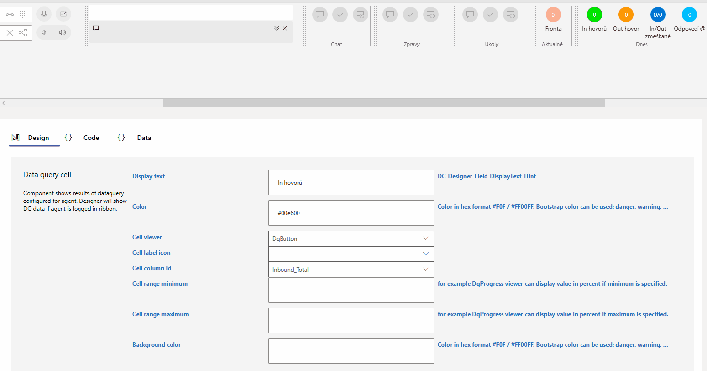
Quick settings:
Display text - The name that is displayed on the bar for the given part of the element
Color - The background color of the part; you can use the HEX/Bootstrap format
Cell viewer - The display style of the given part of the element; selection available from:
Display style
Appearance
DqButton

DqLabel

DqProgress
DqCifernik

DqDurationClock

DqDuration
Cell label icon - If DqLabel is selected, you choose from the available icons
Cell column id - A data source; a list of available columns depending on the query defined for the agent
Cell range minimum - If DqProgress is selected, it defines the range for rendering
Cell range maximum - If DqProgress is selected, it defines the range for rendering
Background color - You can use the HEX/Bootstrap format
Caution
The elements and tabs described above may differ for individual installations since custom-defined elements can be added to each section.
DesktopClient settings
In this section, you set the application behavior and display formats for certain bar elements. The settings are bound to a specific agent; they will not affect others. The default settings of your installation are always uploaded to the database by the consultant before the first launch in the Perso database table.
You save the settings with the Save button in the header. After changing the settings, the application restarts.
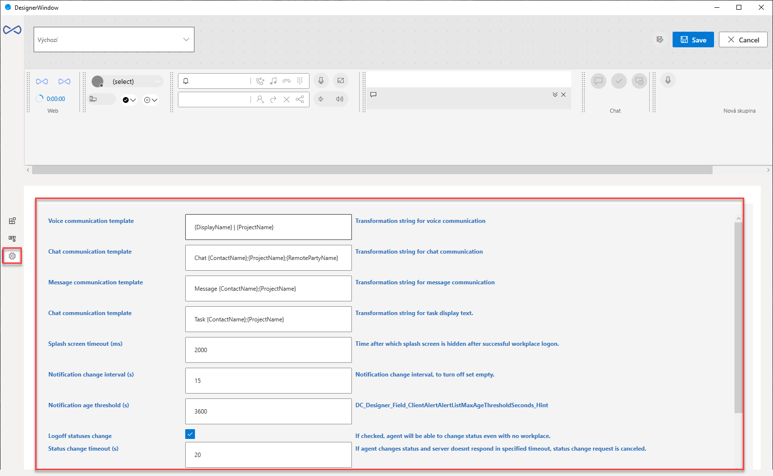
Voice Display Template - The formatting string according to which the Interaction context info element then displays data
Chat communication template - The formatting string according to which the Basic chat bar element then displays data
Message communication template - The formatting string according to which the Basic message bar element then displays data
Chat communication template - The formatting string according to which the Basic task bar element then displays data
Tip
For information on the formatting of the templates described above, see Format string options
Splash screen timeout - Time after which the splash screen disappears after login
Notification change interval (s) - Settings of the Client alert board element; if there are more notifications from the ReactClient wall, the element displays them after the specified interval
Notification age threshold (s) - Settings of the Client alert board element; if a notification exceeds the specified age value, the element will not display it
Logoff statuses change - If enabled, the agent can change its status even when logged off
Status change timeout (s) - If the agent changes its status in the application and the response from the server does not arrive in the specified interval, the request is canceled and the old status remains
Workplace change timeout- If the agent changes their workplace in the application and the response from the server is not received within the specified interval, the request is canceled and the old workplace remains
Chat editor URL - URL of the channel service application in the following form:
{protocol}://{server}/ReactClient/pages/ChatEditor.html?id={chatId}&Embedded=trueTask editor URL- URL of the channel service application in the following form:
{protocol}://{server}/ReactClient/pages/ChatEditor.html?id={chatId}&Embedded=trueMessage editor URL - URL of the channel service application in the following form:
{protocol}://{server}/ReactClient/Pages/MessageEditor.html?Id={messageId}&Embedded=trueVoice action throttling (ms) - A protection against multiple key pressing; it will affect call bar elements. The elements will allow the same voice operation to be sent once per set interval.
Format string options
Enumeration of possible format string items (variables filled by the system):
{WorkplaceNumber}- Number of the agent’s workplace{ProjectName}- contact project{LanguageName}- contact language{ContactName}- Contact name/surname{WaitingTime}- Connection waiting time{RemoteParty}- Information about the counterparty, see Visitor identification{PbxCallId}- Call identifier at the branch exchange{SourceNumber}{RemotePartyNumber}- Counterparty number, see Visitor identification{DisplayName}- Note/custom text (for outbound calls){PilotName}- Name for the pilot installation{PilotNumber}- Number for the pilot installation{RedirectorNumber}- Redirection number{ProcessingTime}- Call processing time{IvrResponseA}- User response for IVR A{IvrResponseB}- User response for IVR B{OuboundListName}- Called number campaign{Trial}- Number of attempts to make a call with the number{CallKey}- External call ID; a key for pairing information with another system{CallId}- Internal call ID
Note
A list of variables of a specific installation may vary since specific variables can be defined, which are used to pass information from an external system to FrontStage. These can then be shown to agents in the form of a completed form.
JSON attributes used to set toolbar elements
Most toolbar elements have a set of attributes attached to them that you can use to change their appearance/properties. You can do this in settings section in the Code tab.
List of available attributes and their values:
Reaction designer
Note
DesktopClient tries to load the json response definition from several places:
If it is not found there, the default definition is stored in the
LL0.jsonfile in theDC_Defaults_EventHandlingDefinitionparameterIf it is not found there either, the default definition in the application code will be used
The reaction set is very important for DesktopClient because it defines the behavior of the application to various stimuli, such as an inbound call, chat, etc. Reactions here mean, for example, the type/appearance of event notifications, automatic process initiation if something happens, etc.
Attention
With this designer, you modify the reaction definition for the logged-in agent only, which was loaded into the database during the first run. Changes are saved to the same location.
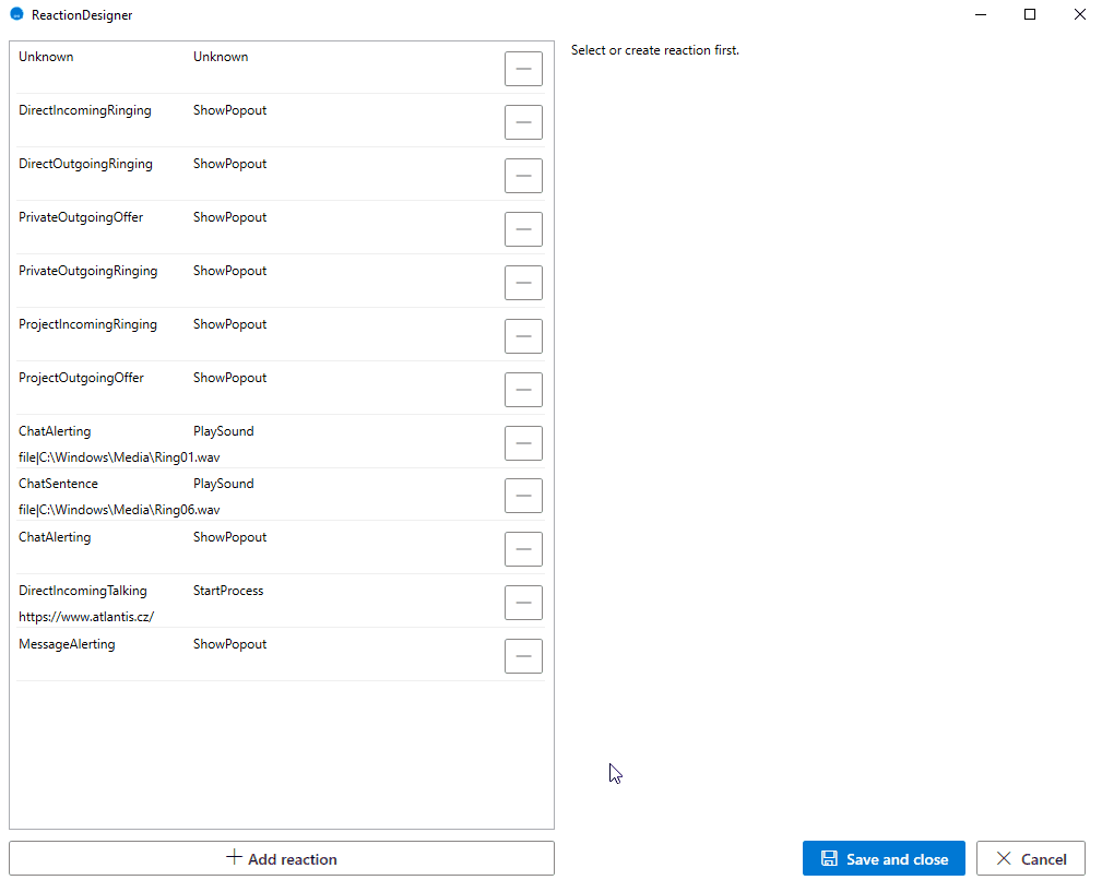
The editor window has two parts: “List of active reactions” and “Settings of marked reaction”
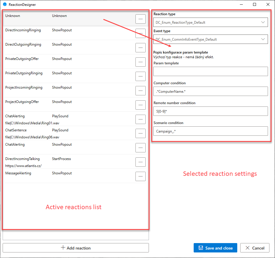
Adding a reaction
To add a reaction, click on the Add reaction button
A new reaction is added to the end of the list with the default value
Click on it with your mouse to view the settings, then you can edit them
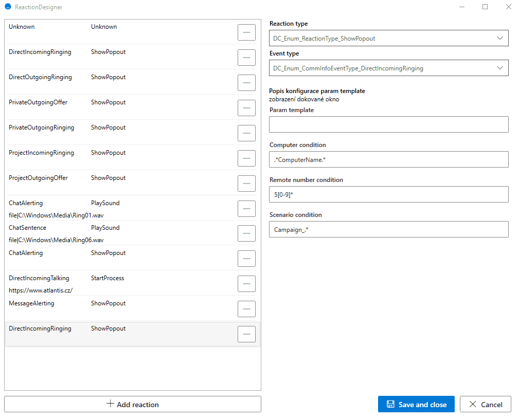
Reaction settings
Reaction type - Reaction of the application to the generated event, see Types of application reactions
Event type - Types of events to which the application can react; see Types of events in the application
Param template - For reactions where a parameter can be set (e.g. PlaySound)
Computer condition - A condition of a specific computer; uses a notation with a regular expression
Remote number condition - A condition of the inbound call number; written with a regular expression
Scenario condition - A condition for the campaign scenario; written as a regular expression
Note
If the reaction has the conditions Computer condition, Remote number condition or Scenario condition set, it will be executed only when all conditions are met.
Types of application reactions
StartProcess - Start the process as from the command line; it respects the protocol (e.g.
http://demo.frontstage.cc/ReactClient/pages/ChatEditor.html?id={chatId}&Embedded=true). Write the command in Param template. Syntax:with the following arguments:
'<cmd command>|<arguments>'without arguments:
'<cmd command>'
PlaySound - Play/stop sounds. Write the function settings in Param template
Play audio -
file|<file-path>(e.g.file|C:WindowsMediaRing01.wav)Stop the currently playing sounds -
stop|Play sound from registry -
sys|<path-to-registry>(e.g.sys|AppEventsSchemesApps.DefaultNotification.Default.Current)
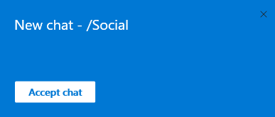
ShowPopout - When the event occurs, a window will also appear - see below. The window contains unique information for each type of event. If the window should also have a unique title, enter it in the Param template field
ShowStrip
ShowNotification
Types of events in the application
List of events that the application can react to.
Direct Calls
DirectIncomingRinging
DirectIncomingTalking
DirectOutgoingRinging
DirectOutgoingTalking
Private Calls
PrivateOutgoingOffer
PrivateOutgoingRinging
PrivateOutgoingTalking
Project calls
ProjectIncomingRinging
ProjectIncomingTalking
ProjectOutgoingOffer
ProjectOutgoingRinging
ProjectOutgoingTalking
Predictive calls
PredictiveOutgoingRinging
PredictiveOutgoingTalking
Chat, messages, tasks
ChatAlerting
ChatAnswered
ChatSentence
MessageAlerting
MessageStatus
TaskAlerting
TaskStatus
IssueAlerting
IssueStatus