Portals
The ReactClient user interface for end users (such as agents and supervisors) is widely customizable in terms of appearance, layout and behavior. This article introduces you to creating portals (user interface pages) and portlets (elements that can be placed on a portal).
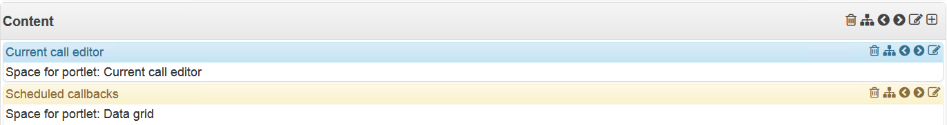
Portal is a web page created in the administration environment in which agents, supervisors and other end users work. Portlets are individual elements on a portal page, such as a call bar, data grid, chart, etc.
The basic type of portlet is Container, which can contain additional portlets. For example, if you set styling for one container to 4/12 and to 8/12 width for another, you will create a basic user interface structure with a narrower container on the left and a wider one on the right. Each additional portlet should be placed in one of the containers.
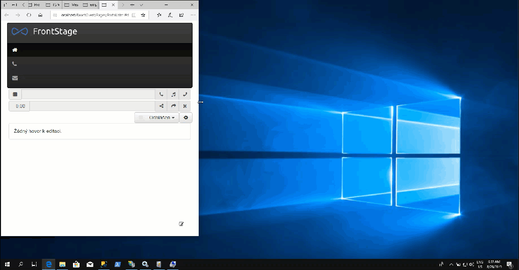
For example, a portal called Home that looks for the user like:
consists of several containers to which various portlets or other containers have been added. Each of them with its own styling and behavior settings.
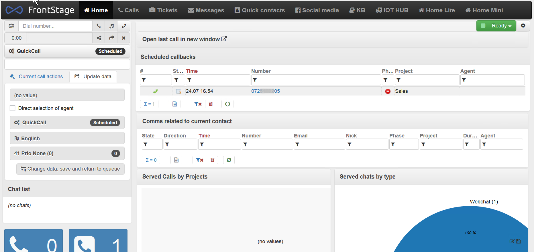
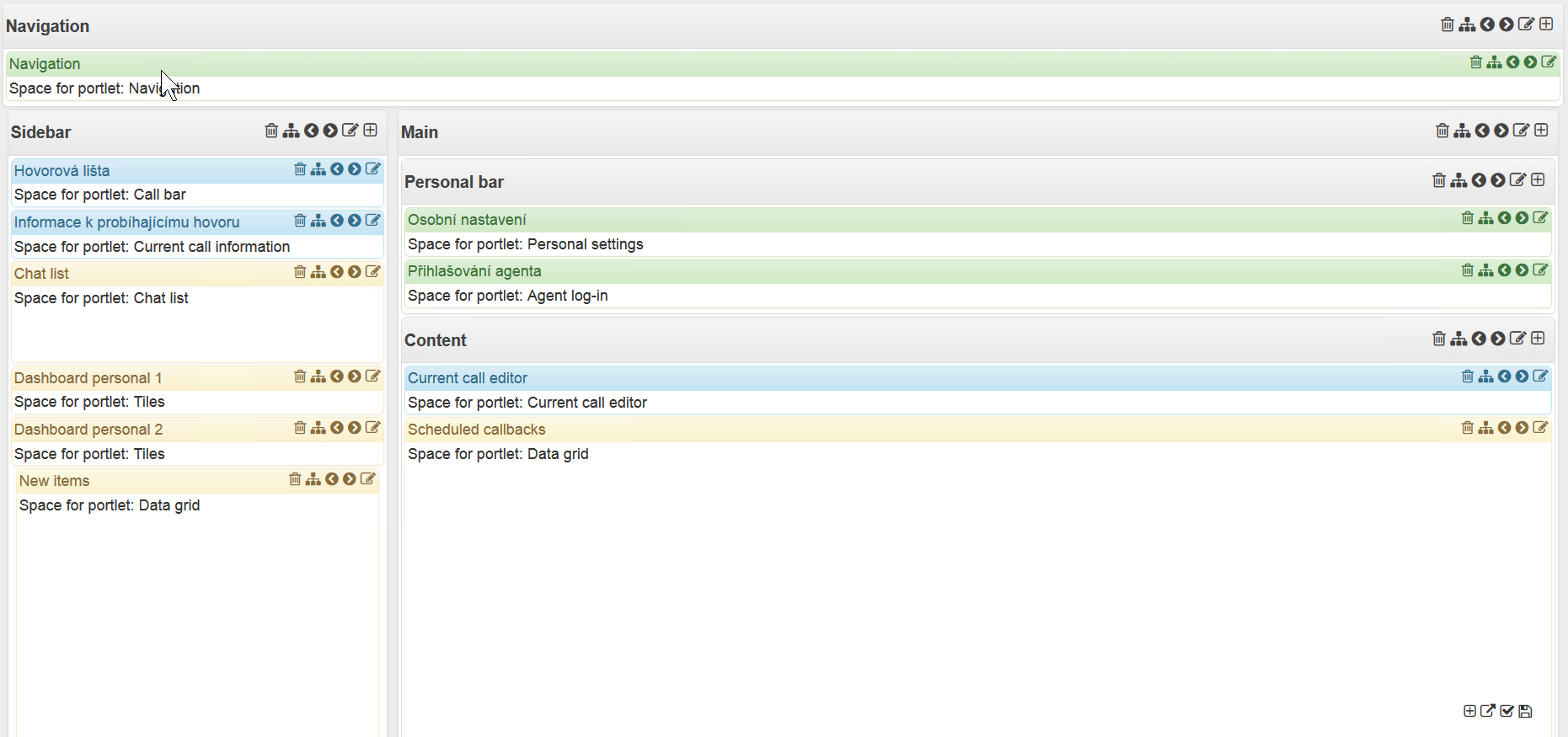
To get from the portal view to the portal edit mode, use the small  button in the bottom-right corner. The previous example of the Home portal then looks as follows in this mode:
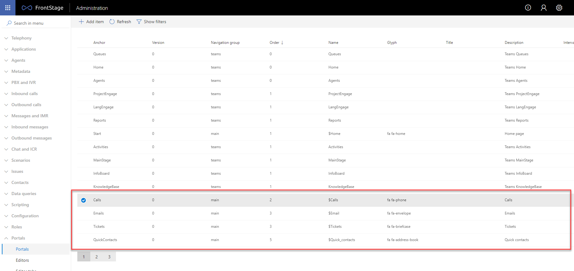
For example, a navigation set to be displayed in black for a group with portals called Home, Calls, Tickets etc. looks as follows:

It is created in the administration as follows:
A navigation group forming the user interface for agents is usually named main. Another navigation group for supervisors is usually named sup.
Each portal has an anchor, which is used as a fragment in the portal URL (the part after #). For instance, the default anchor is usually the home page of the main group. Anchors with the sup_ prefix (e.g. sup_agents) usually indicate a group of portals for supervisors.
If ReactClient is available to others at, for example, http://demo.frontstage.cc/ReactClient/, then the URL to the default portal has the URL of http://demo.frontstage.cc/ReactClient/Pages/Portal.html#default.

Creating portals and navigation groups
Think about how many navigation groups and portals you will create in them.
Create them in the administration environment in the section, with each portal to be completed as follows:
Form field
Description
Anchor
A unique identifier used in the portal URL (e.g.
http://frontsrv/ReactClient/Pages/Portal.html#my_anchor)Name
The portal name displayed in the tab in the Navigation portlet.
Description
A description; it is not displayed anywhere.
Glyph
See Glyphs. If set, glyph appears in a tab in the Navigation portlet.
Title
Page title for the
<title>HTML element . If not set, guilabel:Name is used.Navigation group
Indicates to which navigation group the portal is assigned.
Rank
The order within the same navigation group in which portals appear as bookmarks in the Navigation portlet.
Interval [s]
After N seconds move to the next portal in the same navigation group (according to the portal Rank). Uselful for creating wallboards with multiple pages, among which the system is cycling, for example every 30 seconds. Automatic movemend will be canceled when: * clicked on a different portal tab * switched to the edit mode (
 icon when editing via ReactClient). Automatic movement can be restored by refreshing the webpage.
External URL
Click on the portal tab in the Navigation portlet to navigate to the specified address instead of the portal. The portal is still accessible when you use its URL, but it cannot be accessed through the tabs in the Navigation portlet.
Editing the portal
If you look at the portal pages that you just created, you will find that they are empty. Depending on the purpose, they must be fitted with suitable portlets. Alternatively, you may want to modify existing portals – remove a portlet, change the appearance, layout, etc.
Users who are assigned the role of ShowContentPage with permission of AllowWrite or higher will see a small button at the bottom right to enter the portal edit mode.
Click on to display four new buttons  that allow you:
 add a new portlet. You can choose its name and styling. The portlet type is set as the default name. You must then complete the settings of the added portlet according to its type.
 open the portal in a new window in the view mode. It only shows the saved changes.
 quit editing and go to the view mode. If there are any unsaved changes, then instead of in the bottom-right corner, you can see the
  buttons on the page. You can thus see your changes and save them immediately.
 Save changes but do not exit the edit mode.
Important
The changes that you make will be applied to all users who use the portal. These are not changes just for the current user!
In the edit mode, a set of buttons appears at the top right of each portlet header
and the buttons have the following meanings:
 Deletes the portlet from the portal. Note that in the case of Container it will delete all portlets in it.
 Moves the portlet to another container.
 Moves the portlet within the same container to the left before or to the right after the other portlets.
 Displays the portlet settings.
 Container type portlets allow another portlet to be added into them.
Styling
ReactClient uses the Bootstrap framework for CSS layout styling. You set the layout by applying the Bootstrap CSS classes for grids to the portlet.
Note
Responsive styling and the Bootstrap Grid is a complex and extensive topic. For you to fully understand it, we recommend that you read the official documentation or choose from a number of available books and articles.
To put it simply, Bootstrap grids divide the available screen width into 12 notional columns. In portlet styling, you specify how many columns out of 12 at which screen resolution the portlet should occupy. When you set the portlets to have an overall width greater than 12 (they do not fit in a single row), they are arranged under one another.
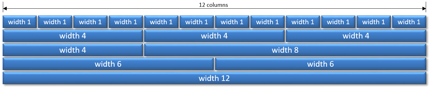
The width class has its name in the form of col-screen-width, where:
the screen is the device screen size –
xsfor very small screens (cell phones),smfor small ones (cell phone or small tablet),mdfor medium screens (large tablet or computer), andlgfor large ones (widescreen),the width is the number of twelfths of the available width.
Example:
col-md-4sets 4 columns on a medium and large screen.col-md-4 col-xs-12sets the width of 4 columns on a medium or large screen, and the width of 12 columns on a very small and small screen.
This helps you obtain a layout responsive to the browser window size and a suitable element arrangement for both large and small displays.